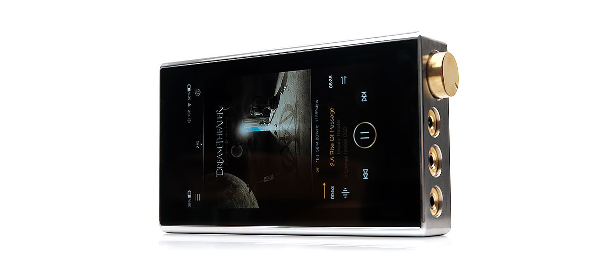
iBasso DX220 MAX Internal Hardware
DAC
There is no change in the actual chipset used inside the DX220 MAX compared to the DX220. The DX220 MAX uses a Sabre ES9028PRO chipset in a dual configuration which is equivalent to 8 DACs in parallel for each channel (4 per channel).
The PRO series is quite powerful, even compared to the Q2M mobile version used on the likes of HiBy’s R6 Pro. It does use more power though than the Q2M variant.
The DX220 MAX uses the same excellent oscillator implementation as the DX220 allowing for a much wider scope in handling key decoding processes. You get a total of 5 Femtosecond League Oscillators, 2 of which are Accusilicon Ultra Low Phase Noise Femtosecond Oscillators.
Decoding
Decoding rates are excellent on the DX220 MAX with a ceiling of DSD512. There are a few DAPs in 2020 that can now compete with that such as the FiiO M15 and Lotoo’s PAW Gold Touch and given it is transportable you would have to throw the Chord Electronics Hugo 2 into the mix also. PCM decoding is unchanged at 32BIT/384kHz.
The codecs covered are wide-ranging and fairly complete. You will get everything from lossy MP3 up to FLAC, DSF, DFF, and DXD native decoding. the full list includes MQA, APE, FLAC, WAV, WMA, AAC, ALAC, AIFF, OGG, MP3, DFF, DSF, and DXD.
Bitperfect & MQA
The DX220 MAX retains the DX220’s BIT for BIT playback up to 32BIT/384kHz. That renders the Android core bitrate limitations moot. Much like the HiBy R6 Pro DTA architecture, the DX220 MAX can deliver bit-perfect playback, not just in Mango OS or the Mango app but for any app that does not alter the source bitrate itself.
MQA unfolding and rendering is a huge plus for those who love TIDAL or other MQA-wrapped formats. The DX220 MAX supports MQA in X4 mode as well as hardware support for streaming MQA via the TIDAL up to 72kHz.
The only DAP that I know of that unfolds to a higher level at X8 mode is the FiiO M15. It recently got global MQA support at the start of August 2020 whereas before X8 was only through their dedicated app.
Amplifier
The amplifier stage in the DX220 MAX is quite a radical departure from the original DX amp card ethos. For one thing, it is not a detachable amplifier card system.
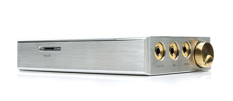
This is a more traditional fixed amplifier stage but it does offer a dedicated LO for balanced 4.4mm out as well as PO for 4.4mm and 3.5mm balanced output.
You had to mix and match to get both 3.5mm and 4.4mm on the DX AMP card system and no single card did the two outputs together. Instead, they often used a 2.5mm TRRS with a 3.5mm and a dedicated 3.5mm LO.
And boy did they upgrade the power specs of that amplifier compared to the DX220. We now have up to 4.4VRMS and 4.35VRMS unbalanced with no load and with a 300Ω load respectively. Balanced is even better at 8.8Vrms and 8.7Vrms into a 300Ω load. Drilling down to 32Ω the MAX output rating is capable of 7.5V equal to 1758mW balanced.
Compared to the DX220 AMP1 MKII stock card there is a lot more power in the new amplifier design of the DX220 MAX. It is also a very healthy balanced 253mW of power on tap for headphones like the Sennheiser HD600 which is outstanding for a device of this nature.
As a point of comparison, the very powerful FiiO M15 can output 280mW into 300Ω using its balanced PO and it is probably the most powerful standalone DAP in the market right now. However, at 32Ω, the MAX powers ahead with almost 1W of additional headroom compared to the 800mW of the FiiO.
Another important note is the dedicated 4.4mm line-out or LO. The voltage output on this is excellent at 4.4V. Compared to its nearest rival, the Cayin E02 motherboard for the N6ii player it is slightly stronger at 4.4V compared to 4.1V but it lacks the variable voltage settings of the E02 which can be set to 2.2V and 3.2V to better match an analog amps input rating.
Performance Numbers
Yet, output ratings without context are a bit of a crapshoot. As discussed on page 1, the topology and power management of the new amp stage are hugely different.
Not only has it got a different power management circuit to the digital section of the device but also upgraded resistor and capacitor components well beyond the DX220 design to enhance noise performance and deliver a superior dynamic range.
So, if we go back to that FiiO M15 280mW into a 300Ω load numerical advantage and switch to noise performance the DX220 MAX is superior with an unbalanced rating of THD+N of 0.00025% compared to the M15’s 0.0005%.
You get the same trend also with the 4.4mm balanced output with a lower THD+N of 0.00021% compared to the M15’s 0.0006%.
SNR is also superior to the M15 on balanced from the DX220 AMP1 MKII jumping from 122dB to 125 dB. Do not get me wrong, I think the M15 has vastly improved noise performance over the older X series and the M11, just not as good as the DX220 MAX.
Indeed with sensitive IEMs such as the Campfire Audio Solaris SE, the background is blacker on the DX220 MAX. Throw in the digital volume preamp control and 3 levels of gain on Mango and it is almost perfect for IEMs of this kind on a transportable device.
Software
The DX220 MAX retains the DX220 dual-boot OS framework with the dedicated pure audio-orientated Mango OS and the more expansive Android 8.1 Oreo for those who want a bit more flexibility beyond pure local and USB-DAC/OTG playback.
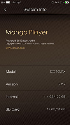
The DX220 MAX comes with Android Oreo 8.1 out of the box and our current review build number is 1.00.100. The review version of the Mango app is firmware V2.2.7 and for Mango OS it is V1.00.100.
Also, in our testing, the latest Windows 10 DAC driver on the iBasso website is compatible with the DX220 MAX since they share the same XMOS USB receiver/Thesycon USB audio driver.
Oreo
The general DX220 MAX software experience is very similar to the DX220 but you should not find that too surprising given the CPU, CPU clock rate, RAM, and OS version are the same on each player. In truth, the DX220 MAX is like a layer of DX220 digital on top of the MAX amplification stage but with better isolation.
The OS itself, both Mango and Android, has come along nicely with subsequent firmware updates on the original DX220 finding its way onto the MAX version.
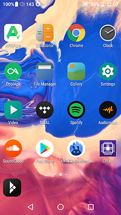
The installation is very clean with very little in the way of bloatware. You get Mango App preinstalled as well as Chrome, APK Pure, Cool APK, and a file manager to name a few of about 9 apps in total out of the box.

One of the big ‘upgrades’ to the iBasso version of Oreo is the ability to safely install a functional version of Google Play from the stock APK Pure store. That makes a huge difference as there are a ton of useful apps out there that require Google Play Services to work such as Hi-Fi Cast.
You still get it with APK Pure out of the box for the DX220 MAX to comply with its licensing terms or lack thereof but it takes about 1 minute to download and install Google Play then simply set it up and you are good to go.
I would argue to retain APK Pure to get around Google regional locks which I find very frustrating at times. This generally applies to software such as TIDAL which is not provided in our region.
Performance Numbers
The varying clock rate fixes for the DX220 made it a tricky DAP to get a fix on performance. Our initial reading came from a low clock rate on the CPU with the original firmware and the numbers were below par compared to the competitors.
Since then, iBasso has stabilized the Rockchip clock rate at 216mHz to 1.01GHz for both the DX220 and the DX220 MAX making it a bit easier to compare in terms of their respective AnTuTu Benchmark performance.
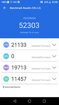
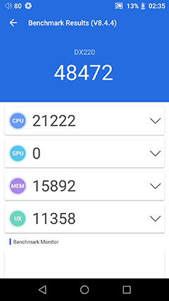
Below are our AnTuTu Benchmark 8.4.4 testing outcomes to show you the DX220 MAX and DX220 performance differences. Both outcomes were obtained on the 8th consecutive test with fresh factory resets on both. The screen brightness was set at 50%, all apps were closed bar AnTuTu and Screenshot, and BT was turned off.
DX220 vs DX220 Max
Right away you can see that the overall performance numbers are slightly better on the DX220 MAX compared to the DX220. Breaking it down we can assume the similar CPU scores are due to both devices having the same CPU and clock rate.
For some strange reason, AnTuTu is locked out of the GPU measurement of the DX series OS so we have to skip that but the memory test was where those numbers diverge. Granted, the DX220 in my possession has had tons of stuff chucked at it in the last year or so and it may have some performance drift but the gap seems too big for minor aging quirks.
We do not have Google Play as yet installed on the DX220 when I did the test so the Play Services background processes should not have an effect. Also, the screen is set to 720p which you cannot do on the DX220 MAX.
I can only assume one of two things. The DX220’s OS has been through the wars a bit more and has a lot more processes redundant or otherwise taxing the RAM. Or, that the DX220 MAX’s better power management allows the rails to provide a steadier voltage supply and thus more consistent measurements during the testing phase.
Either way, our tests seem to show the DX220 MAX as the slightly better performer.
Navigation
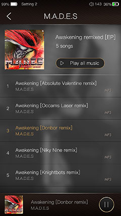
The actual DX220 MAX UI flow for navigation has changed very little from the DX220. Since both are dual boot frameworks with the Mango app available in Android you have the same audio configuration drill-downs, Android drop-down bar mechanism, and in-depth settings access for Android environment controls.
There are some nuanced changes in the options available in each navigation hot spot as well as some pretty big changes in the icons on the notifications bar at the top.
Notifications Bar
Let’s start with those bigger changes. If you notice in the picture above you now have not one but 2 battery icons. That symbolizes the separate power management of the digital and analog components in the DX220 MAX.
To the far right, you have the analog battery icon and the remaining power as a percentage. This is duplicated to the left beside the clock for the battery powering the digital side. You do need to watch both, however, Android will offer a warning for the digital side when it drops below 15% to give you time to hook it up to a USB-C terminated charger or laptop port.
Back to the right side again and just after the battery icon for the analog battery, you have the digital volume indicator, (150 steps). I would have preferred this beside the digital battery to avoid potential confusion.
The analog potentiometer is not connected to the OS in the same manner as the digital volume which is drawn from the Es9028PRO chipset so there is no GUI indicator like the digital side.
Drop Down Bar
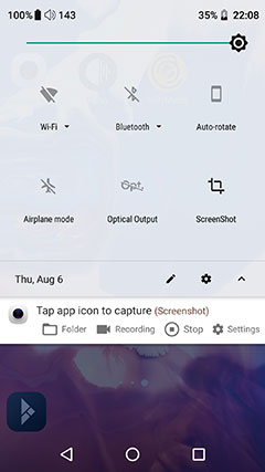
The nuanced changes center on the options available in the drop-down menu rather than how the menu works itself. You still get features such as airplane mode, a screen brightness slider, connectivity quick connects for WiFi and Bluetooth, etc. Some of these nuanced differences might not apply to you, especially if you do not intend to stream.
One nuanced change is the battery icon which is not showing by default on the DX220 MAX main drop-down options. You will have to dig into the edit menu and bring this to the main menu. I find this option pretty useful to draw out that final 15% of charge a bit longer than normal
Note, that further battery saving is not possible on the DX220 MAX by switching to 720p like you can on the DX220. Not sure why they dropped that option since the screen is virtually the same. A few additional hours of battery life on a lower resolution might have been welcomed by some users.
Also, for some reason, the Spotify Offline mode ‘quick change’ icon is not a drop-down menu bar option which is the case with my DX220. I am not entirely sure if that will pop up later with some configuration changes in Spotify but I did check and both apps in DX220 and the MAX version are the same versions with the same settings.
Mango App
Both the DX220 and DX220 MAX use the same Mango app so there are no differences in how they operate and what features they offer. However, since we did the original review of the DX220 back in early 2019 there have been some tweaks to improve the experience.
If you are fresh to the Mango experience or previously used an old version from the DX200 it has had a serious makeover since then and is far more useable with some brilliant features.
It also is still a shade on the clunky side for UI compared to slicker media management apps but overall I am far happier now with it compared to a few years ago.
Menu System Cons
The original Mango player menu system was visually quite blocky with a lot of left/right swiping. The current Mango version does away with that and delivers a more seamless menu access framework but it still retains one to two things I pointed out that could be improved.
The first is the menu access using the cogwheel. It still only appears at the top right of the playback screen and not in the media manager section. I would love it if that cogwheel stayed consistently accessible on every workflow screen.
The second is the lack of OTG media integration when scanning. This is a useful service on the likes of the HiBY Music app though you do have to rescan for accuracy when you take that flash drive out.
The Mango app will recognize and allow you to play files via the OTG folder drill down but it will not scan it into the main media library, so it is not seamless.
Menu System Pros
Aside from that, you do get those easy-to-understand and work-with menu features with far fewer clicks to access them than the older version. The overall UI design is fast with very few clicks and that rates high in my old UI sensibility book.
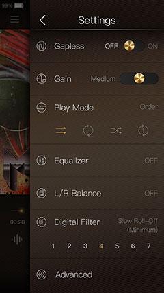
Quick access options include gapless playback, their excellent 3-stage gain control, play modes, and the ES9028PRO 7 digital filter system.
The only playback features that require an additional screen are the equalizers, the L/R Balance, and the advanced menu sections. You can also find the USB DAC and scanning features in the advanced section which are super easy to activate.
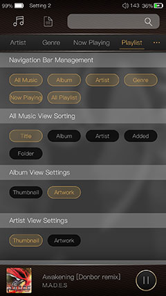
Since our original Mango App review on the DX220, the latest Media Menu navigation editor has also received an additional default option for the “Now playing View sorting” label. That will be handy if you want to do a quick reset.
Media Management
The media library on the Mango App for the DX220 MAX follows a similar pattern with it being the same as the DX220 version but overall, both have had some tweaks through various firmware updates since our original review.
For those new to the Mango media manager, it has shades of the FiiO and HiBy player but that is not a bad thing at all. Familiarity breeds confidence and a degree of similarity means a faster user adoption rate.
All the key tagging categories are now on the top row and you simply slide to the right or left to bring up the relevant category without changing screens.
If you are not happy with the selected categories and how to view your music you can still tweak via the media navigation editor with that additional default option as mentioned previously.
Media Management Tweaks
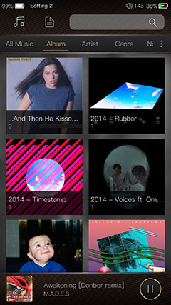
A few tweaks that I know from the previous app firmware updates include an improved loading speed of high-resolution album artwork which does make a positive difference in the UI flow with far less image lag when browsing the album category in artwork mode.
Also, iBasso has included the ability to add currently played songs to a playlist on the fly from the Mango playback screen rather than just from the media manager.
Another tweak is the genre drill down in the media manager which no longer has genre labels and a flat level of all songs with that genre tag to endlessly scroll through.
The genre labels have now got an additional album level of sorting which is helpful but why stop there? Why not add the artist then the album level like how it was with the DX90? That would make it a perfect drill-down system.
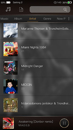
The final tweak since the original DX220 review is the addition of the album grouping under the Artist category. That means when you hit a certain artist you do not get a flat list of songs under their name.
Instead, they are now properly grouped under their album names which makes things a lot easier for artists with large back catalogs.
Parametric EQ
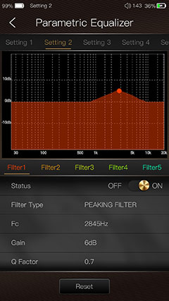
Simply the best PMEQ system I have used on any portable media player bar none. Regardless of whether you want to use the DX220 MAX as a DAP or transportable desktop player this PMEQ feature nails it for me for fine-tuning or making sweeping changes to the tuning of any headphone or IEM I use today.
In terms of attention to detail, the Lotoo OS PMEQ is just as good but it is the usability of the iBasso Mango PMEQ that gives it its edge. It is big, bright, and intuitive to work with whereas the Lotoo is a bit cramped with its cogwheel system.
You get complete access to 8 preset filter types, a touch directional F-Value point, gain control of between -20 and 20dB, and Q-Value control to narrow the bandwidth or focus on boosting instrumental elements such as a snare or kick drum attack from between 0.3 and 20.
All of this can be tweaked and loaded into 6 custom presets to switch on and off whenever you like.
I tend to find PMEQ particularly useful for monitors that are either overly dark or bright and I do not want to upset the balance but rather focus on one key area to bring out more presence such as percussion or low-end warmth.
There is a small dB drop when turning it on but not huge, maybe 6dB at best to match the new graphical EQ dB attenuation setting.
Graphic EQ
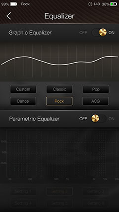
The graphic 10-band EQ on the DX220 MAX Mango App operates in the same manner as the DX220 version. You have 5 presets such as Classic, Pop, and Rock as well as the ability to create your own custom EQ profile and save it. It still has that ‘mix desk’ aesthetic to the custom control system.
As before you cannot turn both the Graphical EQ and PMEQ on at the same time, you can only use one or the other. The one new technical tweak as mentioned is that drop from 12dB attenuation to 6dB when you turn the EQ on which is more manageable on the more powerful DX220 MAX analog amp.
The Mango 10-band EQ performance is still a cut above the average EQ system. Testing it with the new Campfire Audio Solaris 2020 I got an easily identifiable change in each FR bandwidth either up and down with enough steps to be able to chuck in plenty of warmth or treble presence as I wanted in the mix.
This is not an overly subtle tool like the PMEQ but the Solaris 2020, for example, stood up very well to piling on the gain over certain bands.
For example, the 33Hz band right up to 12dB did not show one iota of distortion which impressed me. Even throwing up the next four bands from 63Hz to 630Hz still kept the distortion nicely under control.
Playback Features
Aesthetics
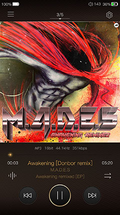
The Mango app playback screen on the DX220 MAX is once again the same as the DX220. However, the visual ‘pop’ is not quite as impressive with those new thick bezels. On the DX220, that 5″ borderless design the graphics from the artwork just rocked.
All the playback tweaking and track information options are as easy to access as ever. Not that there is a huge plethora of new playback features, but they are more or less the same, just far better organized than the original DX200 app version.
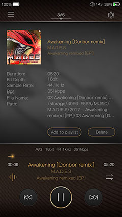
Playlist functionality has been improved since the original DX220 review. You can now add any currently playing music to a playlist on the fly as well as delete the track being played via the second track data playback screen.
This brings back a missed feature from the original Mango app, (the plus sign on the right slide-out tray), but in a much more user-friendly manner.
Options
At the bottom left there is a small pulse bar type icon that brings up that track data screen. The original icon from the older Mango brought a few options playback options such as the filters, gain, and gapless playback that are all neatly housed in the cogwheel drop-down menu at the top of the playback screen.
One drop-down playback feature on Mango OS but not on the Android app version is the ability to swipe down from the top to access your current playlist.
Mango OS
Mango OS, as you know, shuts down all the non-essential processes from the Android platform and instead optimizes the performance purely for audio. Essentially, give or take a few tweaks, what is happening in the Mango App is more or less the same as Mango OS.
There is no real difference at all between the DX220 version of Mango OS and the DX220 MAX version. Boot times the same, the UI flow works in the same manner, and generally, it feels as snappy and reactive as before.
DX220 MAX vs DX220 Mango OS
Only 2 exceptions I found in terms of a difference. The first is the loss of the physical button configuration option from the DX220 Mango OS. That is fairly logical since the DX220 MAX has no physical buttons.
The second is something worth looking at for a future firmware update if possible and that is the time the DX220 MAX took to switch to USB-DAC mode and back out again. It was noticeably slower compared to the same DX220 process.
Changes from the original DX220 review
Some of the fixes in the Mango app since our DX220 review though have meant that there is less of a gap in the feature set. However, there are still some useful plus points on the Mango OS over the app version.
The negatives are still the same, and it is a big one for me, no PMEQ feature in Mango OS. Oh, how I would love to see that show up on Mango OS.
The Mango OS Genre category in library management still has that proper drill down including artist, album, and song. This is easier to work with than the upgraded genre-album list from the Mango app.
Click On Page 2 below for Hardware & Software Impressions

