Software Impressions
The following software impressions of the N3Ultra were created using firmware version 1.20.
Android
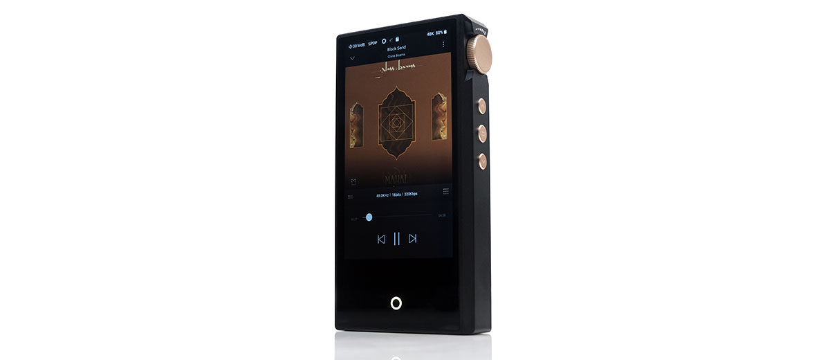
The Cayin N3Ultra is equipped with a heavily customized version of Android 8.1 with an SRC bypass that presents what is popularly known as a ‘garden wall’ OS experience.
That might surprise those coming from recently released DAPs with the full open Android 10 experience or higher but it plays into Cayin’s aim to keep the unit as a pure player.
If you are used to the N3Pro‘s HiBy OS then you will find the updated UI flow smoother and the navigation relatively similar in terms of upfront options despite the switch to a more expansive OS.
Underneath, the unit uses a more powerful Snapdragon 425 CPU and 2GB of RAM as opposed to the older Mips-based 1GHz SoC.
While this is not the most modern of processors the N3Ultra has no app expansion capability. That should mean a consistent user experience throughout its lifecycle, negating the need for a more capable processor.
The only way the experience will radically change is through firmware updates managed via a local file and memory card update system since there is no onboard memory or wireless connectivity for OTA.
Navigation
I did say the N3Ultra UI flow would be relatively familiar to the N3Pro user with its home screen options. And indeed, it is at a high level.
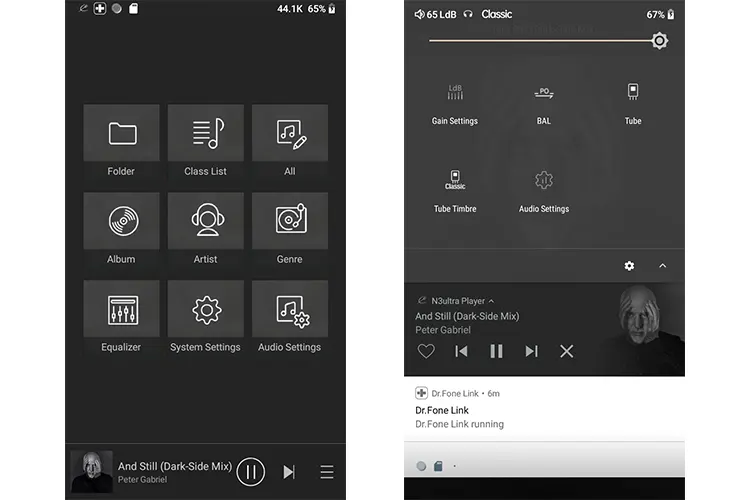
You still have the skinned HiBy Music player as your main interface with a mixed grid of media, system, and audio options on the home screen. Touch navigation is combined with gesture swiping and the command home button at the base that doubles as a multi-colored sample rate indicator.
The additional real estate from the larger screen makes everything much easier for scrolling, especially for long playlists.
The N3Pro always had a useful drop-down interface though it was combined with a less intuitive swipe up from the base option for additional music and system settings.
Now, all of those shortcut icons are housed in a single Android drop-down menu which should please those expecting a more ‘modern navigational’ experience.
The irony is that there are fewer shortcuts on the N3 Ultra dropdown when compared to the N3Pro HiBy OS dropdown.
Some of that is simply because the N3Ultra lacks that option such as Bluetooth. The rest is due to the Android framework absorbing those settings in its deeper menu system such as the default USB connection options which offer more choices but further back in the OS.
So, you will have to click a few times more to access the same headline options on the N3Ultra but the payoff is you might get a wider range of choices under that headline option.
I hope subsequent firmware updates allow the navigation system to have an edit option so I can add 1-2 more shortcuts for quicker access, for example, the PCM or DSD filters or the default USB mode when the device is connected.
UI Experience
The N3Ultra OS experience is split into media management, DSP and playback options (audio), and environmental settings (system).
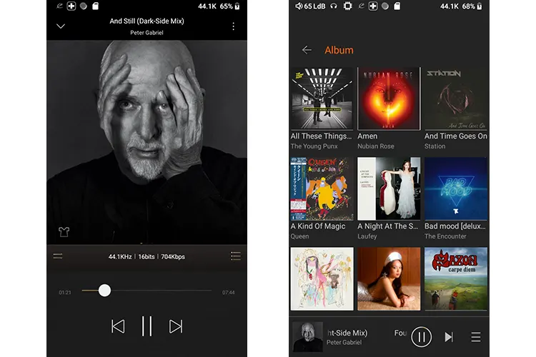
Media management gets pride of place on the home screen with a flat navigation system or direct access to the main categories such as album, artist, or Genre.
The flow is much the same as the N3Pro but the experience has improved with the bigger screen for proper artwork displays, smoother animation, and faster scrolling. Also, the older 20k file scan limit from the N3Pro no longer applies to the N3Ultra.
It’s a similar experience with playback on the N3Ultra with a high degree of overlap with the N3Pro’s HiBy OS regarding core functionality such as playlist management. The difference is that glossier presentation with one or two value-added features such as playback control theme switching and quicker access to the play queue.
If you have used HiByMusic before then the in-depth audio options menu on the N3Ultra is also a familiar experience. Value-added features such as replay gain and gapless controls are there as well as an Exclusive HQ USB Mode for OTG dongle attachment.
As mentioned the depth of choice is now richer. For example, the gapless playback on the N3Pro was a simple on-and-off, now you have a transitions menu with gapless, fade controls, and the ability to insert a period of silence where none exists.
Given that the Android 8.1 system is heavily customized the system settings are limited to a few options such as display controls, pulsar brightness, language formats, and a firmware update prompter.
I did notice that some remnants of the full Android experience linger with prompts for wallpaper and time in some labeling but no wallpaper or time options are available. I would suggest Cayin tighten those aspects down a bit more in future firmware updates.
PEQ
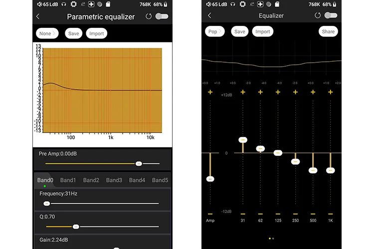
One major feature in the N3Ultra that HiBy recently developed and was not part of the N3Pro OS is a new PEQ system.
I am a big fan of PEQ but only when it is done correctly as those new to how it works can be easily confused by the depth of granular controls a good system can offer.
Perhaps the best implementation I know of is the iBasso Mango Player app version because of the direct touch control over the frequency range allowed with each filter.
Now, the N3Ultra 10-band version comes close in terms of ease of use. I find it much more useful when compared to the alternative packaged EQ system, especially with its Pre Amp control to limit the potential for distortion.
However, it lacks a touch control system over the FR GUI and offers fewer ‘type’ options with just 3 in total as opposed to 6 or 7. That means individual bands are managed via the slider system below the frequency range.
Despite the slightly fiddlier UI, the PEQ works extremely well and for some, it’s a game changer for fine-tuning their paired IEM or headphones’ performance and tuning combined with the timbre modes from the N3Ultra. Simple narrow Q value peaking ‘types’ can transform a satisfactory listening experience into a great one.
Wired Options
USB-DAC
The N3Ultra is plug-and-play for both PC and Mac but you can also use the Cayin’s ASIO driver available on their website for download. I tested both the Windows WASAPI and ASIO via Foobar2000 and JRiver Media Center and could playback DSD128 files without any issues.
The default USB connection mode can be adjusted in the system settings under the USB submenu option with options for the DAC mode being one of them. You can elect to have it in a powered mode from the PC or unpowered, as in from the N3Ultra battery.
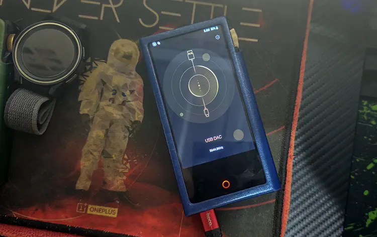
Once activated you get a simple screen but one that displays the sample rate during playback which I appreciate give players like the DX180 do not display that information.
You also get a small cog icon in the top right-hand corner that allows you access to the audio settings for multiple adjustments such as gain, filters, and channel balancing.
The only faux pas in the USB-DAC screen is the inability to navigate your way out of the USB-DAC mode while keeping it plugged into a USB connection. To exit back to local playback you need to disconnect the cable.
USB-OTG
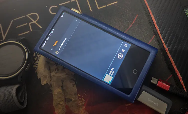
You can connect the N3Ultra with either a flash drive for additional memory expansion or output via OTG digital audio to a dongle or a compatible 3rd party DAC of your choice.
Since HiByMusic forms the bedrock for the media management experience it will scan both the external microSD card and any OTG flash drive connected at the same time and put all media under the same library.
That is a valuable integrative feature to have for media management and something that competitors such as the DX180’s Mango Player do not offer.
Compatibility is reassuring with tested dongles including Cayin’s RU6 and RU7, as well as the HiBy FC6, Luxury & Precision’s W2, and a 64GB Sansdisk flash drive.
All connected without a hitch though I advise activating the Exclusive HQ USB mode to allow you to bypass the internal Android controller for digital audio as the sound is much more dynamic with it turned on.
Click on page 3 below for my sound impressions and recommended pairings.

