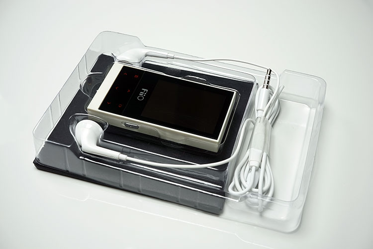
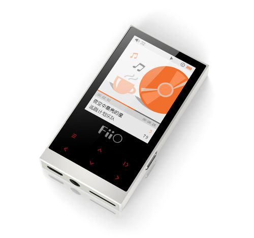
The FiiO M3 is a new entry-level DAP featuring a 96kHz capable, 24-bit Cirrus Logic CS42L51 chip, and 8GB onboard memory. It is priced at $55.
Disclaimer: The FiiO M3 sent to us is a sample in exchange for our honest opinion. We thank FiiO for this opportunity.
To learn more about FiiO reviews on Headfonics you can click here.
Note, this review follows our new scoring guidelines for 2020 which you can read up on here.
There are a lot of FiiO Dap’s out right now in the market. The X range and the 2nd Gen X Range with the X1 and X3ii being the smallest and cheapest among them.
I wrote a while ago that I thought the X1 was good value but it faced stiff competition on various fronts from the likes of the Sanza range (Clip etc) or the iPod Nano that were retailing in and around the same price marker.
Well someone must have been listening because now we have the M3 DAP from FiiO and its very small, very cute and retails for just $55.
This is a brand new letter from FiiO. This is the first time they have used the letter “M” in their product line and interestingly they have started at M3. With the X series, they also started with the X3 and left enough room to launch the X1 so I am sort of wondering if the budget range, which I presume this is, will have an even cheaper M1 at some stage later.
However, honestly, at $55 they are practically giving this away. There is a lot going on here for $55 and I am telling you right now this could be the best budget DAP on the market for 2015.
What is it?
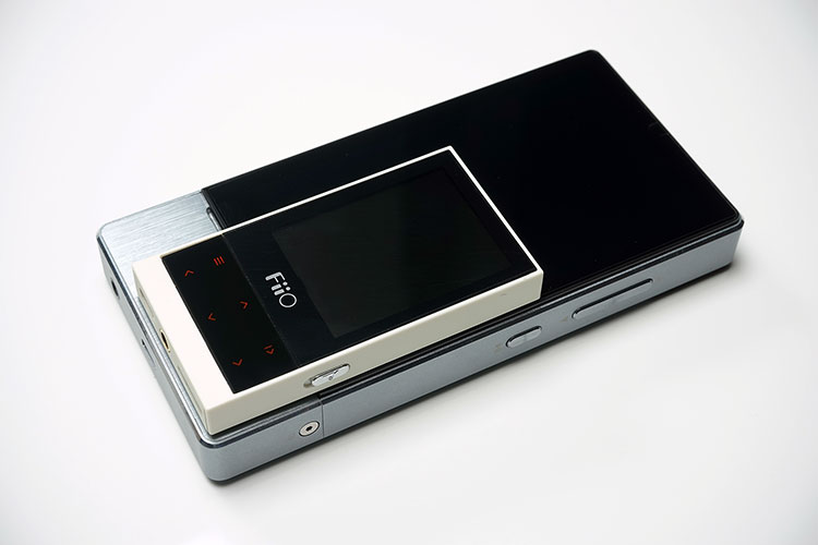
Well, it’s a DAP, but a darn cheap one at $55 and a slither of a thing at just 74 mm× 39.7 mm× 9.1 mm and weighing in at 40g. It is about as long as your index finger, smaller than the front of a credit card, and about the same thickness as one of those Nokia slabs that came out before they got re-branded.
In short, this thing is truly pocketable. It has its own proprietary UI, which I suspect is a sub-genre of the X series UI but heavily stripped down and simplified.
It also has an excellent battery life of around 20-24 hours, can play lossless and lossy, take a 64gb SD card, plug and play, and, to my surprise, didn’t suck when jacked into an HE1000.
The M3 actually sounds pretty good for $55. You also get a set of cheap plastic IEM’s with the package so you can just start listening right away but I suspect anyone buying this will have something of their own to jack into.
Positioning
This places it though right in the heart of Clip territory and to be frank there is not much else I can think of at this price point that is worth comparing to. Sadly, the classic Clip range is, well, getting a bit clipped on availability.
The SoC used in the Clip+/Clip Zip (AS3525A/AS3525B) is very hard to acquire and new Clip units are now the Jam and the Sport using the atj2127 SoC priced in the sub $50 range. Most feedback on the newer versions are that they sound ok, play lossless but are quite fragile with fixed storage. Something for the gym as they say.
Yet the M3 could be equally ‘fitness outing’ worthy such are its dimensions and it does look built for a knock or two. I guess time will tell if this was intended to target the fitness clubs. Accessories are usually a good sign with Noisy Motel already launching a sports armband for $30 for the M3 specifically.
Build quality
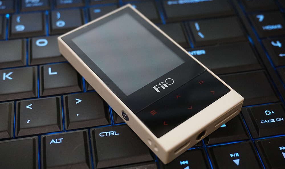
Ok so we know it is small but to get to that $55 marker do not expect rock-solid machined CNC because it is not, it is hard plastic. That being said the M3’s body is well cut, well finished, and lacking in rough edges or bad molding technique.
The corners are not the rounded type you would find on an X7 but it does not feel terribly sharp either so I can’t see this one stabbing you in the groin if it is resting in your pocket.
The shell is comprised of two parts with the top and sides resting on a bottom plate. The join lines are subtle and placed on the underside of the M3 so the whole build feels monolithic rather than two parts joined together.
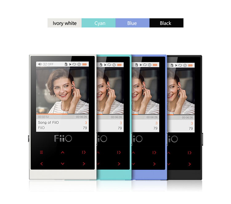
The M3 is also set up for the consumer market which means it does have a variety of color combinations to pick from. The one here is what FiiO has described as Ivory which comes as an off white shell with a cream to light tan base and a black inset front led screen and control panel.
It also comes in an all-black color, Cyan, and Blue colors so in all you have four different colors to choose from. Personally I think the all-black is the ideal choice but the iGadget fans might opt for one of the brighter variants to go with their shiny Benetton monotone tops.
The Ivory was the launch color and it is a sensible medium between the dark side and the light.
Front
The front of the M3 is comprised of two sections, though from afar it looks like a single front faceplate. The larger of the two sections is a 2.0″, TFT screen 240 x 320 pixel in quality surrounded by a 0.5mm bezel with the FiiO logo at the bottom.
It is a small screen and compared to the X1 upwards it nothing special but given the price range, it is a bit more sophisticated than the old Clip screens.
The viewing angle is a bit restricted and it does have some glare under the sun. Colors have decent depth though not a huge amount of pop.
The second section at the bottom is the physical control panel for playback and menu access. On the surface, it looks like it might be touch-sensitive but its actually a single physical panel that you must press down over the icon labels in order to activate a command on the M3’s UI.
This is not a touch-sensitive DAP either on the screen or on the controls. It is $55 after all. The options on the front panel are:
- Menu access
- Back, forward (long press for rewind and fast forward)
- Volume up or volume down
- Play/Pause or select/enter
All buttons glow red when pressed but fade down a little after pressing so it is not terribly distracting during use and saves a bit on battery power in the process.
Sides
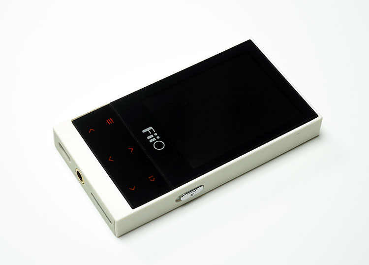
A rather simplistic affair with but two physical buttons in silver chrome, one on each side in a slightly recessed slot. The right slot houses a lock key to prevent accidentally pressing the menu buttons on the top panel and the power on button is the button on the left side panel.
The power button also allows you to turn off and on the LCD screen depending on your needs. Powering off the LCD lengthens the battery significantly during playback according to FiiO.
The front panel houses a micro USB slot for charging, 3.5mm jack output for headphones or IEM of choice, and a single microSD card slot that can hold up to 64Gb of memory.
In total the M3 can take 72Gb of memory with 8GB onboard also officially (with a 4k file limit). The 3.5mm jack port is the only out of the M3 and it cannot take USB OTG nor does it have any line out or DAC functionality. It is straight to headphones and earphones only.
FiiO M3 Internal Hardware
The emphasis on the design architecture is isolation. The concept being that each aspect of the internal design can be powered up or down (not by you of course) to conserve energy as well as using parts and components that are light in power consumption in order to achieve those long battery cycles.
SoC
To allow this process FiiO has opted for an Actions ATJ2129 SoC (system on a chip) which controls all service-based functions in the M3 shutting down any unnecessary functions when not called upon. Given the size of the battery is just 550 mAh that is a wise move by FiiO to keep the whole system highly efficient.
DAC
The DAC is a 96kHz, 24-bit Cirrus Logic CS42L51 chip, and if you are canny enough you will have spotted that it’s the same family of chips used for audio in the previous generation of iPhones.
Bear in mind though Apple has seen fit to gimp the resolution output of their CS chips before preventing hi-res output so thankfully FiiO has not followed that route.
The DAC chip is also very much a 2 channel mobile solution with a low draw on the battery and makes perfect sense in a lightweight solution such as the M3. It can decode pretty much most mainstream lossless and lossy files including MP3, WMA, OGG, M4A, and APE 48/16, FLAC 48/24, WAV 96/24.
Honestly, it covers all the bases with regards to decoding audio on a shoestring budget.
Packaging & Extras
The M3 packaging at this level is starting to follow a road map similar to that of the K1 and A1. Whilst it does not have a plastic see-through veneer to view the unit it does seem to have the same branding concept and quality of box.
I guess this is how FiiO will want their new starter gear to look like for the next year or two and it does look markedly cheaper than the X7 boxing at the other end of the scale. Now inside you have a lanyard write strap, USB charging cable, screen protectors (one is already on ready to go), and a white set of open earbuds.
That is a first I think for FiiO to throw in a set of free earbuds. What’s more, it has a remote mic and playback inline on the buds which I think those want to just buy and roll with it will find very useful.
Sadly, I hate earbuds, everyone knows that and whilst these are not the worst I have heard (actually strike that, they sound ok actually), I just couldn’t get a comfortable fit in my very abused ear canals. Sound impressions instead were done with my own particular selection of vastly overpriced IEM’s and flagship planars.
Why? because I can. Joking aside I grabbed some RHA’s. Fidue etc just to get the budget match right but I couldn’t resist plugging it into the HE1k a month ago and it didn’t suck. Not that I am suggesting you use this pairing but it was a fun experiment that didn’t go badly wrong.
Software
Being $55 you should not expect an apps library and smooth flowing gestures. Something has to give and the OS is one of those areas that has been slimmed right down to the bare essentials of a modern OS.
On the other hand, Clip OS, it is not. It is much more than a set of single lines of data on a black screen. Presentation-wise it does have those rather quaint Chinese English font which to me looks like an anemic Times New Roman or something similar with a sans serif coating.
I am well used to it and to be honest its reasonably easy to read but it just doesn’t have a high aesthetics feel about it compared to a Nano or the X series.
Controls
The menu system is entirely physical button-operated and as such the playback buttons on the M3 double time on menu options. The far left button with the horizontal 4 lines allows you to quickly flick between the play screen and the home page/central menu options page.
From there you can navigate to your desired menu option through the center up and down arrow buttons which also act as the volume controls during playback. Once highlighted vertically you can select the option with the far-right top button which also acts as the play/pause button during playback.
During playback, a long press of the top left home button will give you access to a secondary menu page which includes play mode, system settings, delete a track, track information, the equalizer with some presets, playlist generator and playback repeat, loop or continuous (note no gapless support unless using cue files).
Now for me, some of these would have been better off on the home page such as system settings rather than the media library. If you want to start setting up your player these options are buried a bit too deeply into the system itself and are not immediately obvious or user friendly.
You will learn it quickly though since after all there are only really 4-5 menu screens in this OS.
Menu systems
There are two core menus but for me, they are back to front. The main system settings, equalizer, and playlist maker are tried to the playback screen with a long home button press. The short home button press takes you to the media library selector.
It could be a question of personal preference here because for some the media library will be the starting point for those who have no interest in fiddling with system settings but I want to start my DAP daily with a tweak on the entire setup, update my library, change the sleep timer and maybe pick a preset equalizer before I choose my song.
It could be construed as six of one, half a dozen of the other but it is my personal preference. Those coming from the X series will be familiar with the main system and playback settings such as left-right balance, memory volume, preferred display, brightness and timer options. You can also update the firmware from this menu.
Firmware
At the time of writing FM1.05 just came out and sadly I didn’t have time to go back and rewrite another review for the new firmware (who does?) but in essence, some of the concerns I had do seem to have been remedied:
1. Added option to go to Settings by holding the menu button while not at the Now Playing screen (Yes please!)
2. Added On/Off reminder for Fade in/Fade out.
3. Fixed issue where the player would display format error by certain operations.
4. Fixed issue where the genre tag of some APE files was read incorrectly (thank you)
5. Fixed issue where the battery gauge couldn’t move when charging under certain interfaces.
Forward But Not Always Backward
The process for accessing song choices and moving back and forth is not terribly logical nor does it really follow any 3-click drill down.
For the more advanced version of this OS in the X-series, you can drill down to a song choice and move back out on the same path or go straight to the home menu and back into another menu option within a few clicks or cycles of the jog wheel.
The M3 UI can take you deep into the folder or media library quite quickly, however, you cannot reverse back out on the same path once you start playing the track. All you can do is click home again and start moving around the folders again. I hope in time the firmware of the M3 can develop to allow you to go back to your folder or song list choice rather than start again.
The good news is navigation through the main menu itself is more linear and allows you to drill down and back out the same path via the home button so if it can be achieved in that way then I think it can be done eventually in the media library once you hit the playback screen.
Boot Times
The benefits of a slimmed-down OS is a fast boot time and the M3 is pretty fast compared to its older siblings with an approximate power on to home screen boot time of 4 seconds. It does boot into the play screen though so you will have to manually navigate back to the main menu if you want to fiddle with any options.
The power downtime is around 2 seconds. Both power on and power off is activated by a single long press of the physical power button on the left panel. A short press will turn off the LED screen only.
Playback
The media library itself is reasonably accurate though one of my album titles didn’t get grabbed and ended up being an orphan album of sorts. Artists’ names and the general list of sing titles came out accurately in the library.
What I am delighted to see though is FiiO adopting a more structured drill down from artist to the album to the song which I much prefer to the older flatter big lists they did in the Gen 1 X series. How many times have I had multiple albums under one artist only to find the album breakdown not there, well in the M3 that album breakdown is there.
Sadly, no genre category on the M3 that I can see off on the current firmware 1.03. so that might be an issue for some people who do not playlists.
You can also access tracks via the folder explore option on the main menu and that is my normal route given how OCD I am about file naming but note the internal and external memories are not integrated so in effect you are moving around two different areas for track selection.
Click on Page 2 below for sound Impressions & Comparisons


