Software Impressions
Speed
Shanling, much like FiiO (outside of the X7), Cayin and Hidizs use variations of an open Linux system for their GUI on the M5. This version builds on the existing platform used in the M2 and M3 and it does look significantly more refined than the awkward and unintuitive M3 system.
Whilst it is more simplistic than the versions of Android being used by the likes of AK I will give it one thing it is very stable and increasingly speedy with the improved processor speed in the M5.
Boot time is a mere 5 seconds which is about 3 seconds faster than the iteration of this software on the M3 and power down time is one second or less. No noticeable lags are moving from menu to menu with perhaps the slowest being the file browser but that is very marginal.
Bugs are few and far between, in fact, I have yet to have one in 2 months of testing. The large screen real estate also makes it a much easier GUI to work with, though at the time of writing, there is no indication this GUI OS will be touch-capable.
Usability
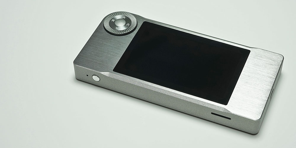
Shanling’s command dial is still the physical hub of the M5 user interface and controls all aspects of navigation, selection, and playback control. It is still in the top right-hand corner giving it a slightly awkward usability factor when attempting to do anything with it.
That being said, the smaller build size of the M5 and the steadier command wheel build quality does make it a lot easier to use than the old M3 which was huge and impossible to use with a single hand in comparison to the M5. With the M5 single hand use is possible whether in the right or left hand.
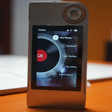
I am glad that booting to the playback screen has been ditched in favor of a dedicated boot to the “home” screen.
It makes far more sense with the playback screen, “Now Playing”, a single click away should you need it. A central home screen gives you far more control over what you want to do and is more intuitive to boot. The new screen design is a huge step up on the old M3 home menu and looks fresh with plenty of pop on the IPS LCD panel.
Settings
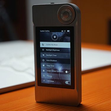
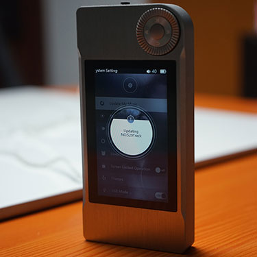
As in the original OS, you have two types of settings; play and system. This time, they are far more accessible on the front home screen. Within the system settings you can control LCD brightness and backlight timer to improve battery performance as well as control when to shut down the system automatically should you forget to turn it off.
You can also elect to change the USB mode from the system settings to convert to DAC mode upon connecting with a PC or mount the micro SD card.
Note the M5 does not come with onboard memory but you can load up to 128GB officially. I am pretty sure you can go 256GB and beyond but have yet to test it as I prefer using 64GB high-performance cards (less to lose should you get bad blocks).
Curiously you can also update your media library from the system settings. I think it should be under the play settings but it’s ‘six of one half a dozen of the other’ and not a big issue.
The system settings menu also allows you to control the dual line out/digital output signal as well as update the firmware as and when required. You can also select one of four themes in the systems menu. Each theme has a color variation though the core system and font remain unchanged.
The cleanest one seems to be the last of the four with a vibrant two-tone red and violet theme which makes the font very easy to read compared to the other themes that mask the legibility a bit more.
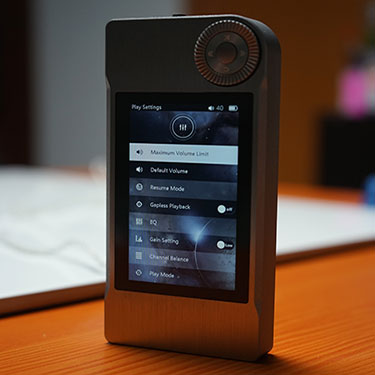
Play Settings
Play settings also follow a familiar route in this OS and those with previous M DAP series or FiiO and Cayin will understand where I am coming from on this OS.
Play settings allow a wealth of options that adjust how your media playback on the M5. This includes volume macro controls, gapless playback, the EQ and gain as well as channel balancing and folder skipping.
The EQ is a 10-band graphic EQ with 8 preset options including; metal, jazz, sentimental, vocal, dance, pop, classical, and rock. It’s fairly standard but you do have a custom EQ option to create your own as well as a reset button should you get tired of the EQ.
I play flat 99% of the time but it is a bit of harmless fun for those who like to color up their sound. The one area that I do sometimes like to do within a custom EQ is to try to flatten out any spikes in the lower treble where possible with bright earphones.
Media Management
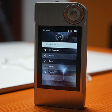
Media management is split into two home screen options; file browser and My Music. My Music generates the library according to the meta tags of the tracks and includes playlists and favorites sections.
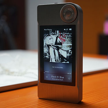
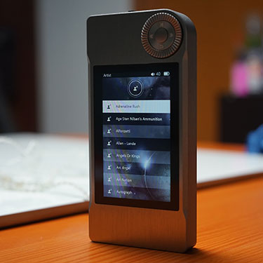
You can create favorites and playlists on the go by long pressing the central confirm button on the command dial during playback. Tag breakdowns are standard norms including album, genre, and artist.
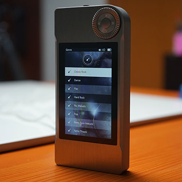
Once again there is a missed opportunity here to do a proper drill down. For instance, Genre selection gives you a list of genres but after that, it is straight to a long list of songs.
That’s not very useful if you have but one genre and 1000 songs. There is still a real need to break that down to Genre-artists-album-songs and at this point, I do not believe this software is capable of doing that since it is inherent in every version of this software I have seen to date.
Media updating from the system library is fast and it is accurate though with only 29 out of 1100 tracks coming up with incorrect genre tags and more than likely that is a result of a wonky tagging in the song itself (flacs) than a problem with the M5 software. In album and artist tag reading the accuracy was 100% and with proper drill downs to album and song.
File Browser
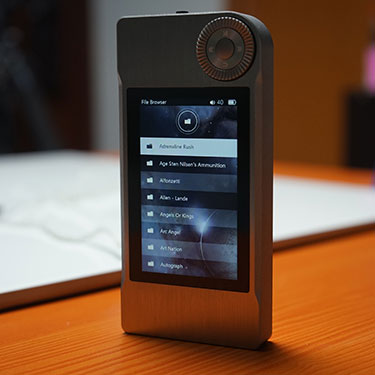
The second option for media management is the traditional file browser which I tend to use a little more often as I am pretty OCD with my file organizing. If you’re not a fan of tagging, then the file browser is a pretty easy way to navigate to the file of your choice on the micro SD card and will accurately reflect how you have loaded your card with folders and files.
Click on page 3 below for sound Impressions

