Design
Form Factor
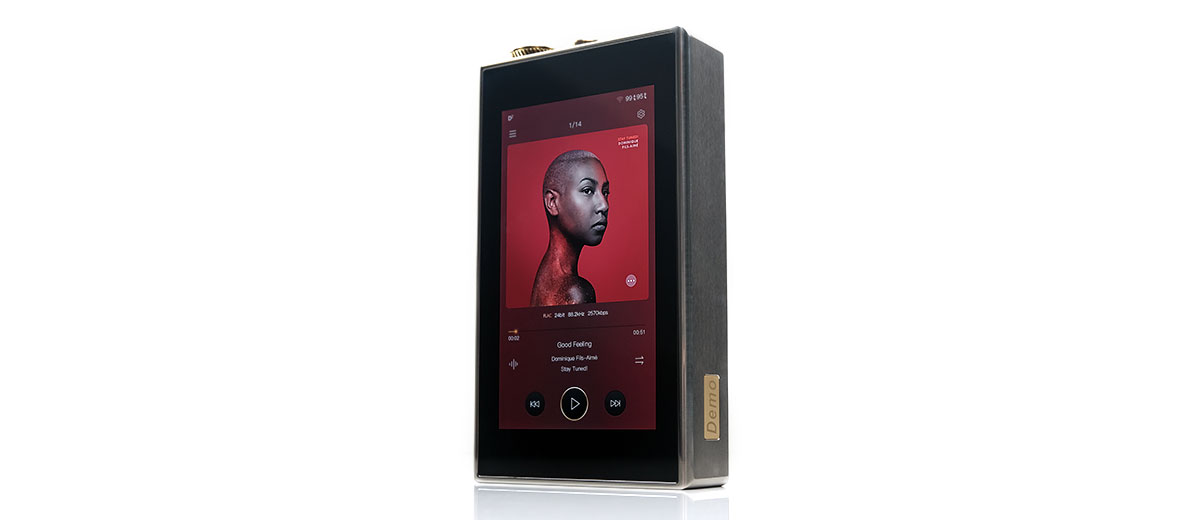
The large rectangular form factor is relatively unchanged from the previous DX300 MAX save for some changes in the front facia control options.
However, surprisingly, the DX320 MAX Ti weighs less than the previous model at 620g versus a shade over 800g for the DX300 MAX due to the lighter titanium materials. It will feel easier in the hand compared to the previous generation though by DAP standards it is still a huge device.
But not the biggest DAP anymore! That accolade goes to the FiiO M17 which weighs in at almost the same weight, 610g but is volumetrically bigger at 156.4mm tall, 88.5mm wide, and 28mm deep compared to the DX320 MAX Ti’s 146 x 86 x 30mm dimensions.
Aesthetics
The finishing is beautiful as always. The TC4 aerospace-grade Titanium housing combined with some soft curving and a slightly ‘aged’ finish has a certain timeless appeal to my eyes.
The branded matte cadet grey rear plate of the DX300 MAX has also been modified slightly to allow you to unscrew it and replace the supplied battery packs if so required which is huge news for those fishing for some serious longevity in the DX320 MAX Ti’s performance.
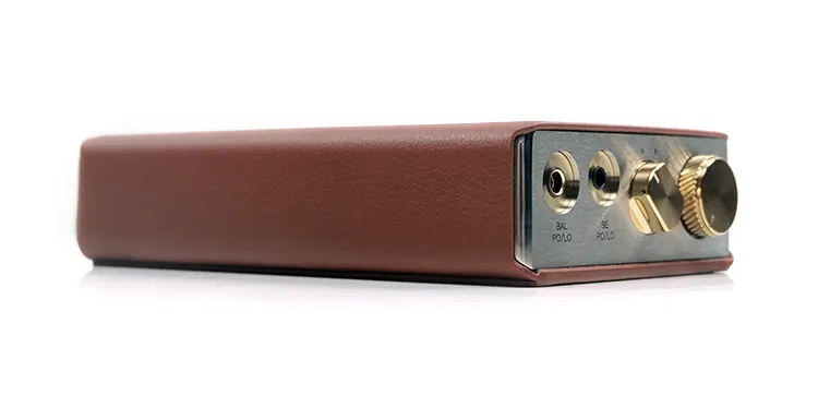
Both the analog potentiometer, gain switch, and sockets to the rear of the DX320 MAX Ti are all 24k gold-plated creating some nice visual focus points among the otherwise grey and chrome aesthetics of the rest of the design.
One thing that might make your eye twitch is the slight offset of the 3.5mm PO/LO beside the balanced version. It’s the same setup actually as the DX300 MAX in terms of alignment just shifted over one step to allow space for the large gain switch to be included.
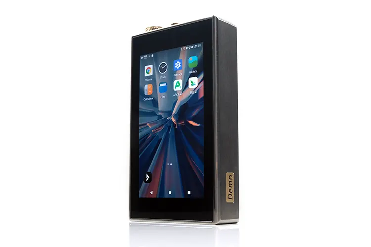
The DX320 MAX Ti screen is unchanged from the previous generation. That means an On-Cell 5″ 1080P IPS multi-touch capacitive panel with good density rates and a 60Hz refresh rate.
I can see why they went with it but maybe in 2023, a slightly taller screen and less bezel would have been ideal unless engineering-wise that would have created issues with the battery life. Still, the viewing angle of the DX300 MAX screen is still very good, with clear legibility from wide angles and relatively smooth scrolling performance.
I/O
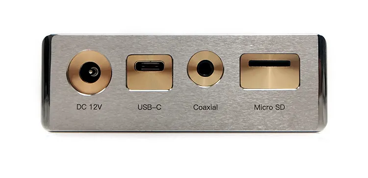
All the digital I/O on the DX320 MAX Ti is to the rear and all the analog PO/LO including volume and gain control is to the front. It is a tried and tested formula since the very start of the MAX series with the DX220 MAX.
This generation’s rear panel seems unchanged from the last generation save for a slight change in the size of the microSD slot and the DC12V port opening size. You get a USB-C port to charge the digital side of the DX320 MAX Ti, as well as data transfer, OTG, and USB-DAC duties. You also have a coaxial output for more traditional HiFi connections.
Just to note the DC plug is not the same as the previous generations which were 12-18V. This one is strictly 12V so do not use the other MAX chargers for the analog amplifier.
The microSD slot thinness did give me a slight issue when attempting to get the card out as it was not a simple case of push-in and snap-out due to blocking from the lower ledge of the slot. I did have to use a small, pointed device to ensure it came out smoothly without sticking.
If you are uneasy about using external memory cards in general then the device also offers 128GB of onboard memory with OTG flash card expansion capability via USB-C, (Android only).
Labeling and spacing for both the front and back, as before, are excellent with good legibility levels and plenty of space around them to prevent them from being blocked from sight by the plugs.
Controls
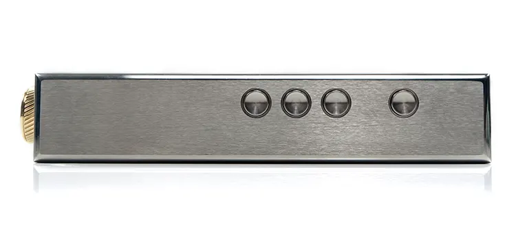
The DX320 MAX Ti control options are largely unchanged from the DX300 MAX with the inclusion of playback controls and a power button on the right-side panel.
You get a set of 3 playback buttons and a separate similarly designed power button a little further away. Only this time they are slightly raised with a stronger central indentation compared to the flush setting of the DX300 MAX.
I am presuming this is for better tactile control when the case is put on or when you are operating the device ‘blind’. It certainly feels a lot more intuitive and a lot easier to find using touch only.
Android and Mango OS also provide you with the ability to switch the forward or previous functionality of the buttons via their respective settings menu. That also means no labels on the physical button but I personally found it simple and intuitive to use without labels.
Touch Control
The DX320 MAX Ti touchscreen will cover pretty much every other control outside of initiating analog volume control, power on/off, and LCD on/off.
With the latest firmware, you can also operate the digital volume from the touch OS for PCM playback but not the analog potentiometer since it is completely separate from the digital side. There is also no double-tap-to-wake functionality in the DX320 MAX.
You can track the volume setting for the DAC on the front OS drop-down bar which has an individual volume display. There is no display for the analog output level.
The digital volume can be seen as a pre-amp setting though you can also set it to 100 maximum and lock it there. Either way, you have the ability to control the volume of the device to a very fine level which can sometimes be difficult with a stepped attenuator alone.
Aside from that, you do have capacitive multi-gesture support including pinch and zoom, and various apps access to enhance keyboard support such as SwiftKey which I much prefer to the stock version.
Packaging & Accessories
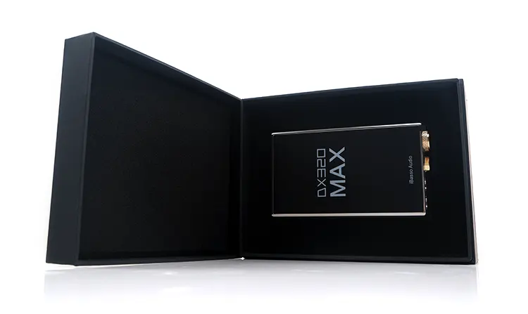
Not much has changed with the DX320 MAX Ti packaging over the previous iterations. It is still a low-profile sturdy black box with a display lid on a hinge and everything neatly packed into two well-protected foam and felt layers on the inside.
The unit itself has a protective black sticker on the front and a number of screen protectors available as accessories in a black envelope along with the manual and warranty card. There is no screen protector applied to the front or rear and to be honest, iBasso is not hugely encouraging you to apply them to ensure the screen touch performance is not affected.
Accessories
The accessory line-up is slightly unchanged from the DX300 MAX package. You no longer get a 4.4 mm balanced to 3.5mm single-ended cable or a 2.5mm balanced to 4.4mm balanced adapter (CA02). What you do get is as follows:
3 x Screen protective films
1 x Leather case
1 x USB Type-C Charging/Data Cable
1 x Coaxial (SPDIF) Cable
1 x Burn-In Cable
1 x User Manual
1 x Warranty Card
The DX320 MAX Ti case has changed also in color and design. It’s gone back to a tan or brown color that has a closer resemblance to the older DX220 MAX case than the blue of the DX300 MAX version.
The frame of the design is more like the DX300 MAX case so it’s tight and snug and fits the player really well but so I have no fears of it ever sliding out during use. The newly styled button array is more visible than before but I would still urge some caution as a firm grip across both panels can still activate some of the controls.
It also has an attractive Dignis-style metal venting pattern on the rear with the DX320 MAX Ti and iBasso branding.
Click on page 3 below for software changes.

