Software
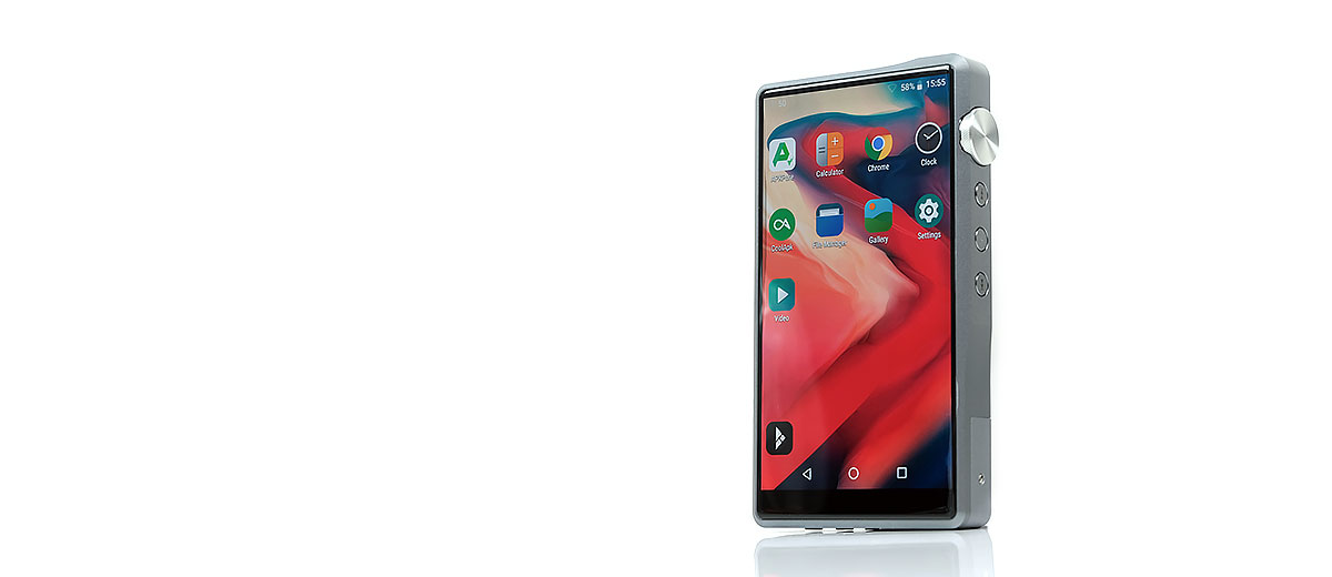
Android Oreo
The DX220 comes with Android Oreo 8.1 out of the box and our current review build number is 1.08.050. The review version of the Mango app is firmware V2.0.0 and for Mango OS it is V1.08.050.
I am hesitant to draw a correlation between differing DAP platforms and firmware but the latest DX200 FW is 1.06 meaning that it is possible the DX200 will get a subsequent upgrade to the DX220 1.08 version that brings in that fresh Mango OS and App, but we shall see.
For now, the DX220 is the only DX platform with bit-perfect Android 8 and the new Mango OS. What that means is you get pretty much everything that the DX200 can do with Oreo including a much more expansive Bluetooth codec decoding capability including LDAC.
Also, in our testing, the latest Windows 10 DAC driver on the iBasso website is compatible with the DX220 since they share the same XMOS USB receiver/Thesycon USB audio driver.
Performance Benchmarking
One of the key upgrades iBasso has done on the DX220 compared to the DX200 is to increase the onboard RAM from 2GB to 4GB. Our testing seems to indicate that this may have far-reaching positive consequences for the future stability of the DX220 platform.
This also seems a logical step considering Android 6 was already impacting the 2GB of the DX200 in our performance tests and the DX220 is also using the same 8-core 64BIT ARMv8 processor as its predecessor.
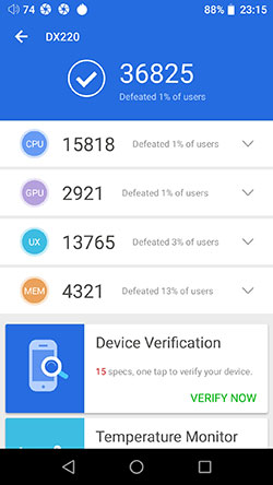
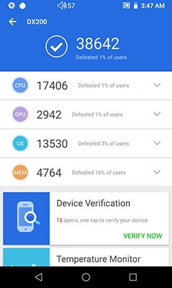
Below are our Antutu Benchmark 7.1.7 testing outcomes to show you the DX200 and DX220 performance differences. Both outcomes were obtained on the 8th consecutive test with fresh factory resets on both, screen brightness at 50%, all apps closed bar Antutu and wifi, BT turned off.
DX200 Vs DX220
Conclusions
The additional 4GB of the DX220 is not about making the DX220 faster than the DX200 with both on their latest firmware. Both these DAP’s CPUs are the same for their respective clock rates. It is however about making it more stable when the tasks and apps rack up and coping with that new 5″ screen.
Numbers
With the addition of a 5″ 1080p IPS panel, which is more demanding than the older 4.2″ 720p panel of the DX200, the GUI of the DX220 holds up extremely well. It should be lower, it is not and that is very satisfying. The rest of the point’s score differences are simply too marginal to cast any conclusive pointers as to which delivers better performance.
You could debate that the lower CPU/RAM score might point to some additional demands the DX220 platform is putting on them compared to the DX200.
Certainly, the DX220 has a few more features up its sleeve such as bit-perfect playback and native MQA decoding capability not to mention the 5″ screen. However, the overall gap is too small to make a conclusive statement without accounting for typical margins of error in these tests.
Android Navigation
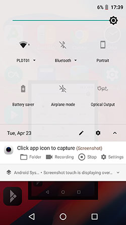
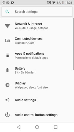
The DX220 navigates as you would expect using Oreo. That means using a drop-down menu combined with a deeper Android settings menu. There are also additional audio navigation controls inside the main Mango App for media library management.
You do not have an apps drawer, instead, the iBasso theme will build additional screens to accommodate downloaded apps. I advise downloading the Nova Launcher if you really need an apps drawer.
Drop-Down Bar
The drop-down menu will give you access to key features such as WiFi, BT, battery saver, screen brightness control, optical output, and the Android main settings menu cogwheel. One nifty little addition to the drop-down bar is the display of the true sample rate that the DAC is working on.
Within the Mango app, you have a further level of navigation for media scanning, USB DAC, and a set of comprehensive audio controls such as their new PMEQ app, digital filters, channel balancing, replay gain, and gapless. Note these are exclusive to the app only whereas the drop-down menu audio settings will apply to all media apps.
Features
Mango
Mango is probably the most important ‘new feature’ out of the box for the DX220. Both the DX200 and DX220 now use Android Oreo so the experience is quite similar on that level. However, Mango on the DX220 is a whole new experience and much closer to how I would want my stock media player to look and act.
Is it the finished article? No, not yet, not on this firmware but its framework is much better than the original Mango so subsequent firmware updates should be able to expand on it.
Mango App
Menu System
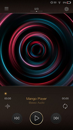
Let’s start with the app version. The original Mango player menu system was visually quite blocky with a lot of left and right-swiping. The new player does away with that and delivers a more seamless menu access framework.
This allows you to tweak right everything right from the playback screen using a cogwheel icon top-right. This cogwheel, in turn, activates a quick drop-down menu with plenty of playback settings.
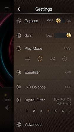
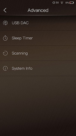
Pretty much all of the original tweaks from the previous Mango play settings are here but the drill-down navigation to activate them now requires far fewer clicks. This is a much better and faster approach to UI design.
Fewer screens mean faster and simpler usability in my book. Quick access options include gapless, their excellent 3-stage gain control, the play mode, and even 7 digital filters.
The only playback features that require an additional screen are the equalizer, L/R Balance, and the advanced menu sections. These are more complex settings that require their own space. You can also find the USB DAC and scanning features in the advanced section.
My one piece of advice to iBasso is to allow access to the cogwheel from the library management section of the Mango app also. It only appears on the playback screen which means an additional click away from what you are doing.
Library Management
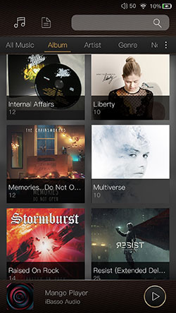
The media library on the Mango App is overhauled in much the same manner with far faster access to categories and playlists than before. It has shades of the FiiO and HiBy player but that is not a bad thing at all, in fact, I commend iBasso for going in this direction as those migrating from other similar platforms will adapt to the Mango framework a lot faster.
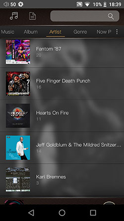
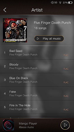
All the key tagging categories are now on the top row and you simply slide to the right or left to bring up the relevant category without changing screens. If you are not happy with the selected categories and how to view your music iBasso has also provided you with a way to tweak the layout and categories in the Mango app.
Customization
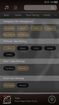
The small 3 dot icon on the far right of the category menu slider will bring up a ton of navigation and view customization settings. You can tweak the tag categories, the all music sorting, album view settings, and artist view settings. If you rather avoid tag views altogether the ‘creased page’ icon at the top right will allow you to navigate the internal storage manually.
I personally enjoy the Artwork view if I am not loading my library with too much stuff but once it gets long I revert to a list view which is called Thumbnail here. It is nice to have that choice.
Another final observation, the long-established Genre-artist-album-song drill-down of the older DX90 and DX150/200 series is now gone. It now has just a genre and a flat list of songs in alphabetical order.
This seems a backward step in library management, especially if you have a ton of tracks with the same genre as I do. Can we have the old Genre category drill-down back structure back, please?
Scanning & Accuracy
Scanning is by meta tags so the accuracy will largely depend on how well you have tagged your tracks. I had no issues with the speed taking less than a minute to scan over 2000 lossy and lossless tracks and for the ones that I have tagged properly they all showed up correctly in the library under each category.
However, the way it sorts those scanned tracks, particularly under the album song list and artists categories not ideal. The default is for the album song list to be in alphabetical order.
Ok, that’s one possibility but the default should always be according to song number and accurately reflect the order of the songs as published. There really should be a small option to switch between alphabetical and default album song lists.
Also, there is no album grouping under the Artist category just yet. I presume a new firmware will bring that in because it is quite difficult to manage without an album grouping for Artists with that many albums.
Parametric EQ
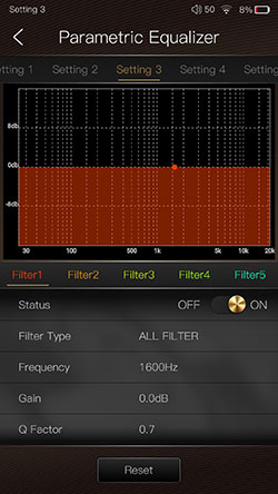
A first for iBasso and places them on par with the likes of the might Lotoo PAW Gold Touch, a PMEQ. Thank you very much indeed for including a seriously fun and interesting EQ system.
More than that it is pretty easy to use with complete access to 8 preset filter types, a touch directional F-Value point, gain control of between -20 and 20dB, and Q-Value control to narrow the bandwidth or focus on boosting instrumental elements such as a snare or kick drum attack from between 0.3 and 20.
I tend to find PMEQ particularly useful for monitors that are either overly dark or bright and I do not want to totally upset the balance but rather focus on one key area to bring out more presence such as percussion or low-end warmth.
Graphic EQ
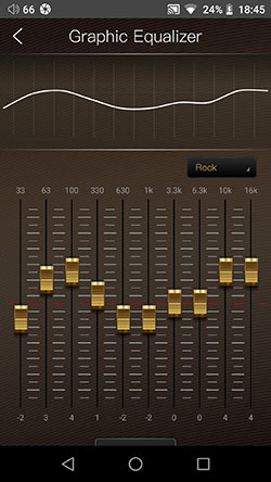
The graphic 10-band EQ on the DX220 seems to operate in the same manner as the original EQ on the DX200 stock Mango app. You have 5 presets such as Classic, Pop, and Rock as well as the ability to create your own custom EQ profile and save it. It does have a new lick of paint though with iBasso injecting a ‘mix desk’ vibe to the controls.
The Mango 10-band EQ performance is really good by the way. Testing it with an IT04 I got an easily identifiable change in each FR bandwidth either up and down with enough steps to be able to fine-tune how much warmth, the treble presence, or vocal forwardness I wanted in the mix.
This is not an overly subtle EQ tool but neither is it overblown nor did it end up distorting everything on the IT04.
A final note on the EQ systems available on the DX220. You cannot turn both the Graphical EQ and PMEQ on at the same time, you can only use one or the other.
Digital Filters
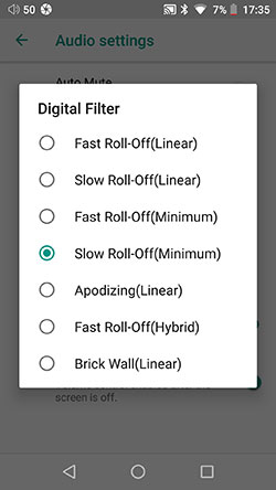
You get a choice of 7 digital filters on the DX220 via the Mango app (sourced from the ES9028PRO filter capability) and you can also access them from the Audio settings menu on Android. In truth, I am not a huge fan of digital filters though I know some swear by them. The nuanced changes can be very hard to detect unless you have a technically capable monitor.
Out of the 7 offered my preference seems to go for the slow-roll-off (minimum) option no 4 or Brick Wall (Linear) which tended to sound marginally fuller and airier than options such as Fast roll-off (linear) no 1. Your mileage may vary on this and I do not see digital filters as critical as the excellent PMEQ and GEQ options on the DX220.
Playback Features
Aesthetics
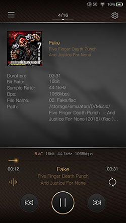
The playback screen looks incredibly impressive now with the new design, enhanced cover art space, and that big borderless 5″ screen. All the playback tweaking and track information options are now much easier to access also. Not that there are a huge plethora of new playback features, in fact, they are more or less the same, just far better organized.
Options
At the bottom left there is a small pulse bar type icon that brings up the track data. That replaces one of the icons on the side tray that flipped out when you poked the cover art.
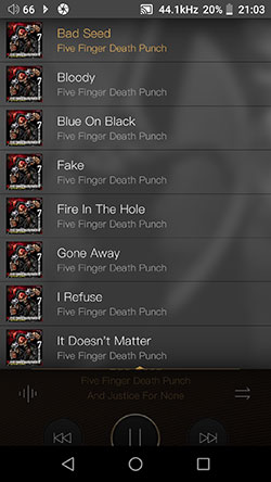
The original icon there from the older Mango brought a few options playback options such as the filters, gain, and gapless playback that are all neatly housed in the cogwheel drop-down menu at the top of the playback screen. Speaking of drop-down you can also pull down your current playlist in Mango OS by swiping from the top downwards.
Refining
The track timeline just below the track simple and bitrate data is also now much more touch-sensitive to move forward or reverse on the tracks being played. That bugged me on the old Mango player.
Finally, you actually get the song title, artist, and album information above the play button instead of having to poke the cover art to see what you are playing on the old Mango app.
Missing?
What is missing? The ability to add to a now playing playlist for the tracking you are playing is gone. On the old Mango app, you could bring out the right side tray and click on a plus sign and add it.
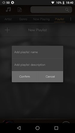
There does not seem to be any way of creating playlists directly from this screen anymore. This might bug a few users so I suggest looking at a way for it to go back in as an option in any future firmware update.
Mango OS
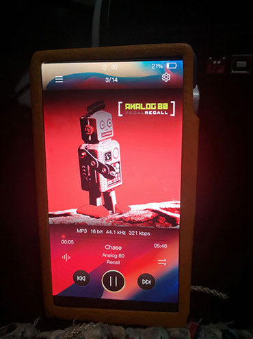
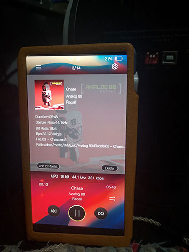
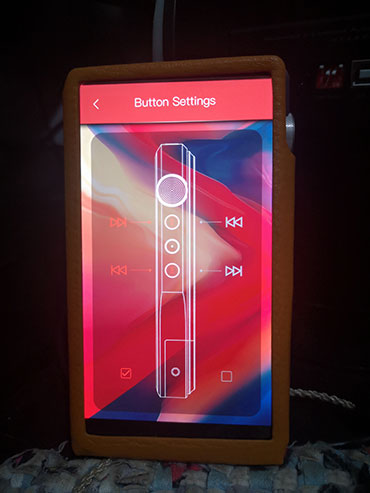
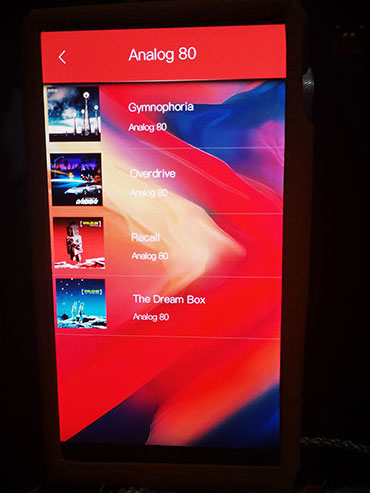
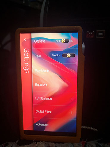
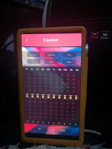
(We couldn’t screenshot Mango OS so apologies for the picture quality).
Mango OS, as you know, shuts down all the non-essential processes from the Android platform and instead optimizes the performance purely for audio. Essentially, give or take a few tweaks, what’s happening in the Mango App is more or less the same as Mango OS. However, there are some quirks in Mango OS, both positive and negative.
Mango OS Positives
On the positive side, (in the second picture above, the bottom of the greyed-out area on the screen), is the retention of the old Mango version of adding whatever is playing now to a playlist. This is not on the Mango app and you can access that when you are exploring the track data via the bottom left pulse bar icon.
Another nice positive is the Genre category in library management which does indeed have a proper drill down including artist, album, and song. This is much easier to work with than a flat song list so thanks for retaining this iBasso!
The final positive is retaining the physical button configuration from the Android platform, a most useful tool for those who like their forward and backward buttons on top or bottom.
Mango OS Neutrals
On the neutral side is the slight change from the easier access drop-down menus of the app to the more traditional Mango sliding-in menu screens. You can still instantly access them from the cogwheel in the top corner of the playback screen but it is a fresh new screen. The same is also with the top left icon for the library management called ‘My Music’.
The advanced section has more options because of the lack of global Android tweaks at your disposal. these include power management, languages, and display control.
Mango OS Negatives
The initial scan on the Mango app is faster than Mango OS’s first scan for the same tracks on the internal memory. I am not sure why that should be the case.
You also lose the use of the PMEQ option from the main app in Android mode with only the 10-band graphic EQ option available to you. It still works in the same manner and the effects are just as good but the PMEQ would have been the icing on the cake.
Click On Page 4 below for Sound Impressions & Matchability
Click On Page 5 below for Comparisons & Verdict

