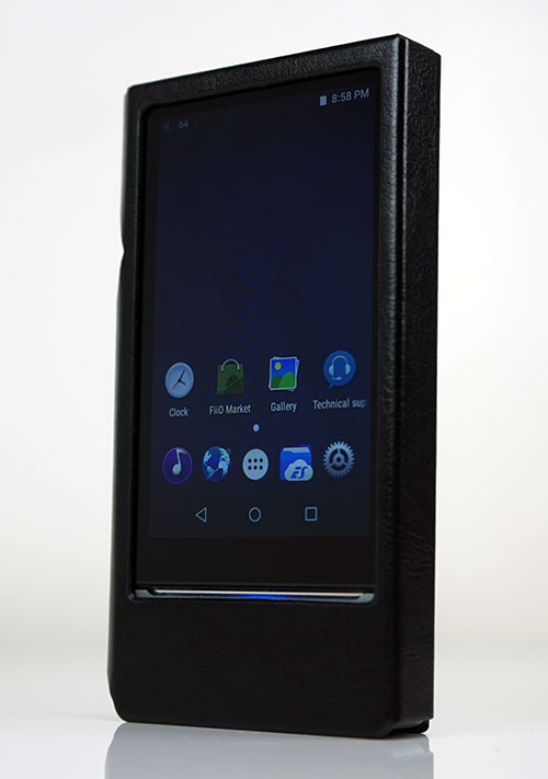
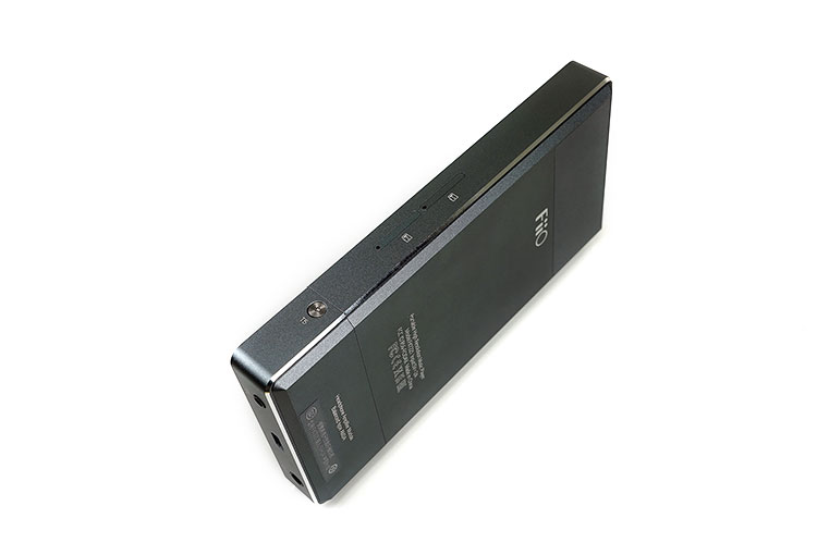
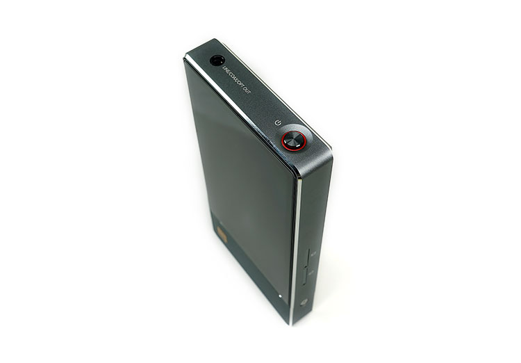
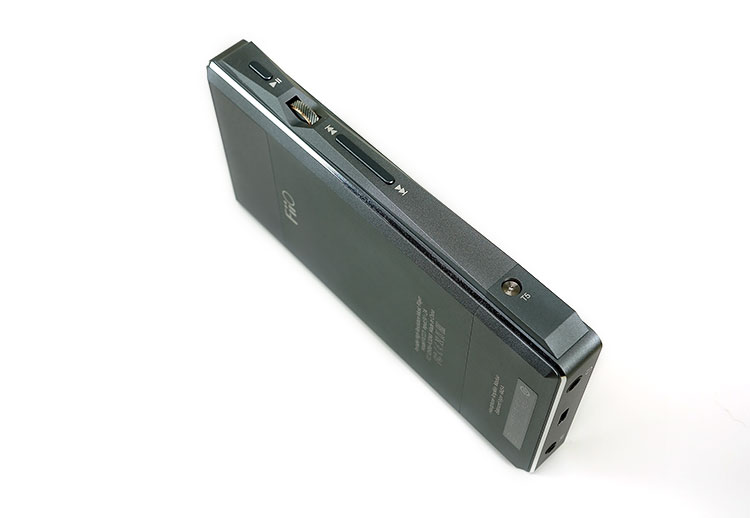
The FiiO X7 Mark II is a next-gen DAP or digital audio player featuring FiiO’s innovative amp card system, Android, and balanced output. It is priced at $649.99
Disclaimer: The FiiO X7 Mark II sent to us is a sample in exchange for our honest opinion in this review. We thank FiiO for this opportunity.
To learn more about FiiO reviews on Headfonics you can click here.
Note, this review follows our new scoring guidelines for 2021 which you can read up on here.
Given the rapid development of DAPs in the last 2 years, it is totally unsurprising to see FiiO launch a revised edition of their original and very successful X7 flagship DAP which launched in late 2015. FiiO has always been consistent in a product life cycle of around 18 months and the TOTL DAP cycle seems to be no different.
FiiO also has a habit of dovetailing their products with a defined vision and very often they lead to the market with a new product feature, that if successful, find themselves integrating into succeeding products.
It is not simply a trickle-down effect either. The $649.99 X7 Mark II draws a little from its little sibling, the X5iii, both in terms of firmware and design concepts. Some of what you see on the X7 Mark II has been refined from earlier X5iii customer feedback.
It is also one of the lead products for FiiO’s Infinity sound marketing campaign and has seen it launched simultaneously with other co-branded FiiO gear including the X3 Mark III, F9, and Q1 Mark II.
Whether or not the Infinity sound concept will take hold or not it is too early to tell but clearly, the X7 Mark II is the big ticket item and as such should have all the best “goodies” under the hood.
Tech Highlights
New DAC
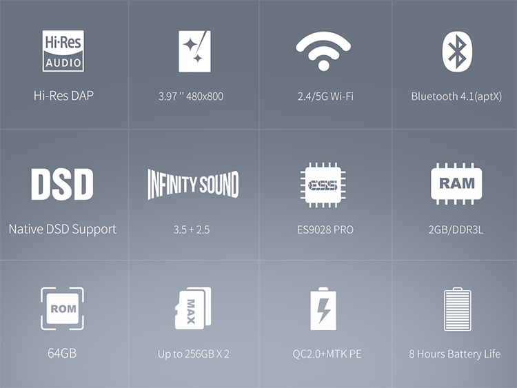
There are a ton of unique selling points on the new X7 Mark II but a few strong pitches stand out for me to lead off with. The first and foremost is the new DAC chipset that now seems to be the standard setter for high-end DAPs, the ES9028PRO.
I am a big fan of this chipset thus far in the implementations I have heard to date, be it the DX200 or the Oppo Sonica’s slightly higher-end ES9038PRO.
Though the X7 Mark II only deploys a single chip implementation unlike the dual DX200 design, the performance figures and tonal change up from the ES9018 chipset should provide a vastly superior though still neutral sound and one fixed on delivering plenty of detail.
Worried about treble glare, an often remarked tonal quality of the ES9018, then the Es9028PRo so far has been the antidote to those concerns.
The fact that the material cost of the ES9028PRO is considerably higher than the ES9018 yet the older FiiO X7 price point has been largely retained is considered a very positive plus point.
New Amp
The X7 Mark II also comes shipped with a brand new amp module, the AM3A, which is a single-ended and balanced output amp card in keeping with FiiO’s Infinity Sound pitch.
The AM3A features an Analog Devices AD8620 opamp implemented to provide a higher level of performance than the older AM3, particularly with sensitive IEMs.
If you remember the AM3 had a slightly high noise floor, this new card drops the output power a little in favor of a much more attractive lower noise floor for IEM users.
Modern Shape
Gone are the more sedate straight lines of the older X7 and in comes the new left panel accented rotary volume dial design of the X5 Mark 3. This now harmonizes the design cues between both DAP lines as well as offers a more tactile and easier-to-use volume control experience that brings it up to speed with today’s typical competing DAP designs.
FiiO also claims it should be a little easier to use than before with a slightly lighter weight and a little height and thickness taken off the Mark II.
Enhancements
Everything else is being pitched as being faster and easier to use (streamlined OS plus 2GB RAM), easier to connect to the outside world (improved WiFi and BT support), more output functionality (additional optical output), and capable of storing a lot more music and files than the previous model (dual memory slots).
Design
Form Factor
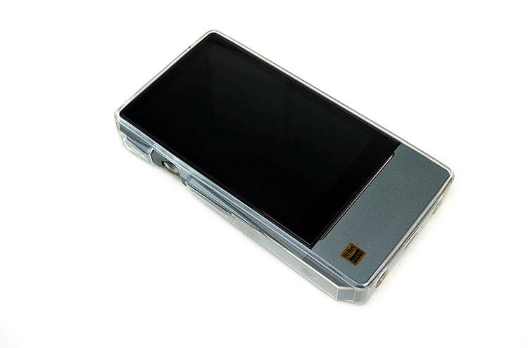
The X7 Mark II uses the same titanium-colored CNC Machined aluminum alloy as its predecessor, however, the final design has been given a more modern finger and case-friendly makeover.
Handling
It may not seem a huge change but once in your hand, you will notice the smoother handling of the X7 Mark II over the Mark 1. A big contributing factor is the reworking of the volume buttons into a 45-degree etched line rotary dial on a more modern accented left control panel.
With all the buttons on the left panel, there is now also less stretching and manipulation to use the playback controls on the Mark 2. Combined with a rounded redesigned leather case you get a softer level of pressure in your hand as well as a device that is generally much easier to operate.
Left Panel
The left panel is also a harmonized design originally showcased with the FiiO X5 Mark 3 and represents a more modern approach consistent with competing DAP designs in today’s market.
The only major difference in how they are implemented is the final part of the wedge design over the amp card which is actually a separate piece screwed in. This allows you to use the older amp cards with their older shape without affecting the form factor. You simply take off the wedge and screw it back on again over the amp card of your choice.
Dimensions & Weight
The X7 Mark II is still more or less a candy bar design though this time we lose 1.2mm in length and 1mm in thickness as well as 10g in weight. What the marketing material does not say is the additional girth over the older X7 with that new left panel design.
The X7 Mark II may be shorter and thinner but it is wider by some 3.2mm. In terms of preference, I trade height for width since in the hand the X7 Mark II feels more balanced than the older longer X7.
The Mark 2 is not the shortest of the competing DAPs, that award goes to the Opus#3 but it is certainly not as fat or as heavy. In fact, out of the selected DAPs, the X7 Mark II was the lightest and thinnest DAP tested. The numbers may seem marginal on a ruler but in the hand, they make a huge difference.
Back Panel
This is the other major design change and a most welcome one also and that is replacing the raised back panel with a flatter version.
Though not a huge factor in the operation functionality it does improve the visual aesthetics immensely as well as increase the fit and grip from the included leather case. Much of that reduction in height being pitched in FiiO comes primarily from flattening the back panel.
Screen
Performance
On paper, FiiO has deployed the same screen specs from the gen I X7, a 480 x 800 pixel 3.97″ IPS TFT screen capable of 16.7m colors and a 233ppi pixel density resolution.
In reality, the performance of the screen on the Mark II is much superior with better color saturation and more pop so they have definitely changed to a better-performing version than the previous Mark I LCD screen.
It is not quite on the same level as the brilliant DX200 screen which is a bit bigger at a 4.2″ IPS Screen and a slightly higher resolution of 768 x 1280 but a bigger screen would have meant a much bigger body which may not have suited FiiO’s harmony design philosophy.
Flush and bezel changes
If you also look carefully the screen is now more flush with the chassis compared to the older raised screen of X7 Mark 1 and the bezel design has changed a little also. This is primarily due to the slightly squatter form factor with a thinner top bezel and slightly thicker bottom and side bezels.
FiiO has also moved the “FiiO” white moniker off the bottom bezel border to the back plate. I suspect moving it creates less distraction when watching movies and media given its all-white appearance.
There is still no integrated navigation in the bottom bezel, something smartphone makers are really going to town on. It would have been fascinating to see a borderless X7 screen design, perhaps Gen 3?
Blue LED Lights
You still have the very funky LED light system on the Mark 2 just below the screen which will show a pulsing blue light for power on and charging. The option to customize the light to solid or pulse remains in the display settings should you wish to differentiate.
Memory Capacity
The X7 Mark II not only draws from the X5 Mark 3’s form factor but also its memory card function and capacity. Instead of one open slot on the left side of the old X7, the Mark II now sports 2 sim slot-style trays that can hold up to 512GB in total (256GB x 2).
On top of that, the internal memory gets a boost from 32Gb to 64GB. The switch to these sim tray style slots is similar in styling to the X5 with a 0.2mm gap but you do need to keep a pin or the key card handy if you want to open it up and change cards.
Battery Life
Battery size has increased from 3500mAh to 3800mAh on the X7 Mark II. FiiO has rated the X7 Mark II capable of delivering 8 hours of battery life in single-ended mode and 7 hours in balanced output though in truth this relates more to the performance of the new AM3a amp card as opposed to just the X7 itself.
Amp Card Influence
Previous amp cards all have an effect on the output rating and battery performance of the X7 system. You can get as low as 6 hours with the balanced output of the slightly more powerful AM3 card on the older X7 and as high as 9-10 hours on the weakest output card, the AM1.
The AM3a, therefore, sits second from bottom in terms of battery life but its performance is not inconsistent with its output ratings. Much of the additional battery life of the Mark 2 is likely to be used for the additional oscillators, RAM, and CPU demands.
Rapid Charging
One thing to note with the Mark 2 battery management is that it supports the same rapid 9/12v charging system on top of the regular USB BC1.2 design found in the X5iii.
This means you can charge your X7 Mark II in about 1.5 hours rather than the more standard 2.5 hours. The new battery config allows both this and temperature management when opting to rapid charge and tells you all of this on the screen during those 1.5 hours.
I/O
Optical Output
There have been a few notable changes and additional features to the Mark II I/O’s over the first generation design.
The big new feature is the addition of an optical output to the jack on the top plate. This is a ‘do it all’ jack now for both analog and digital line outs with both line and coaxial from the previous design still being retained.
Those who own a Hugo, Mojo, or even a lower-end iBasso D14 can now use the X7 Mark II’s optical output as well as the USB OTG and coaxial features.
Micro USB
One thing that did surprise me was the retention of the micro USB slot for charging, DAC, and OTG purposes. Since quite a number of releases in the last 12 months have gone to USB-C I was half expecting the new X7 Mark II to go in the same direction.
Sure micro USB is still quite prevalent and connection options are as easy today as they were 18 months ago but I get a feeling this may be less future-proofed than before. Time will tell.
Power button
FiiO has also moved the power button away from the left panel to the top panel and drawn again from the X5iii design though it omits any LED given it already uses the LED strip on the front panel.
I actually much prefer the position of the power/Screen button on the new X7 Mark II over the X5iii. It stays out of the way a bit more whereas the X5iii position tended to conflict a little with the play pause button on the opposite side. Too many times I have hit the play pause button with pressure when attempting to press the X5iii power button so the new position is ideal.
Playback Controls
Playback controls are now all housed in the left panel’s wedge panel design with a rotary dial replacing the older volume rocker of the X7 Mark I. This is the exact same design and layout of the X5iii with a slimmer playback rocker below the rotary dial and the play pause button just above.
Personally, I am a big fan of the new playback control system and it felt right on the X5iii. Everything feels more tactile now with the buttons a little more raised and the volume rocker in-between and all on one panel. Controls are easier to find, faster to access, and less left-to-right-hand manipulation in the process.
Accessories & Packaging
The X7 Mark II retail box has had only a few minor changes from the original X7 box 18 months ago. It is marginally bigger and wider with a pic of the new design as well as apt-X in bold white letters on the back, something which the X7 did not have when launched 18 months ago.
New Cases
Perhaps the best part of the new accessory package is the included case. The original X7 did not have one, you had to buy it, though it was a lovely brown color. It also slid off way too easily after prolonged use.
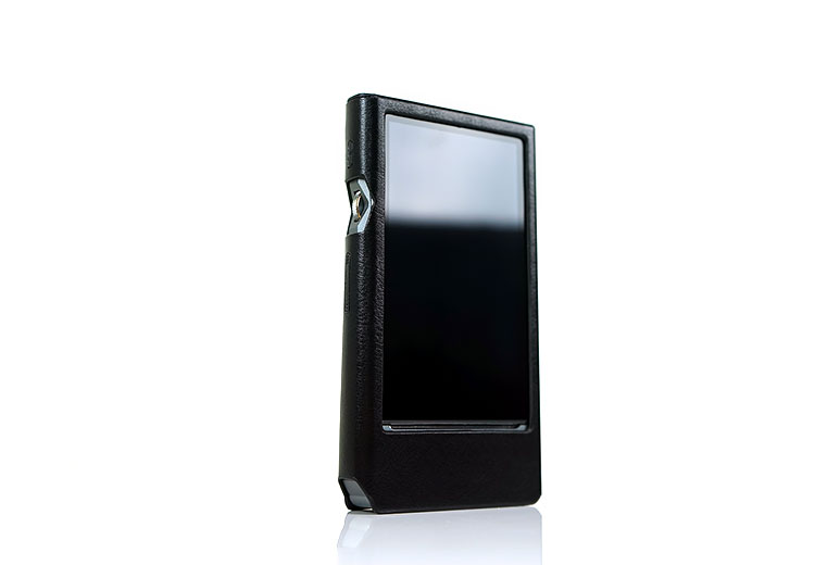
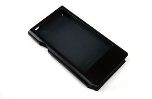
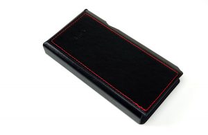
The X7 Mark II now comes with a leather case as standard and is better designed to hold the X7 Mark II in place with slots for rotary control and digital outs as well as indents for playback control. It pretty much draws from the design of the X5iii case with the red leather sticking on the back.
This time the playback button is covered by the case and the top seam is open by design I presume to allow for the case tension surface on the left to be a bit looser for accurate button mashing.
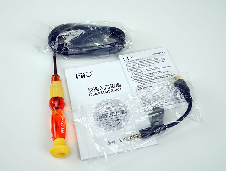
Everything else is relatively similar to the older X7 accessory kit with a screwdriver for amp card swapping, USB-A to micro-USB charging cable, coaxial adapter, warranty, and quick start guide.
Note though the screwdriver is much bigger and easier to use than the older T5 screwdriver in the X7 Mark 1 package. I dare say a few of those tiny T5 versions have been lost over time.
Click on page 2 below for Hardware, Software Performance & Features


