UI and software features
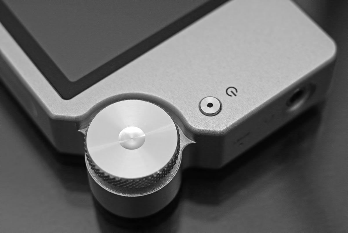
Shanling, like FiiO and Ibasso, has used their own proprietary UI system built from the ground up and to suit the usability of their command dial. This is a non touched based UI though more in keeping with FiiO products than Ibasso’s touch-sensitive DX range. Unlike Ibasso and FiiO though the M3’s UI system has two relatively salient features that stand it in very good stead and that is general speed and most important stability. In the month or two that I have been using the M3 not once has it ever frozen or locked up or done something that it is not supposed to do via the UI. That reset keyhole remains virginal I can assure you that.
The LCD Screen
The LCD screen is a 2.4 inch TFT LED which is the same size screen used by FiiO and Ibasso but not IPS level in terms of quality, a shade lower. However, it does use the full length and breadth of the screen unlike FiiO who have left and right bezels reducing the width of the screen actually used. So overall a slightly less vibrant screen both in terms of color schemes and quality of display against the DX90 and FiiO X5 but not the smallest in terms of actual optimization of that screen.
Booting and power down
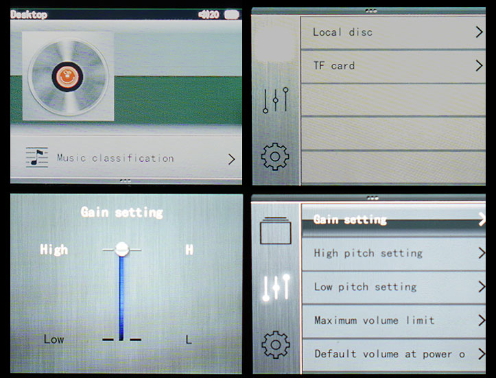
Boot up time of the M3 is approximately 6 seconds from releasing the power button to the home page display. The M3 booted faster than the DX90 by one second and for the FiiO X5, it was faster by around two seconds. The home screen is perhaps the most confusing aspect of the M3 if you are a first time user. Unlike say the now excellent FiiO UI on the X1 and X5 you do not boot up into a default menu or central section from which you can quickly select what you want to do such as settings or playlists. Instead, you get a screen with a blank icon of an album cover and at the bottom, you have a single menu option called Music Classification. Power down is near instant with the M3 after a 1-2 second press of the power button. You can also have the screen turned off with a simple tap of the power button which goes blue upon screen off mode to ensure you don’t forget it is still on and let the battery drain unintentionally.
The true home page
I can see a lot of people automatically thinking ok what next? It really is not that obvious what you can do with the M3 UI wise from this home page. Using the dial you push down until the Music Classification is highlighted. and if you press right on the dial it will take you to your media library. However what is not obvious is if you press down one step further you will instead be brought to the main options menu page which includes selecting your storage source (Local Disc and TF Card) on the right side. On the left side you have 3 icons running vertically which you can select for a range of playback sound options and your core settings for the unit. Again you can select either to browse your files in the storage side by flicking right or pushing back or left to select one of the other subcategories and exploring them through the dial.
Sound mixing options
The sound setting options is quite impressive actually for a mid-tier DAP. Here you can adjust gain high or low depending on your preferences as well as play around with what Shanling terms as high pitch and low pitch settings. The high pitch setting allows you to push forward or tone down the treble performance and the low pitch setting accentuates or pulls back the lower mid and mid bass settings. You can play around with both with incremental adjustments to you get the right mix or blend. Whatever setting you have stays in the M3 memory whether on or off until the next time you choose to adjust the settings.
Beyond those, you can set maximum volume allowable during playback as well as determine the default volume setting when you power on the M3 DAP which out of the box is set at a reasonable 20 out of a possible 60 steps. There is also a further option to determine how the M3 determines to resume play after being turned off called “Break-point memory play” (sounds like a college drinking game but then that’s just me). Here you can set the M3 to resume on last known position in the song or the last track or have it turned off altogether to start at the default home page. The last two options in the sound section also have a very useful channel balance option between right and left and a play mode for shuffle, repeat or loop.
Core Settings
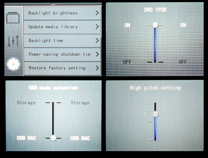
The final option has a mix of the usual and some more interesting selections. Apart from the media library updater, LCD brightness and battery saving timers you also have the ability to switch from 24/44.1 standard output to an upsampling or standard output of 24/192k, a USB mode selection for DAC or storage and an input selector for line in, spdif in and playing directly from the DAP itself. The switch from 22/44 to 24/192 is probably the one that caught my eye and does indeed have a little bit of an effect on the tonality which you can read more about in the sound impressions section.
My only criticism of these lists in general on the M3 is the lack of logical flow from one option to the next. For instance restoring factory settings, language selection and information about the M3 is right in the middle of the list of options and important ones like input source selection are right at the bottom out of sight. My personal preference would be to have those more benign options to the bottom and the more immediate requirements to the top for fast referral or selection. Apart from that though they work pretty well with no glitches or slow down.
The second point of concern with the jog dial UI system is the whole drill down experience feels too linear compared to daps such as the FiiO and the Ibasso which can allow you to dig through menus but still retain lateral controls.. If you are in any of the menu options with the M3 you have to drill up again to access your current music for pause or moving forward or back. You cannot change music as you explore other menu based operations. You can, of course, press left and hold to access a suite of sound editing or mixing options as described in the sound mixing section during playback but you cannot change songs during the menu operation. It is a pity that the physical front panel is bereft of physical controls given the UI experience. I think it does need some level of lateral control.
Media Library
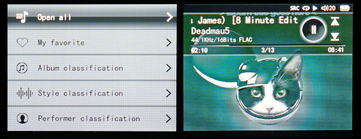
The media library will do the same as most other media libraries in terms of cataloging into album/artist (performer)/genre (titled as style on the UI) with a further one for favorites. The favorites one gave me the cost cause for confusion as it was not clear (now being a dude here so not reading the manual first is mandatory and a source of pride right?) how to access this and make a song a favorite. Yet even a cursory glance at the manual didn’t paint a clear path on how to quickly add a song as a favorite either by UI pics or by narrative. Of course not everyone has the luxury of emailing the manufacturer with such questions so, in the interests of a self-imposed duty to public audio information and gadget services, the short answer on how to make a track a “favorite” on the M3 is to press left and hold that action until you get the pop up screen and scroll down to access add to favorites or remove from favorites. You can thank me later for that gem of information.
Media updating is relatively painless and fast, no hitches and most of my tags were read quite accurately. What I did find was well-trodden path to again go to straight lists of all songs under one genre or one artist rather than go genre>artist>album and then the songs from that album. I much prefer this and thankfully Ibasso listened and added that feature to their media library last year for the DX range. This system on the M3 follows the same hierarchy as FiiO which misses that opportunity to further organize the music like Ibasso and of course Apple. So while it works and impressively without any glitches, I still do prefer accessing my music through the file explorer which is just as quick.
Page 3: Sound Impressions


