The FiiO X1 2nd Gen is the company’s latest take on an entry-level portable media player or DAP featuring a touch-based scroll wheel. It is priced at $99.
Disclaimer: The FiiO X1 2nd Gen sent to us is a sample in exchange for our honest opinion in this review. We thank FiiO for this opportunity.
To learn more about other FiiO reviews on Headfonics you can click here.
Note, this review follows our new scoring guidelines for 2020 which you can read up on here.
It has been just over 2 years now since FiiO originally launched its entry-level DAP, the X1. The X1 took on the form factor and looks of the X3 Gen2 but stripped of a DAC and aimed primarily as a low-cost solution to getting on the FiiO DAP wagon and enjoying hi-res sound on the go.
At the time we gave it a 7.9 simply because the sub-$99 DAP market was moribund in excitement with a plethora of legacy devices and cheap clones knocking around that represented the only real competition. The 7.9 also gave a meritorious nod to the solid build quality and stable OS that saw maturity on the X3 and X5 previously.
What Is The X1 2nd Gen Pitch?
Two years is now a very long time in the DAP business and since then the DAP world has propagated at an alarming rate, FiiO has grown a few years older and the budget DAP range has expanded somewhat with the new Shanling M1, Hidizs AP60 and the latest excellent Alien Edition Gold from Shozy. No one is talking Clip anymore, people want more for less and the new X1 2nd Gen is FiiO’s answer to that as well as fitting in with their excitable product roadmap rollout.
Pricing
It is still around $100, so that’s a good start. It is still their entry-level DAP, so that’s reassuring. It still has everything the original X1 did, so that’s familiar. This time, though, there are some huge changes that address some long-standing issues as well as lay the foundation for FiiO’s product cycle in the budget to mid-fi DAP roadmap for the next 12 months.
What is In, What is Out
Gone is the mechanical scroll wheel and in comes a touch-based version that should be firmware upgradeable in terms of performance. In comes Bluetooth that was not seen before on the old X1 and also it marks the advent of a new design ethos for the X series that is slicker and more rounded looking than the previous X1. The DAC chip has been upgraded as well as the raw materials. The OS has also changed from the older more limited UCOS OS to a more expansive Linux platform.
You can call it a reinterpretation, call it the never-ending cycle of gains from increasing engineering capability and external competition but the pitch is clear here; you are supposed to be getting more in real terms for less than what you paid for the last time around.
X1 2nd Gen Build
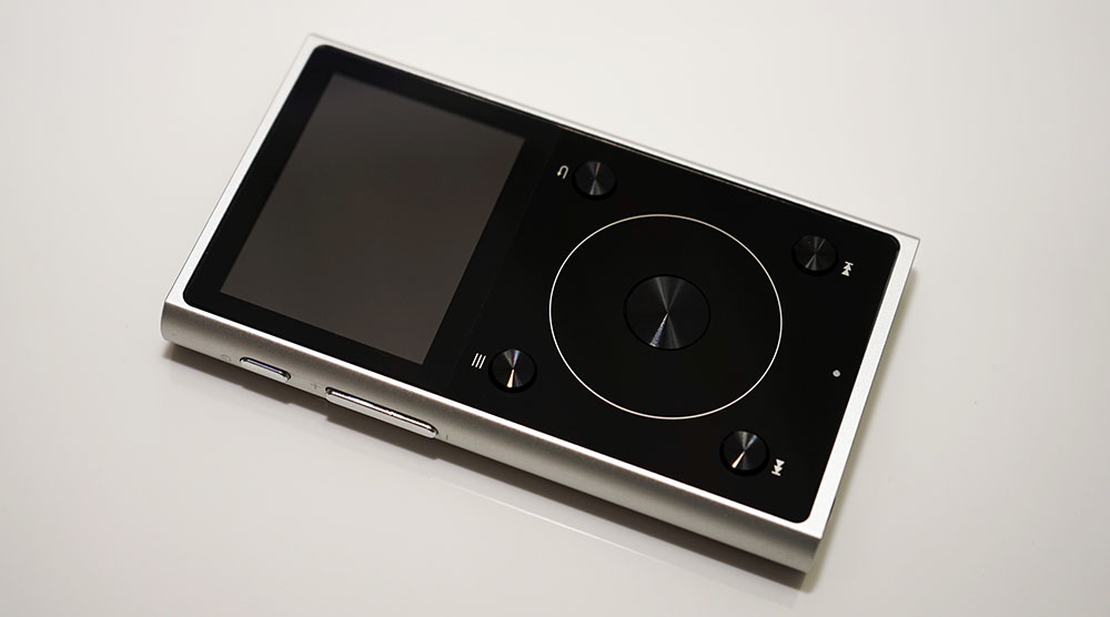
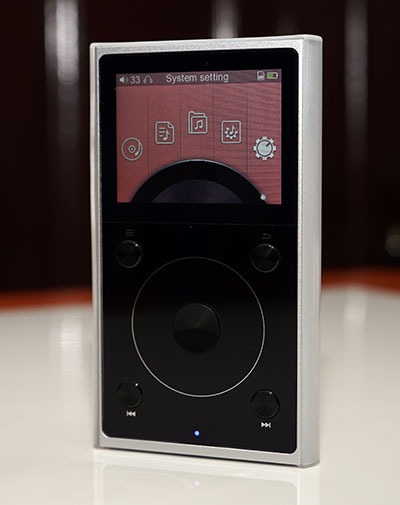
Nothing attracts interest than showing something new in visual form and the x1 2G is just that. Yet remarkably much of what made the X1 successful it still intact. It is still a hardware-based DAP and it still has the 4 corner button and touch wheel design on the front with similar screen dimensions. Yet now it is so much more refined looking.
‘Arc Waist’ Design
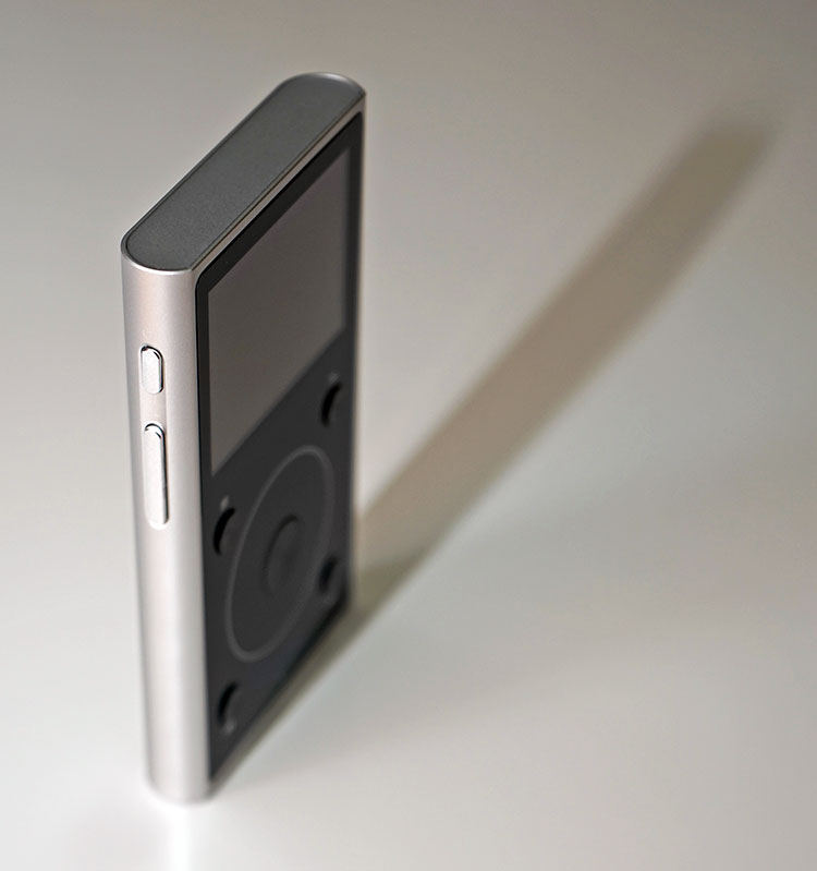
The X1 2G body is rounded instead of angular. The original X1 is still relatively well finished but the new version takes it to a whole new level with a smooth rounded aluminum alloy back and side panels that are much more comfortable in the hand. Side by side the X1 form factor lines look remarkably dated already.
Form Factor
Measurements have changed slightly also with the X1 2G. The new version measures 97mm×55.5 mm×12 mm and weighs in at 102g. That’s a reduction of 4g in overall weight from the first version and roughly 1-2mm in depth and width over the first-gen which measures in at 96.7mm x 56.7mm x 14.1mm. It is though a touch longer a tiny amount. Those numbers might not seem much on paper but there is a palatable difference in the handling of the two in real life with the X1 Gen 2 feeling the more comfortable in the hand.
Button Changes
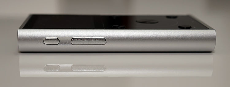
Gone now are the distinct buttons for volume control and instead you have a rocker single long button on the left panel for volume control. The power/LCD/Sleep multifunction button is still separate though and just above the volume rocker.
The power button does seem to be a touch closer than previously which worried a few that they might hit it by accident during one-handed control. However, slide on that silicone jack and the firm edges of the protective shield make it a no-brainer in terms of where your hand is positioned and what button you are using. That, combined with the longer rocker button for volume makes this a much more distinct hardware usability experience.
Inputs & Outputs
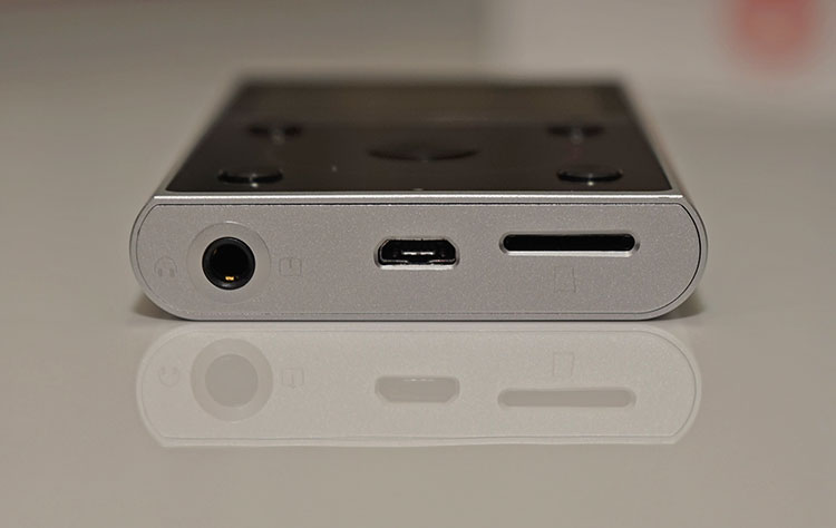
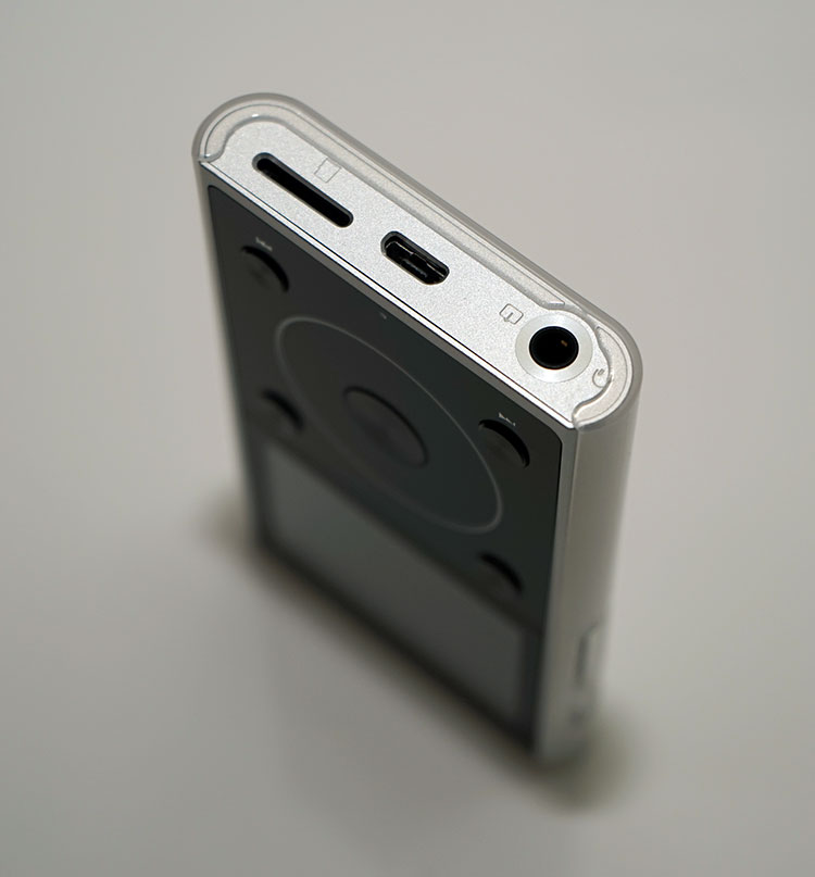
All inputs and outputs on the X1 2nd Gen are now down at the bottom panel. The top panel is flush with zero ports. This harmonizes somewhat with the budget M3, the last DAP release from FiiO, and something I expect will be the norm for future DAP revisions of the X3 and X5 should they come out next year.
The panel consists of a dual 3.5mm headphone and line-out jack, a micro-USB port for charging, and mounting the memory card when connected to the PC and a microSD card slot. The port alignment is a bit up and down, perhaps a space issue but aesthetically it is a bit of mishmash. Labeling icons are on the discreet side but the slot sizes are fairly logical as to stick what card or cable into what slot.
Front Panel Controls
Touch Sensitive wheel
This is a fairly familiar area of control for anyone used to using one of FiiO’s mechanical DAPs. Central to the panel is the all-new touch-sensitive wheel with a pressure-sensitive and discreet central confirm button. I can tell you right now it is much superior in ambition and integration to the older mechanical wheel.
Users of the old iPod Classic should feel right at home with this version of FiiO’s touch wheel. It even feels a touch more responsive than the old iPod Classic wheel utilizing a more modern and complex wheel touch design than the older 12 key click design of Apple’s version. It does have a little audible click for every step you rotate past but you can turn that off in the systems setting menu if you wish.
Physical Buttons
On the outside to the four corners, you have the multi-function buttons for playback, navigation, and menu call-up. The labels now are much cleaner and clearer above and below each button, unlike the original X1 whose more discreet button icons tended to be harder to see and next to impossible with the silicone gel sleeve on top. The new X1’s sleep combined with a front panel screen protector leave the front panel controls much clear and easier to read and use.
LED Indicator
Right at the bottom of the front panel is a small LED indicator much like the older X1 1G which changes color depending on the usage scenario and battery life left. A blue LED means it’s active or in use, red is charging, and green means fully charged.
Screen
The X1 2G still uses the same 2 inch TFT 320 x 240 LCD screen as the original X1 and if you are lucky enough to have the original X3 still it is the same quality of screen they originally used on its first-ever DAP though with slightly different dimensions.
Pros
It is a well-lit screen with bright clean colors, decent viewing angle also and in contrast to the original X1 has a bit more pop and contrast to it in comparison to the more muted X1 1G colors. There is a smaller gap between the glass protector and the actual LCD screen of the gen 2 X1 which may well be the factor behind the brighter display of the new version.
Cons
In other ways, the art graphics and font seem somewhat more pixelated than before with less smoothing being applied than the X1 1G. I daresay this is more to do with the font selection in the new Linux OS than the screen itself which by all accounts seems more pleasing in visuals. Certainly, I hope new firmware updates can address this issue with some better anti-aliasing in the coming months.
Battery
The X1 2nd Gen comes packed with a 1800mAh 3.7v Li-Polymer Lithium battery which is slightly bigger than the older X1’s 1700mAh battery. The slight increase in size gives a marginal increase in performance also with a rated 12 hours playback for the 2nd gen compared to 11 for the first-gen for playback time.
Real-World Numbers
Interestingly FiiO is claiming 15 hours if using Bluetooth only which is something I have been unable to verify with any degree of confidence. Sorry but monitoring battery length these days is just akin to watching your fridge defrost but during various test runs of different codecs and functionalities my first cycle crapped out around 10-11 hours.
Now to be fair there was plenty of button mashing, media updating, and playing around with the various features which are highly unlikely to be happening in a more settled run but I would be fairly confident of FiiO’s numbers based on my own experience to date.
Is it long enough? Compared to the older Clips and Fuze players and some mid-fi DAPS, not really. It is enough for a day of solid play though but you will have to charge it overnight. I would say average by today’s standards with the likes of Sony’s DAPs being able to achieve double that rating in a slimmer design.
Deep Sleep Standby
One of the biggest improvements though in the new X1 2nd Gen battery life has been the addition of the deep sleep standby feature that was introduced in the X3 Gen 2 a while back and subsequently the X5 Gen 2 but was missing on the first-gen of the X1. Standby on the X1 2nd Gen will give you up to 15 days of instant-on capability in standby mode which is pretty darn good.
Now that’s 15 days of not touching it so using the standby mode off and on during some playback sessions will shorten that spec in real-world usage but it should give you a few days at least from my experience using the X3 Gen 2 feature. One thing to note though is to make sure it is turned off fully if that is your intention (look for the goodbye logo when powering off) or else the DAP will drain dry if you do not come back to it in a few days (or perhaps even 15).
Memory
As before the X1 2nd Gen comes without onboard storable memory and instead, providing you with a single microSD slot on the bottom panel that can take up to 256GB of memory. I would still love to see it come with 8Gb onboard just to get you up and running.
The price of cheap cards varies but roughly $20 for a 32-64GB does represent 20% of the asking price of the X1 itself raising the total cost of ownership of the X1 2nd Gen. At budget levels people tend to notice an extra $20 rather quickly. There are no issues anymore on card formats. That hurdle has long since been jumped so exFAT32 and FAT32 work equally well.
Accessories & Packaging
A few changes here since the last rollout of the X1. The retail packaging is now white with a dash of red rather than predominantly red with some black. It is a little lighter and leaner looking and that white theme continues on the inside with the X1 2nd Gen in its pocket on the top of a pullout tray and underneath are the accessories.
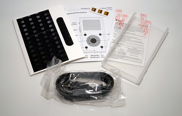
It is a mix of the old and the new accessory wise. You get the usual micro USB cable for charging and mounting your memory card, the quick guide and warranty card as well as all-new carbon fiber stickers for the X1 body and two front panel screen protectors.
You also get the already stuck on LCD screen protector out of the box which you just peel off the label and you are good to go. However, if you want to fully protect the entire front panel of the X1 2nd Gen you can now opt for one of two supplied protectors to cover it.
It’s cut to shape so the button and wheel functions are uninhibited. I personally prefer this solution to the clunky silicone case from previous X series generations which hid the labels and added unnecessary girth to its form factor. When you add the final accessory, a svelte slide on silicon hard shell it does look rather tidier than the older Gen.
Click on Page 2 below to read about our software and functionality impressions


