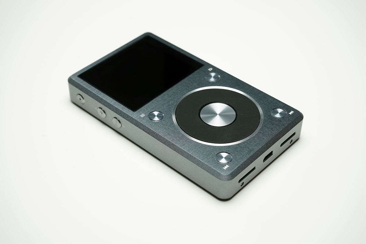
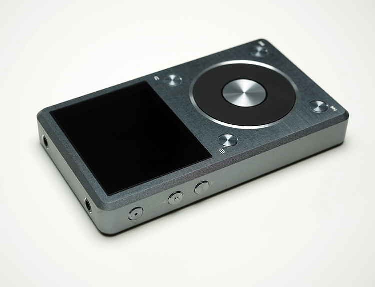
The ‘Applesque’ regenerating life cycle of FiiO products continue unabated with the launch of the all new X5 Generation 2 (X5 gen 2) DAP which represents, for now, their flagship DAP in the market. Much like the X3 Gen 2 earlier this year, FiiO have sought to harmonize their design, UI flow and capabilities of their DAP under one theme. As such the X5 represents the last of the FiiO DAP’s to undergo an overhaul from the first generation. It is also the last of the DAP’s to get the “X1 design and UI” treatment.
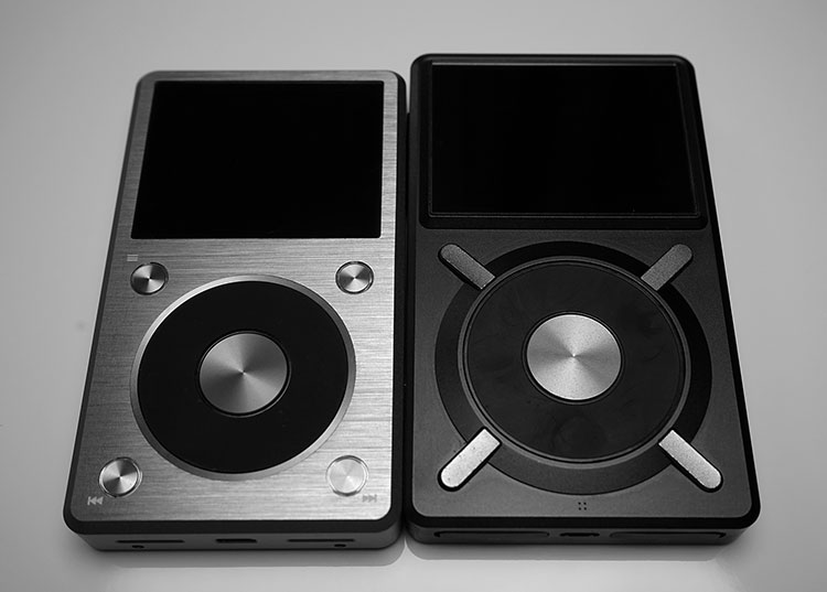
X5 Gen 1
Those who tried, tested and owned the first gen X5 will tell you that it was a huge leap up in terms of resolution, UI and capability compared to the rather dated candy bar semantics of the X3 Gen 1 but it still had some issues. These issues included a UI that, whilst a clear progression, was still loaded with some design cul-de-sacs.
It also had an audio presentation that was a radical departure from the typical FiiO Wolfson inspired house sound. Gone was the warm, laid back and musical WM8740 and in came a higher resolution, neutral and more transparent Burr Brown/TI PCM1792 DAC. In my initial review I praised it but found it slightly lacking compared to the DX90 particularly in the upper midrange and treble which had this metallic glare that became more prominent and noticeable over time. In the long run I found the X5 Gen 1 to technically proficient but not terribly engaging.
X3 Gen 2
That was 18 months ago. Fast forward mid-2015 and the X3 Gen 2 is already out and making the X5 Gen 1 look positively dated with native DSD and a much more integrated UI as well as a form factor in line with the X1 with a few more knobs and whistles such as an upgraded on-board DAC. The X3 Gen 2 was looking somewhat better than the X5 Gen 1.
X5 Gen 2
It had to happen and it did this summer and mercifully FiiO stuck to the same $350 price tag as the Gen 1 whilst upgrading to the equivalent of a turbo charged X3. Originally it looked like they would go with the whole ‘K’ revisionism they bequeathed to the amp range but thankfully by retail launch that was ditched for the Gen 2 moniker. Sounds snappier and more future proof.
On a very high level the mechanics of how the X5 Gen 2 works and is served to the customer is still the same as the X5 Gen 1 in many ways. You still have the same retail packaging (reviewers got a black box which I thought was a bit cooler than the usual red) which includes;
- A single user guide leaflet
- A silicone case in dark grey
- A screen protector ready to peel off and 2 spare
- A coaxial adapter cable and,
- The usual stick on decals found with the X3 gen 2 but fitted for the new X5.
I guess FiiO have got this down to a fine art now in terms of packaging. You can’t fault it but it has no surprises.
The Build
The original X5 came right out of the Xavier School for the gifted with its huge X moniker type hardware system that I still mix up to this day and a heavy duty tank like build. Yes it’s easy to learn the X design but after a while its incredibly easy to forget forcing an unnecessary relearn like a long lost language. After initial wow the original design hasn’t really stood the test of time for me.
Upgrades
Well the X5 Gen 2 clears all that up by adapting an upgraded version of the X1 and X3 Gen 2 form factor and hardware design. So out goes the X and in comes the 4 point button system with labels in a square design around a much improved jog wheel.
Now you have a DAP that looks like the other two only bigger. OCD people I can hear you applaud with approval and clean your hands after but for the left of center fans this might seem a touch boring. I am on the fence but leaning back in favor of the design change for a number of reasons.
Weight & Size
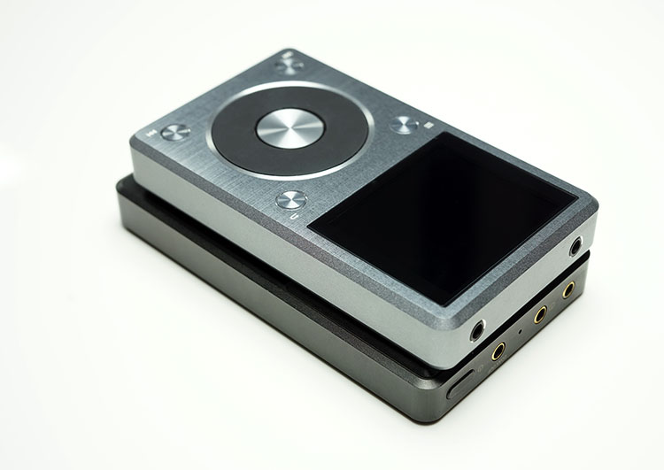
First and most importantly the new X5 Gen 2 is smaller and that’s always a good thing in my book. The new X5 measures in at 109mm x 63.5mm x 15.3mm compared to the old X5’s 114mm x 67.6mm x 15.6 mm. That’s roughly a 10% reduction in size and also weighs 30g less than the old X5 at 165g as opposed to 195g (15% lighter). The net effect of the weight and size reduction means the X5 Gen 2 feels a bit more agile and balanced when using with one hand than the older gen 1 edition.
Form Factor
The form factor and materials build of the X5 Gen 2 shell also is a bit smoother and more elegant than the more rigid lines of the Gen 1. It does not feel as sharp in the hand and gone or the hard edges and ridges of the first incarnation. Everything looks more flush from the screen to the buttons and the edges of the casing itself. The metals are also changed from a powdered coating to a brushed metal finish so it also feels far more premium to the touch from the get go.
Colors
FiiO also saw fit to harmonize the color schemes on their DAP range and, like the FiiO X3 Gen 2, the X5 gen 2 is now available in a Titanium color rather than black. I much prefer this color scheme, it has a quality look over the plain black. It’s a personal taste thing so I know some are die hard black gadget color fans but in the flesh the new Titanium color screams upgrade.
Panels
Top
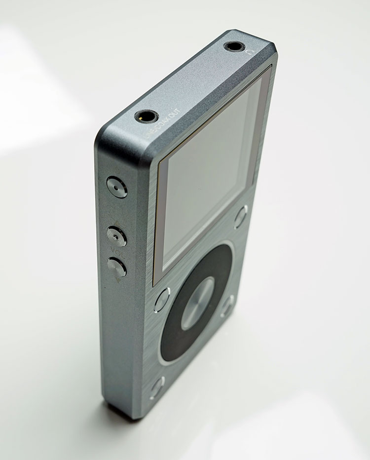
FiiO have also altered some of the older gen 1 I/O physical arrangements, which again, is more consistent with their UI upgrades and the newer gen 2 X3 layout. On the top panel gone is the trio of headphone jack, coaxial and line outputs and in comes a combo coaxial/line out jack controlled at the UI level and a single headphone jack output. It’s a lot cleaner now on the top panel.
Right & Left
The right side panel is the exact same as in nothing to see move along territory on both the gen 2 and gen 1. The X5 Gen 2 left panel is far busier than the older Gen 1 panel with both volume and power in a 3 button arrangement as opposed to the older volume up and down button schema of the older X5. I tested this in the dark and eyes closed about 20-30 times and each time I could tell the difference between the power off button and the volume buttons either by physical proximity of the blue LED light now housed in the power button itself. The added space between power and volume is easy to detect and should not present issues to those who are worried that they might hit the power button instead of the volume button.
Bottom
On the bottom panel FiiO have wisely decided to retain their excellent dual microSD card slots on the far left and right but this time they got rid of the rubber flaps from the older X5 and went with the newer X1 and X3 non protected slot design. Is it a downgrade? In terms of overall protection I would say yes, the flaps have a point to them. However in terms of usability the open slots are much faster to access for swapping than the older flap designs. Both have their pros and cons but I am slightly in favor of flaps. The rest of the panel is finished with same centrally positioned micro USB slot for charging and DAC connection
Front
The big change here for me is the move to the 4 corner round tactile button for hardware menu and operational control on the X5 Gen 2 much like the Gen 2 of the X3 and the X1. It is also labelled in white just above the buttons on what you can do with them which is a god send if you happen to stop using it for a while and forget.
The center jog wheel is still mechanical, still does not do control volume like an iPod and still has the center confirm or enter button for menu choice confirmations. The jog wheel this time on the X5 Gen 2 has much better dampening and micro control, feels steadier when spinning it and has a much better rubber coating for grip. It still is not micro precise in movement from option to option in long lists but the physical play in the wheel is much less than the older X5.
Screen
The screen on the Gen 2 is an IPS 2.4″ 400×360 pixel LCD panel which is the same panel used in the original X5 but this time they have reduced the rather oversized screen bezel or border from the 1st Gen to something more svelte and less distracting. It’s a welcome change because the first gen screen really did get dwarfed by that large black border. I could swear the saturation on the new screen is more powerful with more pop than the older one but perhaps the smaller bezel and flusher finish is altering my perception somewhat. In all other aspects though it’s the same screen. It is also far superior to the smaller TFT screen of the X3 Gen 2 which looks a bit washed out in comparison.
Internals & Functionality
Much like the X3 the X5 Gen 2 has moved with the times with a number of important new features in terms of functionality. In comes DSD, native DSD decoding up to DSD128 instead of PCM output, as well as a higher swing voltage (40% higher) from an improved power supply design to maximize their new chip setup.
The X5 Gen 2 retains the same DAC chip though from the X5 Gen 1, the PCM1792A. This time though they have paired it with an upgraded opamp design, the OPA1652 (4 of them), to try and up the dynamics, lower the distortion and improve the low pass filtering for noise control. The native DSD hardware decoding is controlled by the gen 1 X5 JZ4760B processor and the new dual crystal oscillator SA2000 chips which feed the signal into the opamp offering DSD128 at 24/192k.
Battery
The battery is actually smaller now on the new X5 coming down from a li-polymer 3700mAh to 3300mAH. The old one was rated at over 10 hours depending on your usage with a 4 hour recycle time. Charging time now is reduced to 3 hours given that it’s a smaller battery this is not quite a surprise but are still claiming to be over 10 hours depending on usage and firmware. So FiiO have cooked something to get the same performance out of a smaller battery, only time and subsequent new firmware will determine if that claim will hold true.
UI
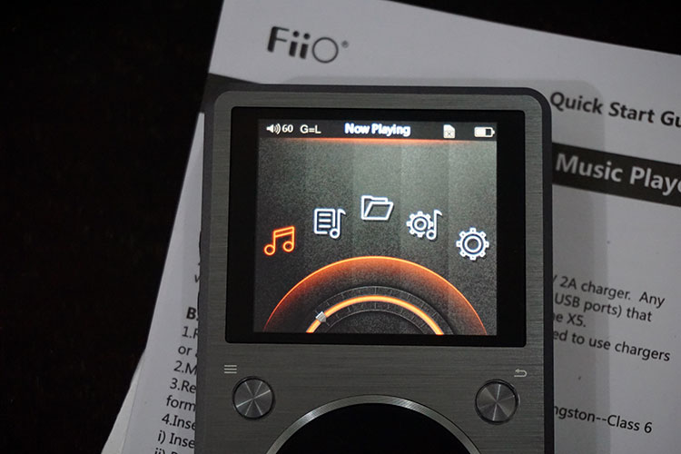
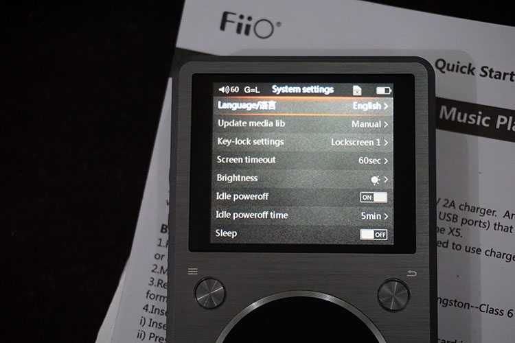
The X5 Gen 2’s UI revision brings harmony to the FiiO DAP range that first started with the X1. The original X5 UI was so much better than the old gen 1 X3 but it does look a bit aged and overly complicated compared to the more intuitive X1/X3 Gen 2 UI that the X5 2nd Gen now uses. Of course taking you through the UI of the X5 Gen 2 means invariably a little bit of repetition from the previous X3 Gen 2 review since the UI is almost exactly the same from the home screen, to the settings menu and the play settings menu.
Only the odd ordering deviation can set them apart if placed side by side. For instance the language option in the X5 Gen 2 is now at the top of the settings menu whereas in the X3 Gen 2 it was much nearer the bottom. Nothing new has been added in that respect. As expected neither the “Now Playing”, “Category” and “Browse Files” options are accessible unless you insert a memory card into the unit itself.
Home Screen
The functional difference of the new X5 Gen 2 from the X3 Gen 2 is the travel distance of the jog wheel from option to option. The travel distance on the X3 Gen 2 is denoted by a single arc or semi-circle on the main options screen. When you move from option to option you can see the option being highlighted with a cursor moving through the arc and settling underneath the icon. On The X5 Gen 2 there are now two arcs, an inner and outer arc and the travel distance form icon to icon is now on the smaller inner arc. This has a nice effect of being able to jog through the options at a slightly faster rate than on the X3 Gen 2. That combined with the gentler resistance on the jog wheel of the X5 Gen 2 makes the home page navigation feel slightly faster and more fluid than the X3 Gen 2.
Of course if you are wondering to stick or bust on a gen 1 upgrade then the UI critique becomes a heck of a lot easier especially with menu navigation. Instead of a home page vertical menu that floats in and out of the screen from the Gen 1 now you have the entire menu on one home screen on the Gen 2. The amount of scrolling from icon to icon on the Gen 2 UI is significantly reduced over the lengthy scrolling of the X5 Gen 1 home menu. The net effect is a home screen that is faster, tighter and easier to understand and just makes the whole Gen 1 scrolling system somewhat “dizzy” and never-ending. Gone though are the equalizer and favorites options from the Gen 1 UI. These are now accessed either through playback or through the play settings menu on the 2nd Gen UI.
Hardware Buttons
The interaction between the software UI and the hardware button and jog wheel of the X5 Gen 2 is also virtually the same as the X3 Gen 2 format. The top left button acts as a confirm button on the home menu whilst it brings up a secondary menu in the now playing section that allows you to navigate by your tagging, playlists and favorites. The top right acts as a return button or escape button from whatever section you happen to be into. The bottom right and left buttons activate forward/backwards or fast forward/reverse during playback but curiously at the home screen it will convert the arc type GUI layout into a straight forward linear line of icons and do away with the arc that I spoke about earlier. With this format it’s simply left or right to whatever icon you want using the forward and backwards hardware buttons (bottom left and right). They also allow you to move from menu item to menu item should you decide not to use the jog wheel.
Folder vs Category Mode
I tag my stuff pretty well but I still prefer the folder mode of the X series Gen 2 UI over the category mode. The tagging is excellent don’t get me wrong and only one album failed to get picked up during the library update from the memory card but the drill down options on the category menu, particularly in genre mode are still stuck in the same format since day 1 which is Genre>Songs. The obvious problem with that is that if you have one genre with a few thousand songs under different albums and artists you really loose that essential second and third step that say Apple give you with the iPod where you can search by Artist and Album before you think about songs.
It also slows the whole process down when you move click on that genre as the X5 Gen 2 feverishly works away at generating a list of over 1000 songs. If you have maybe 5-10 songs then it’s not an issue but honestly most people loading 64GB of music are likely to have more than that. It’s a problem for me and one that I highlighted right from the get go with the FiiO X3 Gen 1 review a few years back and nothing has changed. Ibasso changed it with the DX series after a few long chats via email but not so with FiiO. That’s an opportunity right there that I would love to see in any future firmware update. Otherwise Folder mode, particularly if you are an OCD organizer, is far faster and easier to navigate.
Pre-loaded playlists are still not scanned automatically either so you will have to manually find them or create them on the fly via “collection” which is also labelled as favorites or the playlist creator itself to get any quick use out of them. Loading them onto the memory would be better served as a single folder than accessing them via Folder mode. Also do take note that whilst the ability to read SACD ISO is there and a big hell yes to that, the ability to read disc numbers is still not integrated into the firmware for multidisc packages (not just SACD thought) so a small boo to that.
Page 2: Sound Impressions

