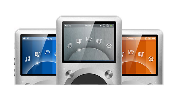
The recent launch of the X1 by FiiO sort of completes the “Holy Trinity” of FiiO digital audio players with the existing but slightly aged mid-level X3 and their flagship X5 DAP receiving largely positive praise and selling pretty strongly to date. Both have been competing indirectly but never officially with the Ibasso DX50 and DX90 at similar capability and price ranges. I have to admit I enjoyed the X3 and the X5 but I firmly favor the DX90 overall for the Dual Sabre sound signature so I guess on a personal level Ibasso come out on top in that dual since price wasn’t a huge differentiating factor.
The FiiO X1 on the other hand at $99 will not have to compete with an Ibasso equivalent this time, so its nearest competitor could well be the timely Sansa Clip, Fuze or the Hifiman HM-700; all retailing from $75 to $120 in most outlets. In this budget-busting range, most of these DAP’s have roughly the same functionality but in vastly different form factors. I have also seen some reviews comparing it to the X5. That is only natural given the fact it looks almost the exact same as an X5 though roughly 60% of the size. I think however it would be a bit of a mistake to pivot the review on whether the X1 or X5 represent better value. Sure there are some shared R&D and some enhancements even over the X5 which I will point out but the overriding feeling is if I have $100 to spend on a DAP I am going to shop around at that level first. I could easily skew this review by saying it’s only $99, give it a free pass and tell you its nearly, but not quite, as good as the X5 so all hail a new budget DAP standard but that is a disservice to FiiO as well as the guy with a $100 to burn in his pocket.
So where does the X1 stand in all of this? Is it better than anything else out there under $100 like the Clip or the HM-700? FiiO tried to differentiate it by saying this as “For the Young”, a DAP for the young people. I mean some of the “young” people I have met who are into headphones and portable audio are some of the most unbelievable hardcore audiophiles out there. Nothing and I mean nothing gets past them. How young do we go before it becomes an acceptable experience? 15, 10, even 5? My son is 5, he won’t touch it unless it has a touch screen and can play something with dinosaurs on it so maybe not that young. It is an unfortunate meme to associate audiophiles with age so I would say the X1 is more like what we call an enthusiast level camera – great for first timers, handy as a backup for the pro camera of choice for more serious users but never going to take the awards for best quality. In this category like gets compared with like and you have a whole distinct range of expected features and performance.
Build and functionality
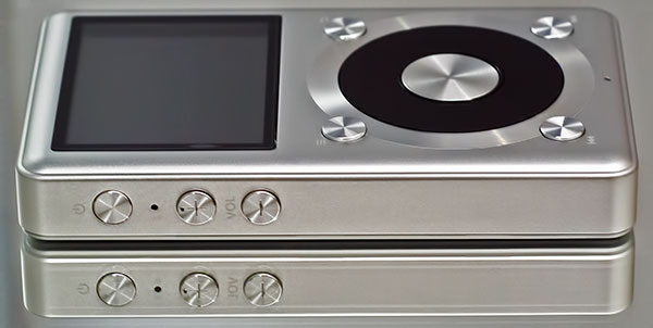
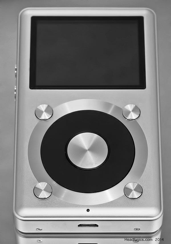
Out of the box (the plain white not for resale box I might add), the X1 screams mini X5 and as I mentioned at the start you can’t help but compare it with its larger sibling. Both have the same form factor with the X1 being around 60% of the size of the X5. Both have the same jog wheel mechanism front and center and both have a similar type non-touch LCD display above the jog wheel. Both have a micro USB port in the middle of the bottom plate and both have a headphone out jacks on the top plate.
Differences between the X1 and X5
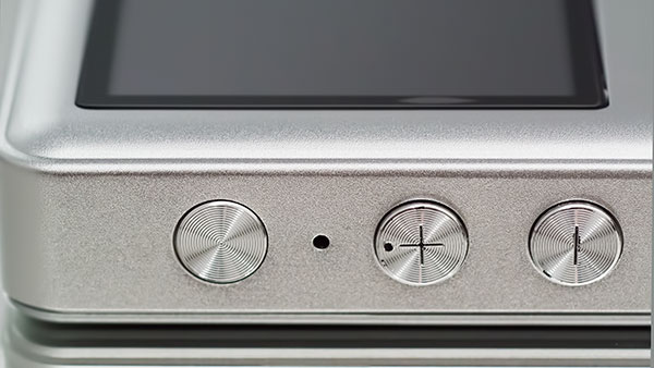
The key functional differences are as follows. The X1 headphone jack doubles up as a line out jack whereas the X5 has separate headphone, line out and coaxial outputs. The X1 also sports only one unprotected microSD slot on the right side compared to the X5’s protected dual microSD slots on the bottom plate. The X1 also has a power and volume control button layout more akin to the E17 than the X5 which has a rectangular volume up and down on the left side and the power button on the top.
Physical controls
One major difference though that I must applaud FiiO for introducing on the X1 and something I would consider superior to the X5 is the more intuitive UI physical button navigation and the play/pause/forward/back buttons that now replace the X5’s less intuitive X style button format on the front plate. These buttons make a lot more sense and are labeled with well-recognized symbols to the side. If you are using these without the accompanying silicon case it is pretty easy to figure out what each button does, unlike the X5 which only comes through regular usage and your ability to remember what each “x” does. Consider it the implementation of the X3 simple button control but in the much better X5 physical layout.
Comparing the X1 physical layout controls to the HM-700 there is no competition. The HM-700 has the basic functions but they are frustrating and unintuitive out of the box. The Sansa Clip is somewhat better in terms of being clearly labeled but due to the diminutive size of the clip can come across as a bit cramped and old school. The Fuze+ touch interface might seem the obvious winner here but the constant feedback on the lack of calibration and accuracy of the touch UI is a really off-putting experience compared to the more assured wheel and button interface of the X1 and even the more traditional Clip controls.
The Screen
The X1 sports a 2 inch TFT 320 x 240 LCD screen compared to the X5’s 2.4″ colorized 400 x 360 IPS screen. So not only is the X5 screen bigger but it’s a deeper richer and better quality screen. The X1 screen is the same exact same type of screen currently being used in the X3 though slightly smaller than the 2.4 version used in the X3 and horizontal instead of vertical in dimensions.
The X1 screen is leaps and bounds ahead of the Sansa Clip’s tiny-by-line screen though but slightly smaller than the Fuze+ 2.4 inch screen. Both the Fuze+ and X1 screen resolution is the same as the X1 at 320×240. I won’t go into the rather diminutive functional screen of the HM-700 from Hifiman. The HM-700 also has a 2-inch vertical dimension LCD but in my eyes it ,is lacking in resolution and pop even compared to the X1 and the UI, for the most part, doesn’t get the best out of the screen real estate. The fact that Hifiman doesn’t tout the screen in their feature list PR on the HM-700 would suggest it not something they feel is a match winner.
Sans Dac
One more important aspect to note is the fact the X1 does not have a DAC function. Those looking to use a FiiO DAP as a DAC can look elsewhere because FiiO stripped that right out along with the coaxial output that goes along with it. Unlike both the X3 and latest X5 firmware the X1 is also unable to decode DSD tracks preferring instead to cope up with a more than respectable 24/192bit decoding level with FLAC, APE, ALAC, WAV, and WMA. This is quite apart from the ubiquitous MP3, OGG and AAC compressed codecs playable on all 3 FiiO DAPs. None of the DAPs from Sansa or Hifiman have a DAC function either at this price range so it’s not something to get too worked up about.
The HM-700 can also decode lossless but only WAV, APE and FLAC at 16Bit and only accepts MP3 for compressed formats. The Fuze and Clip from Sansa can do MP3, WMA, secure WMA, Ogg Vorbis, FLAC, and the Fuze doubles up as a PMP can playback video using H.264, MPEG-4, WMV, Flip Video. On top of that, certain Clip versions can run on Rockbox further widening the codec range and usability for audio playback. In fact, if memory serves me right this was quite the win in audiophile circles a few years back when ‘AnythingbutiPod’ seemed relevant. However, none of the stated competition currently decodes at 24/192 on stock UI. The most you can get is 16-bit decoding so that places the X1 as the highest resolving player out of those competing DAPs. Of course with the likes of an iPod Nano 16gb at $128 (Amazon) you can stack and bypass its own internal DAC to but that’s going to set you back at least $200 upwards.
Memory/Storage
Like the X5 the X1 does not come with any onboard memory out of the box. All the memory comes from the microSD card slots which can take up to 128GB cards in the case of the X1. Though quite why you would want to spend $99 on a DAP and then twice that much on a memory card is beyond me. If you have some 32GB or higher than that should be fine to get you going but 64GB is optimal for me and coming down in price every month. The X3, on the other hand, comes with 8GB onboard and in the case of the HM-700, the $120 version comes with 16GB onboard.
Both the Sansa Fuze+ and Clip come in variable onboard memory configurations but only the Fuze+ 4GB is in the same price range and the Clip tops out at 8gb onboard also. You can also load both the Fuze+ and the Clip with microSD cards to further expand their memory capacity. They are still officially rated as up to 32GB in stock format but crossing over to Rockbox and formatting with 64Gb cards carefully with FAT32 has reported success with the Clip as well as getting rid of the stock firmware’s database count limitation for large libraries.
Battery Life
The X1 comes with a 3.7v 1700mAH Li-Polymer Lithium battery which takes about 2-3 hours for a full charge and gives, on paper around 11 hours playback time, though my first few runs had it ever so slightly under between 10-11 hours playback time. The X1 has a similar performance level compared to the X3’s larger 3000mAH battery. The X5 has an even larger 3700mAH battery topping out at around 12 hours playback time. Comparing the X1 to the X3 and X5 you have to say the battery life is quite respectable given the reduced capacity but then again the X5 and X3, like many other modern audiophile DAPs doesn’t really push the bar when it comes to having a long portable battery lifespan.
In fact, it looks quite meager compared to the competition, especially the Sansa Fuze+ which on paper can churn out a much healthier 24 approx playback time and even the smaller Clip claims up to 15 hours playback time. The HM-700 also claims up to 15 hours of battery life depending on the type of files you are using and how much fiddling you are doing on the screen. Lest we not forget, even the 7th Gen iPod Nano which currently retails for $128 on Amazon for the 16GB version has a pretty decent battery spec claim of 30 hours on paper so it can be done and done very well indeed at the $100 mark.
It is though worth pointing out that the Clip’s playback time is significantly reduced if you are pushing the bit rate to the max with hi-res FLAC files. This is not a hardware limitation but an optimization issue with the Clip stock firmware. To get more solid battery charge times you really need to switch to the Rockbox format which has better codec/battery optimization. Further to this, I have read some independent reports of variable battery playback times with Clips and not all Clips it seems to have a consistent battery life.
If future editions of the X1 firmware do indeed hit 15 hours then I can call it quits but until then the battery is perhaps a little anemic to be considered the top portable player for long journeys and solid listening times. Personally coming from the HM-901 and DX100 I would probably appreciate anything over 5 hours but for others making that first step there are longer lasting portable players to consider in the same or lower price range.
The Darn Radio Option
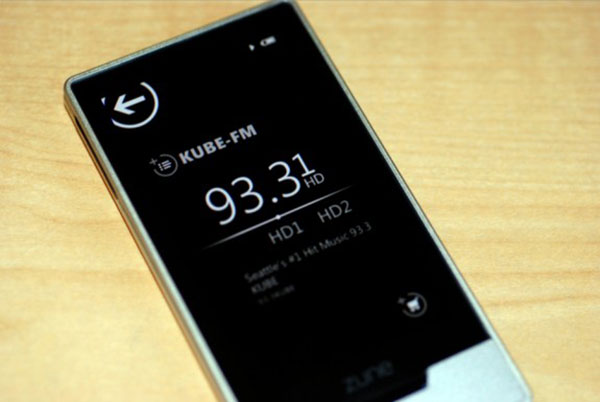
I love the radio. I remember with my old Zune 30 and Zune HD traveling for 14 hours listening to local radio wherever I was. Just plug in your earphone or headphones and you are good to go. Sadly the X1 doesn’t have a radio module. Maybe its old school now but I miss it on the new audiophile DAPs. The iPod Nano now has FM radio and so also the Sansa Clip and Fuze+ in FM format with up to 40 presets. Both of the Sansa DAP’s even have integrated microphones for voice messages etc, though I rarely ever found a use for that option. Neither the X3 nor the X5 comes with a radio option either so I highly doubt it is in the works or hidden in some later firmware version sadly. If you ever get a chance go back to the touchscreen Zune HD radio; it is beautiful, works really well and most of them can be picked up on eBay for a few bucks.
Accessories
The X1 accessory package is stripped down a bit from the X5 and X3. In the box, you get one charging cable, a silicone case (always handy) and a couple of screen protectors, stickers and a manual. One neat touch and I have to tip my hat off to FiiO for, is the fact they put one of the screen protectors on the screen out of the box. Thank God for that because the amount of times I have had to troop down to the local market and pay a few bucks for someone to do it for a cell phone or new DAP is incredible. I suck at putting on screen protectors so just having to take the top layer off and it’s already on the X1 screen without a single air bubble is a Godsend to clumsy fingered people like me. It would have been nice to have a small IC cable in the package for those starting out for the first time but if the intention is to pair it with a portable amp then the likes of the FiiO E11k have a short 3.5mm IC as standard which will do the job nicely.
The package is roughly comparable to the Clip and Fuze cable wise but both Sansa products do not come with any sort of screen protector or silicone case, unlike the X1. The HM-700, on the other hand, comes packed with a whole range of accessory goodies which are actually reasonably useful. You have an armband or wristband depending on how big you are for jogging ala iPod style, a TRRS to TRS adapter if you want to grab the RE-400 or RE-600 and play in balanced mode and a USB adaptor also. That is pretty good value actually and I had one or two guys tell me they actually use the armband during their exercise regimes.
Hailing the sensible UI
The X1 UI is being touted as a new and dedicated theme for the X1. Whilst this is largely true it does borrow a lot from the existing UI of the X5. In fact, in comparing both I actually preferred the UI of the X1 over the X5 especially when used in conjunction with the physical buttons of the X1 which I also find intuitively superior. Now it doesn’t have the same depth of options as the X5 and of course, you are working on a non-touch small screen but I certainly think the flow of the X1 UI is far superior to even the latest 2.0 firmware of the X3 in terms of usability and button to menu interaction.
Boot up times of the X1 is marginally faster than the X5 after thrice testing them in a “boot off” but its slightly slower than the X3 boot times by about 1-2 seconds. The X3 shut down is also about 1 second faster than the X1 but ever so slightly slower than the X5. I say slightly slower it is minute and could have just been my two hands not being totally in sync. Either way, only the X3 can claim to have the fastest boot and shut down times of the 3 FiiO DAPs. All 3 seem very sluggish in boot times to the Clip (Rockboxed) which is almost instant on and off.
Menu options
Once booted up the X1 offers 5 distinct options, 3 of which will not function without an inserted microSD card; Now Playing, Category and the File Browser. The other two main settings are the play settings menu and the main settings menu. All of these can be accessed by the jog wheel and center button with one hand and suffer from zero lag. You can return out of any submenu through the use of the return button which is on the top right-hand side of the wheel. This is probably going to be your most used physical button outside of the big central button in the jog wheel for accessing menu options.
The settings menu is almost the exact same as the X5 also minus the choice of USB mode, DAC or storage. Instead, the X1’s double down option on the headphone jack is available allowing you to switch between line out and headphone jack. Apart from that the only other significant difference in the settings menu is the new X1 theme selector option which has 6 different colored themes in total. Orange I quite like personally, other choices include pink, grey, green, blue and brown. I do hope there will be more options available on the theme section with future revisions. It is a simple but nice personal touch.
The playback settings menu of the X1 also looks quite similar to the X5 options. The Power-on volume of the X5 is now called the default volume in the X1 menu and the X1 does not have the X5 gain low or high option. The X1 equalizer has now moved to the playback setting menu instead of having its own unique second tier submenu that you also find on the X5. The X1 equalizer is also a 7-band equalizer rather than the more encompassing 10 band version you find on the X5. Both have presets and customization options but FiiO has droped the blues preset leaving 7 presets instead of the 8 presets of the X5.
The Competition
The X1 UI is infinitely superior to the rather basic and frustrating UI of the HM-700. The wheel and physical button control and well laid out GUI options leave the HM-700’s presentation in the shade. There just isn’t that same mental connection between what the physical buttons of the HM-700 do and what the UI is suggesting you can do. It is not that obvious and at times using the HM-700, even after many hours I still press the wrong button for what I want it to do.
It feels slow in response compared to the X1 and even slower than the Sansa Clip which moves along very quickly from boot up to playback. The Clip can be considered the fastest of all the DAPs in terms of accessing it’s (Rockbox) database once finalized and updated but tiny screen real estate is the biggest weakness compared to the more expansive X1 screen. The Clip’s tiny screen and line-style UI makes it feel too linear and restrictive compared to the faster drill down options on the X1 UI. Whilst needing far less processing power line UI had it’s hay-day about 5-6 years ago and the “young” do expect a bit more nowadays.
Perhaps the FiiO’s biggest UI competitor is the iPod Nano (7th Gen) with its slick and well evolved Apple iOS system which works very well with the multi-touch touch-based interface. The capacitive LCD though ‘low res’ compared to its bigger iTouch sibling, is slick and highly responsive. It is also very intuitive and well integrated into the Apple ethos so those migrating from any iGadget device will feel right at home with it. Tag reading is normally excellent and library building courtesy of iTunes works very easily. Of course, you are locked into the Apple ecosystem unlike the FiiO UI, lacks on the go playlisting and is now missing the wonderful cover flow option that I enjoyed even on the older iPod Classic and previous non-touch based click wheel Nano.
Click on page 2 for sound impressions…

