Software
Proprietary OS
(Tested with firmware version 1.0.0.2)
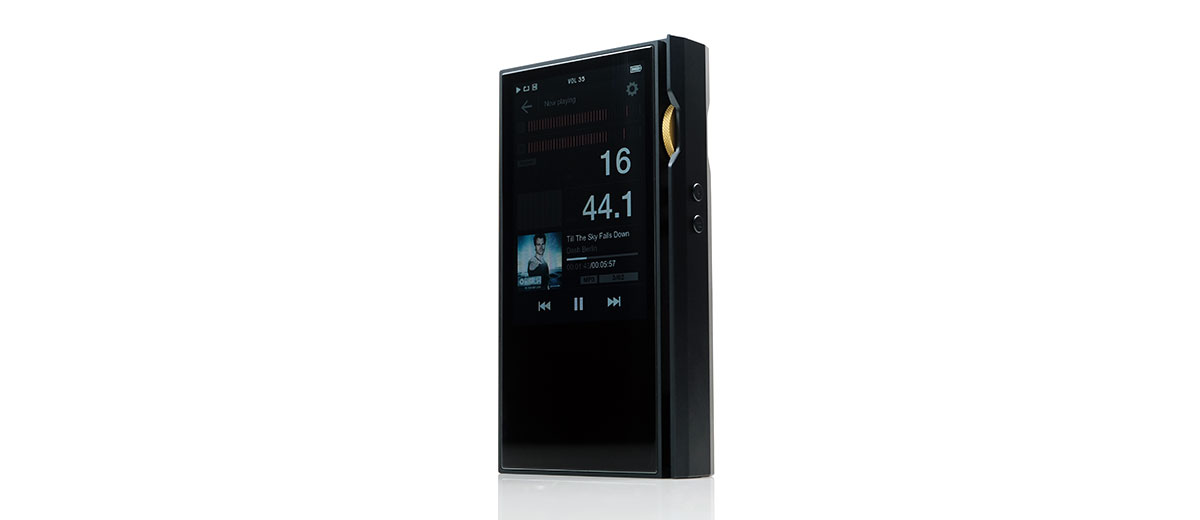
The P6 Pro does not so much as ditch the P6 proprietary OS Linux framework but rather rework the UI to better accommodate touch navigation. It is still a relatively simple OS though slightly less linear than before. Most of the features are exactly the same as the P6 version so that means no app capability and no WiFi for social connectivity.
Comparing to my dated L3 Pro I can tell it’s more or less the same OS with a more mature and refined approach with similar sub-menu options under key headings. The top-most icon layers also make a comeback but it is actually a bit simpler than the L3Pro triple icon layer with a single return arrow to get you out of any sub-menu.
So, essentially the new P6 Pro OS is a mix of the P6 list-based screen cards with the L3 Pro touch control icon at the top for fast touch navigation.
The P6 Pro OS speed and stability are essentially the same as the P6 version though it will seem faster with touch capability once you boot up. The bootup time into the home menu screen is around 5 seconds from a long press and about 2 seconds to power off. I suspect the stability is from the code being relatively mature since LP has been using a version of this for years.
Navigation
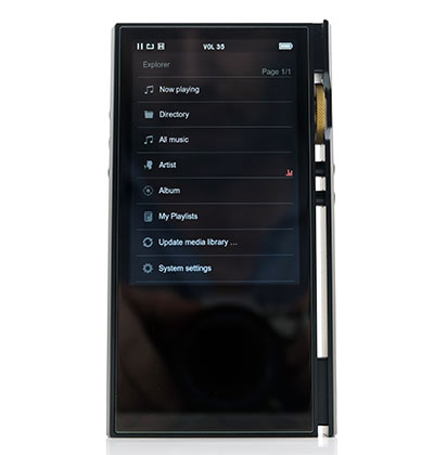
You now have several methods through which to navigate the P6 Pro software. You can navigate via touch, the physical buttons or the rotary, or a mix of all three with the options all user switchable in the advanced settings menu.
If you are a pure touch guy you can disable all the mechanical controls which is my default option for the P6 Pro navigation. You will not lose playback control from the left panel with this option, only menu navigation is affected.
You can also set navigation beyond touch to purely the rotary dial or the media control keys or a hybrid of both. Personally, I do not see the need for them but it is there if you want it.
In terms of UI experience, this is still a relatively linear navigational experience. The old 3-click rule of 20 years plus UI principle is still strongly in effect on the P6 Pro OS so you are unlikely to get lost or stuck when navigating.
The home screen is always but a few clicks or touches away. If you chose to retain the media control via the physical keys it is even faster with a single long press of the command button.
Also, media navigation is much better with touch scrolling on the P6 Pro. Whilst still a bit of a pain with long lists on a small screen, you can get through it much quicker than the media button and rotary dial functionality of the P6 non-touch alternative.
Playback
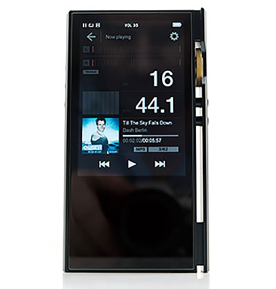
Once in the P6 Pro playback screen, there are a few more layout and option changes from the P6 playback that seems to be a response to moving to touch gestures that can open up different areas of the OS quicker than non-touch.
Gone is the quick low gain and high gain switch from the P6 as well as the volume bar. Instead, you now get a timeline touch control with quick playback options towards the bottom and a cogwheel to the top right that gives you direct access to the system settings.
From there you can drop into the EQ or Audio output and change the gain, go LO from PO, or quickly switch your digital filter setup then return back to the playback screen without interrupting the music.
All other features on the playback screen are unchanged meaning the big bitrate and sample rate display box, the artwork to the bottom, and the animated peak meters at the top which bob up and down during audio playback.
One critique? The tiny timeline is a bit challenging to manipulate where you want it exactly via touch. I would like to have seen that moved up to where the volume bar is on the P6 screen is to give you a bigger and more precise area to control.
Features
The P6 Pro feature set has not changed from the P6 on a high level. The user experience has improved though with the switch to touch-based UI controls allowing for quicker access to sub-menu options including environmental controls.
Audio Output
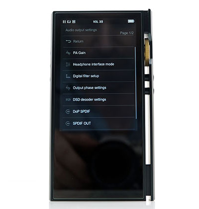
The Audio output option is still the most critical sub-group of controls on the P6 Pro as it was on the P6. This covers the output mode of the analog jacks as well as your digital filtering and gain control options. If you use the P6 Pro as much as I do you will find yourself dipping into this menu quite a lot.
You get two gain controls, high and low, which also act as the voltage switch for the lineout options from the same jacks. You can switch between the two output modes from the same output settings menu.
At the very bottom of the audio output settings menu is the final switch option to change to SPDIF output. This is still split from the headphone interface mode and once again I find myself wondering if these two could not be merged to a single output selector menu for simplicity’s sake.
You also still get the same 5 different filter options in the digital filter setup of the P6 Pro, the ability to select native or DSD to PCM decoding as well as choose DoP over your SPDIF output.
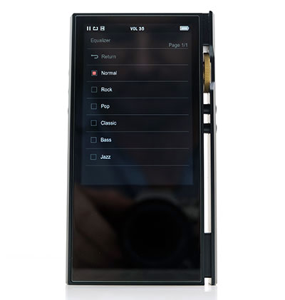
Equalizer
An unchanged equalizer represents a bit of a missed opportunity here for me on the P6 Pro. As before, you get 6 presets the cover the norms such as flat or normal, rock, pop, etc. but sadly still no ability to customize what is in effect an 8-band graphic equalizer, (as represented on the playback screen).
The presets still have a noticeable effect on the final output though personally, I prefer them switched off as it delivers a few more dB volume and sounds the most dynamic out of all the presets.
Using a classic Sony MDR-EX1000 monitor, the Jazz preset still comes in second place with a cleaner tone and more bite in percussion should you wish that. Another doable option is the rock preset which will give you that classic V-shaped response but it also seems to gut the physicality and presence from the EX1000 lower-mids a bit too much.
The rest are either way too muddy like the bass preset or uneven sounding like the mids forward pop preset. The Classic preset sounds like it’s being played in the room next to me which isn’t that appealing.
Environmental Controls
All advanced system settings on the P6 Pro remain unchanged from the original P6 menu options. That includes display management which I mentioned before you should drop to around 3 from 5 to limit the drain on the unit battery life. Sleep options will also help improve battery management if not using it on a frequent basis.
USB options for the P6 Pro remain the same with a choice of connection modes for data transfer or DAC output. You also get an audio sync delay for latency control and a choice of power via USB or the battery inside the P6 Pro when in DAC mode.
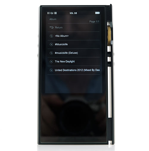
Media Management
You can dig in and manage your P6 Pro media via two routes, the directory option which is the basic folder and file navigation, and through the meta library options.
Directory
The folder and file drill works just like any other DAP that offers the same options and the drill-down and selecting is fast. You also have a secondary menu option by long-pressing the touchscreen over the choice of track to allow you to add the files to playlists or delete the files altogether.
Meta Management
The meta library has almost the exact functionality as the drill-down file explorer except it uses the meta tags to file tracks under the usual categories of artist, album, and all music, (songs).
The flat drill down from there on the P6 Pro is unchanged from the P6. So, artist selection going straight into all the songs rather than grouping them by albums then songs which is a bit cumbersome if you happen to have a ton of albums. There is still no genre option, something that I hope can be included in subsequent firmware updates.
Long pressing on an individual track will give you the option to add that track to a playlist that you can then access in its own area in the media library. However, you cannot delete the actual track in the meta library like you can in the file browser.
Playlists
Playlists have their own section where you can add and delete but sadly you cannot rename the playlists so if you manage a ton of them you will have to memorize what’s in them via a 1,2,3 etc… naming sequence. Not ideal.
Click on Page 3 below for sound impressions, Bluetooth performance, and synergy.

