Official Google Apps
Overview
As the saying goes, the hardware is as good as the software running it. Taking that into context, we realize the importance of one thing when it comes to latest-generation consumer electronics: apps.
Made famous by Apple and the iPhone, the whole software ecosystem now relies on apps for functionality, productivity, and enjoyment. Without apps, a gadget can be easily made irrelevant as people clamor for more features than what is expected of the device.
Apple currently dominates this space with the immensely successful App Store – what does Google, primarily an advertising company, know about such things? Well, with the introduction of its Android mobile operating system, Google has advocated open-source access and thus spawned a new breed of consumer audience; those who prefer free apps, and free app development.
With that in mind, Google is set to contend with Apple in terms of applications both in the sheer number and pure quality. Today, this section only covers the basics of Android apps – the stock Google Apps found in Honeycomb.
These are meant to optimize productivity and media value of a stock Android device, without the need for 3rd-party solutions. So, how do Google’s services work, and what can they do for the consumer and end-user? Let’s find out.
Google Market
Ah, the Google Market. This is the one-stop hub for everything Android; apps, games, widgets, mods, and media are all right here in the platform’s official app store.
The open-ended app distribution model of Google as opposed to Apple’s more stringent approval process makes it enticing for a considerable number of people, who are interested to publish their work in this less-restrictive environment.
But this also has resulted in a number of incidents – low-quality apps, stolen/defective copies, and even malware-infected ones. However, that is the price we have to pay for maintaining this free-market ideology; intelligent consumers who know how to sort through the crapware are usually greatly rewarded with rare gems.
And with Android’s stunning growth at over 350,000 handsets activated every day, the market has also exploded in terms of app count and app quality – around 220-300,000 apps are already available in the market alone.
The gap between the App Store and Market is inching closer and closer, as more and more developers are seeing the potential in selling their products to the Android platform.
Interface
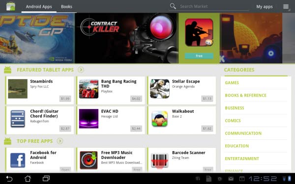
Now, let’s take a look at the user interface of the Market. Honeycomb users will be greeted with a largely horizontal-based layout of the Market, which frankly looks a lot cleaner and more professional than the mobile version.
Over at the top is a menu bar that categorizes between apps and books, as well as a search bar, shortcuts for your installed apps and a context menu with options such as accounts, purchase history, and content filtering. Just below is a scrolling gallery of images that feature top new apps, and tapping one takes you to the respective app.
Also at the main page, there are categories for featured tablet apps, top free/paid, and Editors’ Choice applications; these are automatically updated to showcase the most recent trending high-quality apps for Android.
The right-hand side has the Categories panel, which organizes all apps into specific classes like games, books, and sports apps. Pressing on one of them takes you to the category’s sub-menu that splits into a Best-Selling and Top Free list.
Specific App info
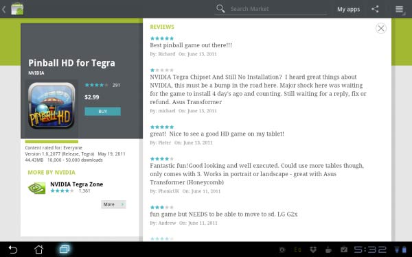
When taken to a specific app, there are some elements unique to the Market UI from others. The left panel has the name, picture and overall rating of the app, and buttons to download (or purchase) and manage it.
Also within this area is the content rating, latest version number, file size and download history of the app. The right panel hosts the most content; text descriptions offer an overview of the app’s function, highlighted by some key details and a separate list contains the patch notes for each latest update version (for users to keep track of tweaks and new features).
There are also preview screens or videos showcasing the app’s design and usage – tap on one to see it in full view. User Reviews is probably the most important part of this panel; one can read people’s thoughts about the app, both positive (great optimization, cool functions, etc.) and negative (force closes, lack of usability, etc.) for the consumer to know if it’s worth downloading/purchasing or not.
Right below are links to the developer’s site and email address, as well as shortcuts to applications relevant to the category.
Purchasing
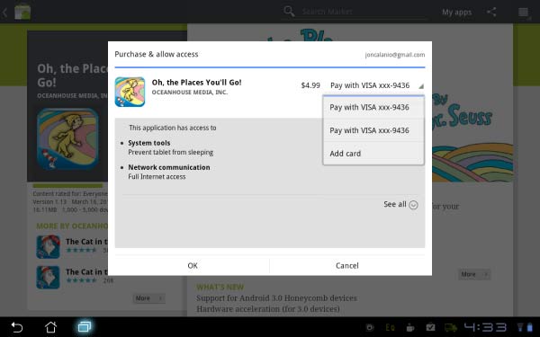
Purchasing an app is done by selecting the Buy button, which takes you to a pop-up menu which requires you to select a payment method (credit card, or carrier billing) and accept the Permissions list for the app.
Once the transaction is done, the app will be downloaded and an email directed to your Gmail account will immediately be sent pertaining to your purchase receipt. Should you be unsatisfied with your product, there is a Refund button to revoke the purchase as long as it’s within the 15-minute period upon buying the app.
This is kind of problematic since 15 minutes is very short to test all the features and quirks of the app, but this was done by Google so that people won’t be able to finish full-length games in one sitting and refund them once finished.
Under the My Apps section, one can easily keep track of all installed apps as well as those purchased, but not installed on the device. The grouping splits if there are apps that are available for an update; those are immediately grouped at the top of the list for easier access.
These apps could be updated individually, or in a batch by hitting the Update All button. Should the user wish to have his apps updated automatically, he can select that particular app, enable the checkbox for Allow Automatic Updating, and off it goes. All update options are done over-the-air; no cables, no syncing software required, only an internet connection and access to the Market.
Honeycomb Browser
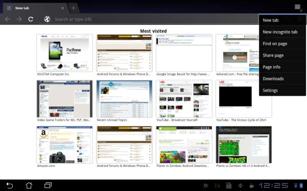
Look at the new browser. Doesn’t it look familiar… the tabs support, the unified URL address bar and search bar, the minimalist design? No, it’s not Chrome on Android, sorry to say – it is however built in the same WebKit as its desktop counterpart.
The Honeycomb Browser is as awesome as its bigger cousin, with quick tab access, the famous Opera-like speed dial front page, and ease of use. It is Flash-capable on all websites, even 720p Youtube videos right from the desktop version. Navigation is relatively easy, and renders webpages accurately – from Newgrounds’ Flash-heavy environment to Gizmodo’s Gawker feeds interface.
Features
The basic features are pretty standard for desktop browsers – clear cache, fill form data, text encoding are present. There’s an option to sync with your Chrome data, as well as User-Agent strings to render webpages either in mobile or desktop forms.
Flash plug-ins can be set either to off, on-demand or always on – this is a great option for users to turn off Flash content in order to save on data and resources. Google Labs is also present in this browser, allowing you to try out experimental functions such as Google Instant or the innovative Quick Controls.
However, despite all of these excellent features, the Honeycomb’s browser still has a bit more to go. In terms of stability, the browser sometimes crashes in really resource-intensive sites; it might be the limitation of the OS or the hardware, but this issue should be fixed.
Also, scrolling isn’t as smooth as I would like: it re-renders the webpage as it moves, playing catch-up with the speed of the scrolling. T
his results in seeing blocks of information being blank before being rendered as I navigate a site. But Google isn’t going to leave this browser as-is; future updates to Honeycomb will hopefully fix these issues and make this browser as solid as it can be.
Youtube
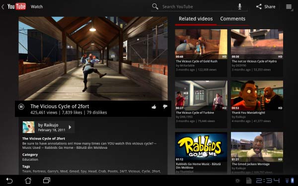
Honeycomb’s version of Youtube is, in both form and function, beautiful. Users will be amazed to see the unique 3D carousel presentation of top trending Youtube videos, or those uploaded by users they subscribed to.
Navigation is quick and easy by simply swiping through the hundreds of available video thumbnails, along with their descriptions and ratings. Pressing any Youtube video takes one to the tablet-optimized Youtube video interface.
On the left side is a small window of the video in question and ready for playback; tapping on the Expand button on the video’s bottom bar takes the viewer to fullscreen mode, with the app upscaling the resolution to HD or the highest available version.
The right panel hosts a number of related and recommended videos; simply tap on one to be taken to the selected video. This view also has a tab for viewer responses, allowing someone to read comments, or even make one within the app by typing on the displayed text input bar.
Extended controls include a Share function commonly found on most Honeycomb-optimized apps. Users will be able to share Youtube videos over to various outlets like Gmail, Facebook. Other options include adding videos to favorites, flagging inappropriate content, and so on.
Performance
Overall performance of the Youtube app on the Transformer has been improved from 3.0 to 3.1 Honeycomb. On its initial version, the Transformer struggles to even playback 720p videos, and 1080p was simply unplayable.
I thought this was a serious limitation of Honeycomb or the Tegra 2 processor, but the 3.1 update luckily has fixed this issue. Now, 720p videos almost always playback smoothly, while 1080p versions – while still laggy – are at least viewable in the smaller video screen but not always on fullscreen view.
Overall, a great entertainment application that simply works for the most part.
Google Music Beta
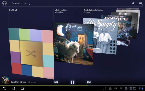
Google’s standard music app is a massive overhaul over the previous versions’ rather bland and unintuitive interface. Accessing the New and Recent view presents users with a partial 3D carousel of album art, like a cross between its Youtube 360-degree carousel and the iOS horizontal Coverflow.
This function is optimized for Tegra 2, so flicking through albums is smooth, fast, and accurate. Other views include Artist, Album, Song, and Playlist modes, and in every mode, the bottom control bar always displays the currently playing song – controls include play/pause, back/forward, a small album art of the song, as well as a thin navigation bar.
I must say, the overall design is much more unified and modern, very minimalist that goes well with the Honeycomb Holo UI.

Useability
In terms of usability, the new Music app has a new slew of features. Now, users are able to do more with their collection; accessing a sub-menu in their chosen song grants them the ability to make an instant remix (like the Genius Playlist) based on the song and shop for the artist’s songs/albums via the web browser.
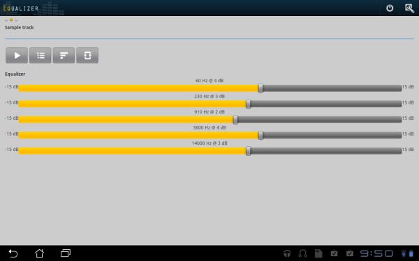
And via an app from Google Market, audio enthusiasts will be pleased to know that a functional equalizer is available integrated within the Music app after installation.
Options include a 5-band parametric user-defined equalizer, headphone virtualization, and reverb effect settings, as well as Bass Boost level and multiple EQ presets. Sound quality, while not as detailed or analytical as my Cowon S9, is more than sufficient enough on the Transformer and could act as my secondary source.
Bass has impact, the soundstage is wide, and instruments/voices are organic-sounding.
Cloud
Google just released its Music Beta cloud service in the US, open to all beta testers who wish to avail of this offering. I was invited to partake in the beta (coincidentally getting the confirmation email hours after activating the Transformer) and decided to test it out.
Basically, Google’s approach to a cloud music storage is similar to Amazon’s; users will have to organize and upload their music collection into Google’s servers, essentially becoming a media locker service.
Once in the cloud, all stored music (up to 20,000 regardless of bitrate) will be instantly available for streaming across multiple devices linked to the same Gmail account. In my case, I could sync my entire library across my Desire HD, the ASUS Transformer, my dad’s Atrix 4G, and of course any desktop PC with a browser.
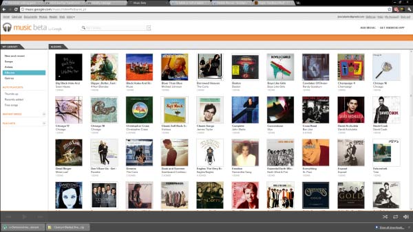
Streaming surprisingly works well with even my Desire HD’s rather spotty 4G HSPA coverage, and even more so with the Transformer connected to WiFi or tethered to my phone’s mobile hotspot. Songs buffer very quickly, that only at times do I get pauses to finish loading a song. While playback is going on, the Music app downloads and caches songs that are next in the queue so as to prevent constant buffering. And if I fancy a song and would like it to be permanently stored to my device, I could “pin” it for offline usage; the songs I selected would be downloaded and saved to the tablet or phone. So anywhere and anytime, Google Music gives me the flexibility to access the cloud or my internal storage to enjoy music.
Google Books
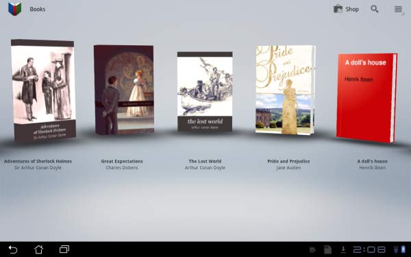
Google Books offers a satisfactory experience for all those e-reader lovers out there. The user interface takes another queue at the carousel view, displaying book covers in a showroom-like fashion.
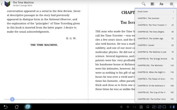
Tapping on any one of the books will automatically load the book, presenting readers with a lovely book-like landscape or portrait view. Flicking the pages is smooth, accompanied by a digital animation of a page being turned; the responsiveness of the app is excellent, especially as it should emulate real book reading.
Both landscape and portrait modes are readable in their default form – the font size is perfect, paragraph format and spacing are great. When read in the ASUS Transformer’s stunning IPS display, both day and night modes offer an excellent viewing experience, especially with its 178-degree viewing angle.
Features
For a default app, Books has some extra features that are essential for any reader. Tapping on the Aa icon on the upper right side takes one to the advanced options menu, giving one option to set day/night reading mode and display brightness, font size, text or scan format, and line-height.
There is also an option to make the e-books ready for offline viewing, so people can read their favorite books even without internet access.
Accessing more titles is made easy by Books’ integration with the Google Market. When launched, the Market immediately goes to the Books sub-category, showing the same homepage but instead of apps, books and magazine titles are being displayed and advertised.
Books are organized in Trending, Top Rated, and Top Free titles, as well as categories based on interest and genre. Downloading or purchasing books are similar to the process in apps, as is in managing them in the library.
Gmail
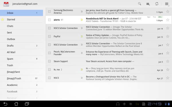
Honeycomb’s Gmail app is vastly superior to other versions seen in Android. Aside from the more comfortable interface thanks to the 16:9 screen ratio of the tablet, it also makes full use of the browser version’s layout; avid desktop GMail users should feel right at home with this ecosystem.
The left panel hosts the standard email options such as compose, the inbox, and organized folders, while the opposite side displays a list of email messages and of course the contents of a selected email.
It’s worthy of note that the email view is just like the browser version; similar emails are grouped into conversation view, and embedded images and videos are in their correct format when viewed.
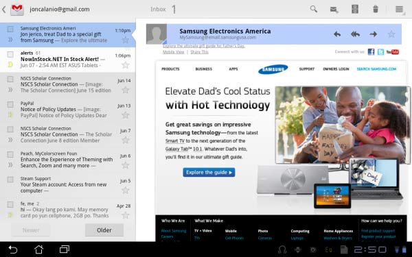
Users can easily type in replies, or even interact with the message if it were a website with a text box, for example. Composing a message however is more streamlined, instead of the traditional form it now displays the message in a cleaner paper-like layout.
So basically, almost all of the functions found in Gmail are available and work correctly in the app version. Messages moved, deleted and archived are instantly synchronized across all GMail versions under the same account, while changes to contacts and calendar are immediately synced to Android versions – I could see the changes I made on the Transformer to my Desire HD’s contact list and vice-versa.
Simply put, the email functionality of Honeycomb is no different from that on the desktop, which is a good thing.
Click on page 3 for more on apps and performance


