The Asus Eee Pad Transformer is a multi-touch IPS display panel with an optional keyboard dock and retails at launch for $399.
Disclaimer: The ASUS Eee Pad Transformer was a purchased unit for the purposes of this review. We thank ASUS for this opportunity.
Note, this review follows our new scoring guidelines for 2020 which you can read up on here.
With tablets being all the rage these days, how does one stack up against the competition? Hardware specs? Innovative features? User experience?
ASUS steps up to the challenge by introducing their first-ever Android Honeycomb tablet that combines software prowess and powerful performance all packaged in a gorgeous form factor.
This is the Eee Pad Transformer TF101, the brown beast of a device that challenges the likes of the Apple iPad and Motorola Xoom – at a very aggressive price of $399 and $499 for the 16GB and 32GB versions.
Transformer Hardware
Design and Feel
The ASUS Transformer, in terms of design, is simply beautiful. Measuring only 12.98mm at its thickest part, the Transformer is relatively slim, albeit slightly wider in comparison to its competitors.
A smooth metal bezel wraps the device, with its power and volume rocker keys kept flush and the various connectivity ports well-spaced and positioned. The contoured back is patterned and textured, providing grip as well as less susceptibility from fingerprint marks.
The front screen gives a smooth touchscreen experience while preventing unsightly marks and scratches with its Corning Gorilla Glass panel. ASUS has done a marvelous job in making a rather minimalistic design principle on the Transformer.
Overall build quality and heft are also quite good. Weighing just a tad heavier than the iPad despite the increased dimension, the Transformer does not make anyone tire out even when handled with one hand.
Some reports say there’s some small gap in the back that might cause the tablet to flex when held tightly; this isn’t true on all accounts as I have never experienced any annoying creaks or anything of the sort. The ASUS Transformer definitely feels premium once held in the hand.


Connectivity
The Transformer hosts a multitude of ports for connecting with various other devices. On the right of the tablet there exist the 3.5mm headphone/microphone jack, a microphone port, the mini-HDMI connector, and a microSD card slot capable of read-write on up to 32GB Class 10 cards.
Over to the bottom, there is the ASUS proprietary USB connector in the middle, while two slits on either side of it are used to connect to the tablet’s optional keyboard dock for stability. Both sides of the Transformer’s bezel have a speaker capable of stereo output.
There is no full USB port found in the device, which is a disadvantage compared to the Acer Iconia which is USB-storage ready. However, purchasing the optional keyboard dock allows the user to have 2 of these said ports.
The back panel is mostly bare, with only the 5MP camera present on the top middle of the device. The lens is protected by a small glass porthole and a flush metal rim. It’s kind of underwhelming to have no flash present here, but most likely it’s a trade-off in order to preserve the seamless look of the tablet.
Over to the front is a smaller 1.2MP camera for video conferencing as well as an ambient light sensor.


Technical Specifications
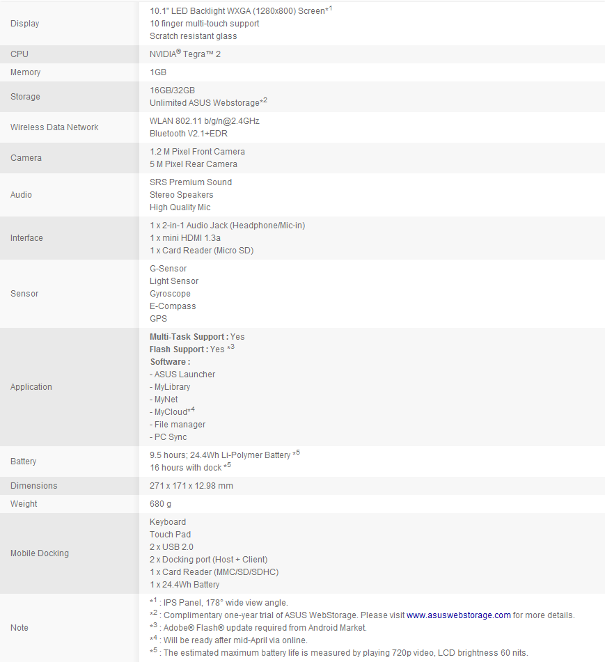
The Transformer is definitely a capable Honeycomb device. Its specs closely match those of other Android slates such as the Motorola Xoom and Acer Iconia Tab; it sports the famed Nvidia Tegra 2 dual-core 1GHz processor, capable of rendering games with relative ease and provides the user unmatched performance in applications and web browsing.
Its battery is rated at 9.5 hours according to ASUS, and I was able to closely match that rated battery life with 8.5 hours’ worth of gaming, HD video, and web browsing. Other standard connectivity options are available, including an accelerometer, GPS, WiFi b/g/n and Bluetooth.
What I really love about this slate is its brilliant 10.1 inch IPS display – blacks are darker, whites are more brilliant, and colors pop with utmost vibrancy. Text and images are displayed perfectly through its excellent 178-degree viewing angle.
Everything from games to movies has become a renewed experience; you literally have to see it to believe it. Compared to other touchscreen devices I’ve used, the Transformer is easily up there with the iPhone 4’s Retina Display for sheer clarity and picture quality.

And of course, what makes the Transformer, well… a Transformer is its optional keyboard dock that’s more than an accessory. Though I don’t have it as of now, reviews really say the dock is a good deal.
For $149 you have the added capabilities of two USB ports (with full controller/mouse support as of Honeycomb 3.1), an extra SD card slot as well as more juice for up to 16 hours total battery life on a single charge. This makes the TF101 a really good alternative to netbooks in terms of staying power perfect for the office and school work.
Without further ado, here is the spec sheet of the Transformer:
Android Honeycomb OS
Overview
Android 3.0 Honeycomb is Google’s first foray into tablet operating systems. Unlike its main competitor which only improved upon its existing platform and upscaling it to a tablet form factor,
Google decided to develop its user experience by taking some features of a desktop layout and streamlining it for use in Android-based tablets. The result was a visually new interface that is markedly unique compared to previous Android versions.
Dubbed the Holographic, or “Holo” UI, it largely resembles futuristic, Tron-like design elements with its dominating blue color scheme and use of outlines and borders on some UI elements.

User Interface
First, let’s look at the Transformer home screen. In Honeycomb, the user is given a maximum of 5 home screens to play with; fill it with icons, widgets, anything you like. Homescreens scroll in a 3D-like effect as is shown in the picture, complete with a neon outline to show the transition between each screen.
This has been an implementation we’ve seen in some 3rd-party home launchers like LauncherPro and ADW and now is enabled by default on 3.0. With the system able to incorporate full hardware acceleration, scrolling through the OS is buttery smooth even when filled with content.
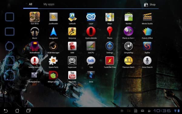
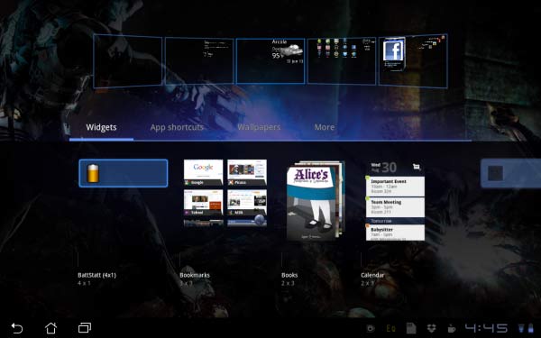
Over to the top left, there’s a quick-access Google search bar as well as Google Voice Search icon; these are now built-in to the system unlike being as widgets in previous versions of Android.
On the top right is the App Drawer to access the entire library of apps present in the device, as well as a + symbol that enables users to quickly add elements to the home screen.
This opens a selection screen that displays a preview of your 5 current home screens, and down below is a categorized drawer for specific UI elements: widgets, wallpapers, shortcuts, and other functions.
You can either tap on a selected item and it goes to the center home screen panel, or you can drag it into a panel you wish to place it on. Deleting such elements is easy as well; all it takes is a long-press of an icon or widget, and have it dragged to the trash can icon in the same spot as the + symbol.
Widget Support
Widgets have always been a feature that characterizes Android, and Google continues to improve upon it with Honeycomb. New designs of the default Google widgets are available, like the updated interfaces of the GMail, contacts, bookmarks, and calendar widgets as well as the awesome Analog Clock.
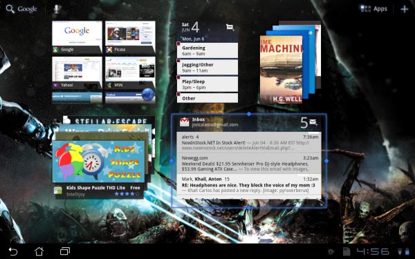
ASUS has its own take on widgets, incorporating into the Transformer their own weather, email, clock, gallery (MyZine), and cloud storage (MyCloud) widgets. And aside from the default settings and layouts, Honeycomb (at least 3.1) now officially supports resizable widgets and introduces an entirely new layout: the stacks widget.
Essentially, the Stack aggregates data such as news articles and apps in unique scrollable thumbnails; users would just flick through the thumbnails and they scroll in a 3D-like fade, and tap on the selected item takes them to the relevant app or content. This is seen in some high-profile widgets such as the Google Market, Youtube, Google Books, and more 3rd-party solutions.

Lockscreen
The lockscreen is another cool thing worthy of notice. Instead of the traditional slide-out to unlock feature found in Android and iOS, Honeycomb has the “Ripple” lockscreen enabled as default.
This is basically an icon of a padlock that users have to drag to the edge of a circle, making rippling animations as it goes. This is rather a fun feature since people can just roll around the lock without having to unlock the screen by just moving it about and not hitting the edge of the holographic circle.
Other lock options also exist, like the use of the Android-native pattern lockscreen as well as a numeric PIN or an alphanumeric password.
The Taskbar
One unique aspect of Honeycomb is its focus on a button-free experience. There’s no physical Home button for most Android tablets like the Transformer; instead, Google decided to implement a familiar feature we commonly see in desktop platforms – the taskbar.
Like in Windows, the taskbar in Honeycomb performs most of the basic functions of the system. It has a Back, Home, and Multitask button for UI navigation, while over to the opposite side of this is the clock and status icons, where things like WiFi status, battery, and notifications are displayed.
Tapping the clock reveals Honeycomb’s extended menu, where it displays even more useful information such as a scrollable list of recent notifications and an icon for easy access to the most common Settings toggles: Airplane Mode, Brightness, and Auto-Rotate among others. This implementation is easy, non-obtrusive, and very intuitive compared to others.
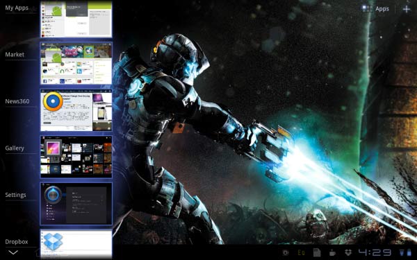
Building upon this taskbar-oriented interface, Google decided to ditch the traditional Home Button long-press to display all running applications. Instead, it implemented the Multitask button, which displays the most recent applications in a vertical scroll complete with a thumbnail snapshot of the apps.
In Android 3.0 this feature is limited to only display the 5 latest running processes, but in 3.1 this is increased to all running processes and applications in the tablet.
This is a welcome improvement over the multitasking options in the older Android builds, as people now have easy access to their apps through a tap of the shortcut. Most, if not all, running apps will continue to run their operations even when minimized: loading a Youtube video, downloading Market updates, and more.
Settings
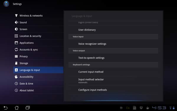
The full Settings menu of Honeycomb has been revamped as well. All of the core settings found in other Android versions are presented in a more systematic fashion, with the main selections are pinned to the left panel and sub-menus are to the opposite panel.
The Storage menu now previews the total space occupied by various content in a multi-colored bar, and on the Screen menu, there is a feature only found embedded within the ASUS Transformer: the screenshot capture toggle.
This is how I get these screenshots without using 3rd-party software. And last but not the least, there is a nice little effect seen while scrolling through all menus, and not just in the Settings but throughout the entire OS; if a user hits the top or bottom of a scroll selection, instead of a kinetic bounce effect in iOS, Honeycomb uses a glow effect to signal that the end of the menu has been reached.
This is also implemented in 2.3 Gingerbread, but the original idea stems from Android 3.0.
Click on page 2 below for the Official Google Apps review


