The Hifiman HM-901 is a flagship digital media player with a unique interchangeable amplification stage. It is priced at $1499.
Disclaimer: The Hifiman HM-901 sent to us is a sample in exchange for our honest opinion in this review. We thank the team at Hifiman for giving us this opportunity.
To read more about Hifiman products we reviewed on Headfonics click here.
Note, this review follows our new scoring guidelines for 2020 which you can read up on here.
Hifiman can claim to have been one of the original proponents of the new wave DAP market when back around 2007 they launched the HM series with the excellent if somewhat ’boutique’ HM-801 and then in 2011 came the lower level but no less capable HM-602.
Not without their faults, especially the all too short battery life, and somewhat limited UI, they were lauded as the future of high-end portable players and certainly a huge step up in audio capability from the Creative, Apple, and Philips ‘norm de jour’ cluttering the minds and retail shelves in many a city.
Fast Forward
Fast forward to 2013 and 2014 the audiophile DAP has become big business and probably one of the hottest wars among a number of companies for many a year.
Ibasso has the DX50 and the DX90, FiiO with the X3 and X5, and Astell &Kern (iRiver) have the AK series topping out just recently with the $2.5k AK240 (and another 0 and it could have been the price as a brand which would be cool eh?).
There are also a number of indie brands out there such as the Calyx brand which is going to ensure this stays an extremely vibrant sector. In some ways, you can argue that Astell & Kern may have stolen the thunder from Hifiman in terms of what can be done and how far one can go with portable high-end DAPs.
Combined with a rather prolonged and slightly problematical launch period for the HM-901 in 2013 you could be forgiven for thinking some of the original sheen in the HM series had been lost.
Vision
However, I see the HM-901 in a slightly different manner now that I have had some time to play with it.
If Hifiman and Dr. Fang stay true to their principles and continue developing the key features of the HM-901 then in actual fact the HM-901 is probably the only flagship “system” DAP out there in the market that targets audiophiles in a way that breaks away from the immediacy of the Apple culture that perhaps the likes of FiiO and Ibasso are more focused on capturing.
System DAP
What do I mean by a system DAP? Every single DAP out there will tell you that their DAP will have a considerable increase in sound quality combined with an easy-to-use UI and a responsive support team focused on improving its firmware by firmware.
But it is only Hifiman (that I know of) that can lay claim to having any sort of modular approach to their DAP designs through their unique amp card system that in some ways negates the need for any external amp matching thereby making it for me the only “system” type DAP for me in the market.
Think of Google’s ‘Project Ara’ and in some ways that is the philosophy deployed by Hifiman, initially via the HM-801 and now with the HM-901. Outside of the “me too” features common on most high-end DAPs nowadays this is what sets Hifiman and the HM-901 apart from the rest.
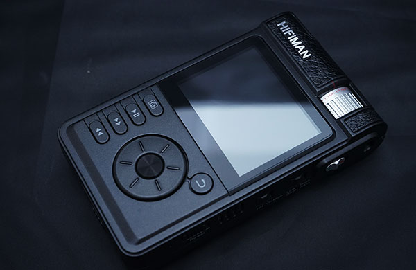
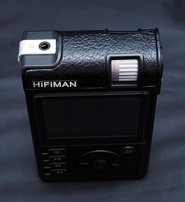
Outside of the Colorfly D4 and Ibasso’s rather complicated DX100, the HM-901 is one of the biggest DAPs in the market far outsizing the diminutive AK series and the slimmer X5. It looks really old school also with the analog volume pot to the upper right and a mechanical wheel and physical button’s adorning the central faceplate.
The casing is mostly hard but high-quality plastics with a leathery finish on the upper rounded plate. It is a unique design, more retro than anything else on the market apart from maybe the C4 from Colorfly.
The screen
There is no touch screen on the HM-901 and perhaps just as well because the battery, huge as it is, is still one of the weaker aspects of the HM-901 armory of features. It’s not a PMP so I never really pay too much attention to the screen’s ability in DAPs so long as they are clean and clear.
I couldn’t find any in-depth specifications on the type of LCD screen they used but it seems to be around 3″ and has average reflective qualities and is not the brightest of LCD screens in general. It is reasonably clear and easy to follow though if not under direct sunlight and the new Taichi UI seems purpose-built for the HM-901 screen presenting no overall usability issues.
The buttons & wheel
The button configuration on the HM-901 thankfully is a lot easier to get to grips with right out of the box than the FiiO X5 button configuration with easily identifiable icons beside each one for forward, back, play/pause, and home on a vertical column to the left and a return or go back type button on the top right of the mechanical wheel which is dead center.
The HM-901 mechanical wheel is unlike the FiiO X5 mechanical wheel being a bit smaller, click or stepped based, and having a series of small ridges on the front to aid the user in being able to control the physical movement.
To be honest given my experience in both, and accounting for the small amount of play in the X5 wheel, I do slightly prefer the snappier X5 wheel over the HM-901 wheel which does not feel quite as in tune with the UI.
That is not to say the HM-901 wheel is of lesser quality than the X5 wheel, probably far from it, just the interaction with the UI is not quite as tight as I would like it to be considering the flagship status.
HD & Vintage settings
On the left side of the HM-901 is the memory card slot (sdcard) which can accept up to 128GB as well as a small switch for balanced and normal playback. On the right-side panel is an array of control features for power, a small hardware EQ switch up (HD/Vintage), a gain control (low and high), and red/green lock switch for the controls.
The HD/Vintage button had me intrigued. I have used some hard EQ switches before most notably on the C&C X02 and the Go Vibe Vulcan amps but not on a DAP. The switch technically alters the HM-901’s dual Sabre DAC frequency response so with HD (high definition)turned on there is a greater extension in the upper frequencies.
The vintage option produces a 3 db roll-off at 20 kHz to mimic a more analog or tube-like experience akin to older or retro amps from yesteryear. It’s a nice touch actually and something I will cover again in more detail when discussing sound impressions.
The volume pot
The analog volume pot is a stepped attenuator type and recessed into the top of the HM901 presumably to avoid accidental movement. It is one of the better ones actually with almost no channel imbalance even on demanding or sensitive earphones.
The top is finished off with 3.5mm non-recessed jack input which can be adapted with a TRRS jack for balanced output using the balanced/normal switch just to the left of the jack. Sadly I don’t have a TRRS adaptor for this review so we won’t be going too much into the merits of going balanced on the HM-901.
The proprietary port
Sadly the HM-901 does not have a universal output socket for data and charging such as what is being used by FiiO and A&K preferring instead to use a proprietary pin socket port and bundling the unit with a data cable for PC/Mac connections and, a spdif/RCA set of cables for line out and a power brick for charging.
Note the data cable will not charge the HM-901. For that you have to use the supplied power block which is huge comparatively speaking. I have not seen that kind of charging for a while in modern DAPs and from usage during charging it seems you can only get a full charged HM-901 when turned off.
Playback time is somewhere around 8-10 hours max and at times, depending on what amp card you use. It can drop as low as 6-7 hours on the balanced card which is kind of low, to be honest, for a flagship DAP and recent revisions of the replaceable battery by Hifiman suggest this is a recognized weakness despite its +/- 7.4 volts, 2,000mA rating.
During playback and charging also the HM-901 does generate a fair amount of ambient heat from the casing. It is not hot or unbearable but it does get noticeable at times especially with the balanced card. I seem to remember the HM-602 suffers from similar heat issues. It is not something that bothers me but just something to be aware of.
The art of stress reduction
The UI on the HM-901 is a new system called the Taichi UI and has been built from the ground up specifically for the HM-901 (and now for the new slightly cheaper Wolfson-based HM-802).
Tai Chi of course is a renowned form of martial arts that is supposed to focus on ways of fighting stress. I appreciate the irony in that statement given my experience of the UI to date.
Whilst I would not say I have been overly stressed with it thus far having experienced the birth of the DX50 I could say I am ready for anything but it did have a certain underwhelming experience given how far FiiO has come with its UI on the X5 as well as the snappy touch UI of the AK series.
On a positive note it is far superior to the previous UI on the HM601/2/801 series of DAP’s and on a simple level I actually quite like it compared to the DX50 initial UI and the X3 UI but for a flagship, I think there is some way to go before the UI is the finished article.
Wheel to screen
The most critical area for me is the wheel to UI sync, it feels imprecise and laggy at times and has a slightly annoying habit of missing my choice and going to the next one. I can’t say for sure that is a mechanical issue or a response issue of the UI but it should feel tighter than this especially if you are going through a relatively long list of files.
That being said I believe only last week Hifiman released a new firmware that states in the changelog “Improve the driving program for the wheel, filter most of the wrong signals caused by aging, and fix the wheel reversing issue”.
Now the wheel reversing issue is where I found the problems to be so I am glad that this new firmware is now out in the wild to address that issue. Most of the review I must point out was done with the previous FW so I might add something later when I get a chance to try out the new firmware.
Boot times
Boot time for me on a full charge using v1.084 and a loaded 64GB SDCard was approx 18 seconds with the new UI. Comparing that with the X5 though and the X5 has a much faster boot time of 10 seconds and the AK100 with v2.01 has also a speedier boot time of around 12-13 seconds.
Given it is not the most elaborate or complex UI and presents a fairly graphic light interface I think there is room for the boot time to get a bit faster than that over new firmware releases. Thankfully the power down on the HM-901 was about 1-2 seconds which was as quick if not quicker than the other daps in question.
The Home page and menu system
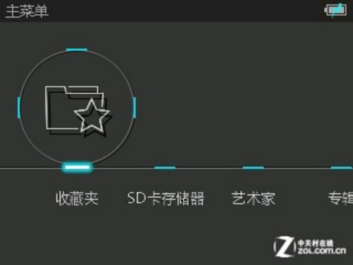
Once booted and into the home page, the UI is very clearly linked to the use of the mechanical wheel. The use of an animated graphic wheel as a type of cursor or menu status indicator is actually a neat touch and really helps with reinforcing the fact this is not a borrowed UI from somewhere else.
Scrolling the wheel moves the graphic wheel across a range of options including now playing status, a favorites option, the SD Card, a flat metatag library system (album, artist, genre, songs), and a settings option last.
(not the image above is sourced from aliexpress.com and is the Chinese language version of Taichi but you get the drift I hope)
In comparison also with the AK touch UI, the X5 smooth overlapping menu and submenu system, and of course the ever-impressive iPod UI, the Taichi UI might just seem a little bit low impact or underwhelming to the eye.
However, what I did find appealing with Taichi UI was that it was easier to pick up and run with than some of the higher impact UI currently it is competing against. As a UI developer nothing more than 3 clicks away and back again was the mantra for us guys in web design years ago and the Taichi UI in many ways follows that mantra quite well.
I do however think the Tachi UI has plenty of scope to add more for the user to play with without breaking that mantra. For instance, I would prefer to have seen the tag library sub-menu with a genre>artist>album>song drill down and more room on the home page for features such as a custom EQ to go along with the hardware Hi/Vintage setting on the external panel.
Some themes might be nice also just to liven up the screen a little and I found most of my well-tagged FLAC had no cover support on the playback screen which makes it even more Spartan in the eye candy department.
It does sound like a wish list at this point but when you think of the fact FiiO has future-proofed the X5/X3 for DSD and USB DAC playback and also the DX50 through firmware rollouts you have to believe there is more to come from Fang and his team that we have not seen yet.
Click on the next page below for amp card module sound impressions…


