UI
The Opus#1 comes with a stripped down version of Android as its core OS and their own proprietary UI design skin for navigation, playback and media file management. A quick peek on the file setup on a MTP mount shows all the classic Android folders present though some, like the movies folder or download folder, are largely redundant. The latest firmware for this OS is now 1.10.22 and available to download from the Opus#1 website at their download section.
Booting
Like most Android based DAPs the boot is around 15-18 seconds though it switches off quick enough in about 2 seconds. This compared favorably with the FiiO X7 and Sony ZX-1 which also has sports a full Android setup but a little slower by 4 seconds approximately over the AK240 version of Android. Of course none of these boot up times can hold a candle to the simpler OS’s on DAP’s such as the X3ii, X5ii and the Cayin N5 which boot up in 8 seconds or less however those OS are nowhere near as complex as Android.
Performance
Once loaded the system is plenty snappy and responsive to the touch with no lag whatsoever. It’s much faster than the Sony Zx1 which is positively sluggish in comparison and as fat if not faster than the X7 which does have the odd lag in loading apps. Because its primarily a music player with no apps the Opus#1 will never really get much slower than this. The Bit have also sensibly kept largely to the 3-click rule to get from one place to the next, whether it is from playback to main menu or to the media library meaning song changes, settings tweaking is fast and quick, once you know where you are going.
Navigation
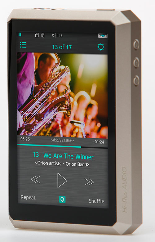
Boot-up in the Opus#1 takes you directly into the playback screen rather than a menu or home screen which is nothing unusual except for the fact I really would prefer it went straight to a central menu screen on the Opus#1 given the rather unintuitive menu system on this particular screen.
I say unintuitive primarily because of the use of icons to denote navigation are difficult to understand in terms of where to go and what to do next as well as the fact it’s all rather messily on top of the album art without any distinction between the icon and the background album art color. Personally, I would prefer to see a semi-transparent bar at the top and smaller icons placed there or labels.
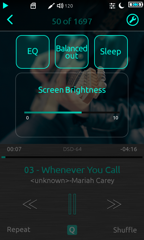
The two primary action icons are on the top left and right just below the battery and playback/pause icon. The first one to the right takes you to the media library and the second one to the right pulls up 4 boxed options as follows:
- EQ
- Balanced out (for switching from 3.5mm unbalanced to 2.5mm balanced jack)
- Sleep (power saving mode)
- Screen brightness
Once you have called up this quick menu screen the icon in the right-hand corner now changes to a spanner icon denoting the settings menu. the left side icon changes to a “>” to allow you to return to the playback menu. You can also return to the playback screen by pressing anywhere below the screen brightness option.
Settings
Once in the settings options you have the ability to tweak their inbuilt equalizer, switch from single ended output to balanced, change screen brightness and language, set the sleep time and update or reset the player. Some of these options are actually already available in the mini pop up screen as listed when you first press the icon on the playback screen. It would actually be pretty cool if there was a way to customize this mini pop-up screen to pick and choose which settings options are most important to you and not just have those set 4.
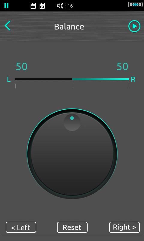
Once nice thing The Bit have included in the settings menu is a channel balance adjuster for those with right or left ear dominant hearing. This is something I applauded FiiO for introducing years ago so glad to see The Bit introduce this from the get go on their Opus#1.
Equalizer
The Bit have packed the Opus#1 with a 10 band equalizer that’s pretty well laid out but I would class it as an intermediate level equalizer with no presets. Instead you have to set it up yourself with the ability to store 3 custom presets. You can adjust in intervals from 30Hz all the way up to 16kHz so those who understand the different responses can play away to their hearts content, those who do not it will be largely trial and error.
You can select a default custom EQ in the settings menu. From the playback pop up screen you can select to turn on the EQ or not and it will pull from your default custom EQ preset. It does take a few seconds to kick in so be patient. Personally I think with any new firmware I would like to see 5-6 presets available to those who do not understand how the EQ works or those who simply want the convenience of moving from preset to preset without manually adjusting. There is still some way to go I think in developing what this EQ is capable off but there is good potential.
Media Management
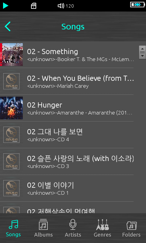
Media Management can be accessed directly from the playback menu and it follow traditional lines of separation with songs, albums, artists, genres, folders and favorites. It also follows the frustratingly familiar lack of organized drill downs that I have seen on quite a few proprietary menu systems. This is a common feature with some basic systems such as those on the Cayin and Shanling DAP’s and this is Android so I know it’s possible. For example, clicking on Genre gives you a breakdown of your different genres, but once you click on genre you get one big list of songs. It needs to be divided again by artist, album, and then song. If you have tons of songs in one genre it’s makes the genre navigation option useless.
In all other areas, the media management follows normal drill down rules. If you have a well-managed file system on your PC or MAC the folder navigation is pretty good also and allows you to select which memory – the onboard 32GB or one of the two microSD cards if you are using them. Loading the library is quick, scanning is pretty quick also and I am pleased to say it is very accurate with zero dropped files or album art which is excellent.
Page 3: Sound Impressions

