UI
Aesthetics & Speed
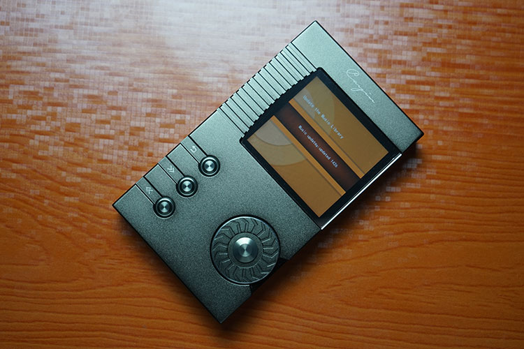
The Cayin N5 UI is essentially the same as the N6 only with a bit of a makeover to make it a bit more useable. That means you get the same upgradeable proprietary software as before and the same core framework of options but with a few tweaks.
I found the tweaks to be a welcome addition. Before, with the N6, powering up brought you a turntable design at the center of the screen that suited the look and feel of the N6 form factor but otherwise felt a little unwieldy in everyday use.
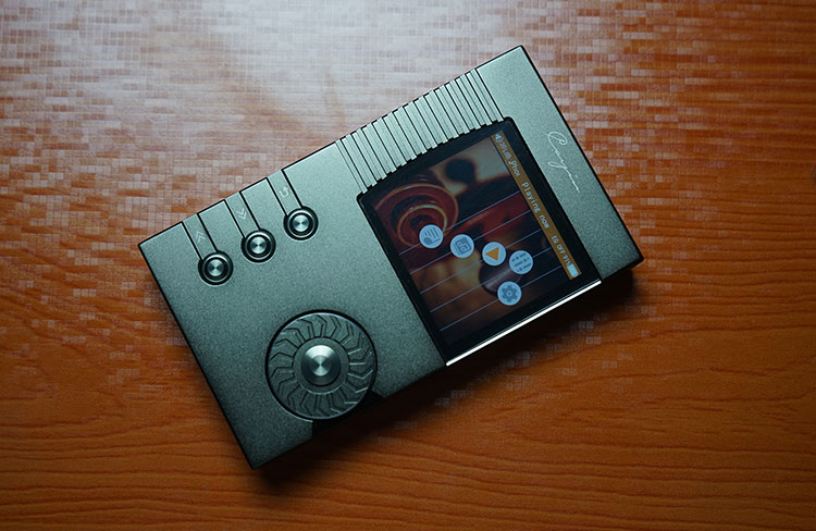
The N5 does away with that type of feel and opts instead for something a little bit linear with a set of guitar strings. It’s still a little offbeat but a touch easier to get to grips with.
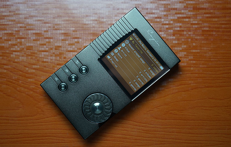
As before control of the UI can be through the mechanical dial on the front panel or use of the front panel hardware buttons though as before the mechanical wheel is the easier of the two options in everyday use.
Since the core UI is largely the same in flow and options it does have a rather solid feel to it and it did not crash once during the review testing period.
Boot Times
Boot-up time is still a bit on the slower side at around 9-10 seconds compared to the FiiO OS which finishes its boot cycle around 6-8 seconds but on par with Gen 1 of the AK DAPs. It is also much faster than some of the new Android-based DAPs.
For instance, it is around 5 seconds faster to boot than the FiiO X7 and almost 6-7 seconds faster than the Opus#1 from Korea. Since both the N5 and N6 share the same OS the performance in boot cycles and power down is relatively the same.
Home Screen
The home screen technically is the same as the N6 in terms of options but aesthetically it feels like a more logical layout than the turntable approach of the N6. The options you get directly from the home screen are as follows:
- System Settings
- Music Setting
- Playing now
- Music Library
- Music Category
You can still access all options via both the playback buttons and the mechanical wheel. You can now also change the format of the home screen through a theme selector which is a bonus. The four themes come in black, orange rustic color, blue, and gray.
I did have a small chuckle on the gray theme which is a return of sorts to the wheel-type scroller on the N6 but instead of vinyl, they have “upgraded” to a cassette spool. How nostalgic!
If you are not happy with the selection of themes you can now create your own theme with a DIY Theme Tool which is free to download from the Cayin website, to be honest, it is more suited to those with an intermediate level of technical ability.
System Settings
Although both the N6 and N5 share the same list-style system menu the N5 does not have the information digital manual option that came with the N6 opting instead to give you access to the theme selection.
Apart from that the options are largely the same with USB functionality, screen display and power options, folder displays, and the ability to reset your device or format your memory card should you need that.
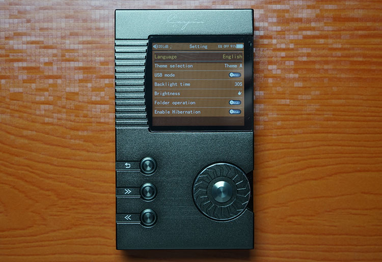
From this menu, you can also pull up information on the latest firmware on your firmware to check the latest and greatest on Cayin’s website. In the case of this particular unit, it is Firmware 3.0.
Music Settings
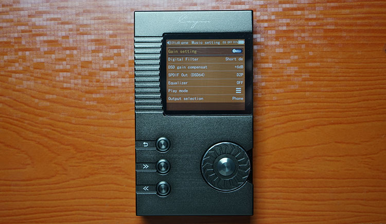
As with the N6, the majority of the fun tweaks and settings are in the Music settings including gain options and a digital filter. This time instead of just sharp and slow filter settings you can now also pick a further three options Short delay sharp, Short delay slow, and Super slow.
The filtering is drawn from the DAC chip’s filtering system, the AK4490 does have up to 5 filters and each moves the sound around a bit in terms of perception (distance to the stage) as well as the tonality in terms of how natural or smooth or how sharp the attack is for instance on acoustics.
Beyond this, you can control DSD output gain which has a default setting of +6dB, SPDIF DSD output on either DOP or D2P as well as work with the same EQ options as you would find in the N6 with 8 presets and customizable settings.
You can also choose to switch from output via the 3.5mm headphone jack output to a line out stage which is set at 2.0v fixed voltage.
You can also select your gapless playback options here as well as adjust your volume memory settings which are particularly useful for stop-and-start play.
The default, as in the N6 OS is set to 20 steps which is a fairly safe starting point with a middle-of-the-road IEM requiring around 25-30 steps for good power. The final set of options will allow the user to tweak for visualization of album art during playback and lyrics if available.
Playing Now
Once you start churning out the audio the Playing Now option is simply a quick way to return to the playback screen from the home menu. If you are not playing anything at the current time on the N5 the playback option will take you to the Music Category section instead.
Once in the Playing Now screen, you can access a set of secondary commands, much like the N6, by pressing the menu button on the left-hand side of the N5.
This set of secondary commands shows up on the far left of your screen with a single column of icons and a label for each icon showing up in the top bar of the screen when you go over the icon.
These include quickly switching up or down your gain, choosing the order of songs in a random, loop, or by list, adding to favorites or creating a playlist, and finally deleting the song entirely.
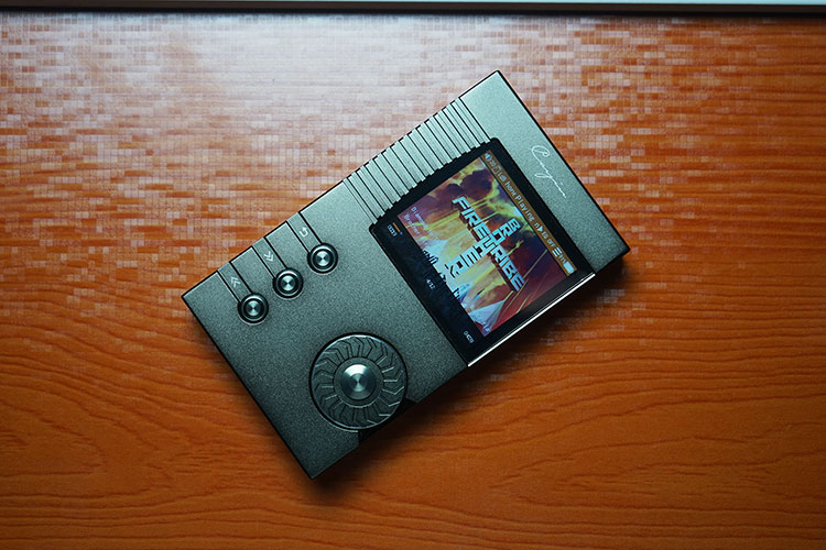
The playback screen itself is very familiar to N6 users and not entirely unfamiliar to FiiO and Shanling users. Album art is front and central with the album, artist, and song choice just below.
The exact time and duration of the song are at the bottom whilst, at the top, you are presented with volume, gain setting, battery, and EQ options.
There is a hefty amount of scrolling also at the top, one of the limitations of having such a small screen. It does make it slightly difficult to figure out what is going on at times so it would be great in future firmware if this bit was dropped from the top to somewhere just below and given more space. This includes the output modality (balance, line out, etc) and the “Playing Now” label.
Music Library
I have never really felt comfortable with the way Cayin have labeled this, the first of two options on how to explore and select your music on file. Library and category are two rather vague terms open to misunderstandings.
In reality, most people view the word library in DAPs to be just that, a library of your music but through meta tag scanning and compiling.
The category doesn’t distinguish itself enough from the Library. If anything Music Library should simply be “File Explorer” and Category should be “Library Browser” or something similar to make it more action-orientated. Right now it is too passive.
Library pretty much acts like a file explorer with some parameters. You won’t be able to access system files and the likes as you would in Android but it does give you the option to explore your memory cards and also, ironically, update the Music Library, which is a whole different section. If you are as OCD as me and correctly name all your folders and files before loading them then the Music Library section is very fast and easy to work with. The only reason I might have for jumping into the Category section is if I have a certain genre in mind, or artist in mind and do not want to scroll to find what it is I am looking for.
Music Category
The final option on the N5 is the Category option and it’s where you will find the results of all your scanned music files via meta tagging. You can also access your previously played songs, your favorites as well as your playlists on this menu.
I have something like 1600 songs on a 64GB file all correctly tagged and accurately picked up by the N5 according to the tagging. That’s a big win for Cayin’s software.
However, the tagging exploration options are once again too flat with a huge list of songs under genre instead of further grouping by artist then album then songs. That is a loss for Cayin.
Under Genre>Rock, for example, I have 400 songs in alphabetical order when I click on the Rock genre but no indication of who is singing them because there is no further categorization.
I have seen this lack of grouping so many times in so many different versions of this software and it drives me mad. Whatever happened to the controlled UI drill-downs that Apple has been doing for 15 years?
UI Summary
There has been a bit of bending here and there to account for the new form and function of the N5 over the older N6. The additional themes seem better thought out than previously and you can also make your own themes which is a welcome if somewhat complicated bonus.
It is though a simplistic OS and not one that will get you too excited compared to the modern touchscreen experiences on the X7 and even the Ibasso DX80. The use of the terms Library and Category is confusing and the lack of grouped drill down beyond Genre is an old complaint that won’t die.
Overall though the N5 software is bug-free, stable and fast. It benefits from having already been tested and deployed on the previous N6 last year so I would be shocked if something funky happened on the N5 during extensive usage.
Click on page 3 below for our Sound Impressions and recommended pairings

