Software
Platform
The Old
The original Opus#1 launched with a gimped KitKat 4.4 Android OS using a proprietary UI design skin for navigation, playback and media file management. It was fast, snappy and easy enough to use but a lot of the Android goodness was missing such as WiFi, BT, and apps loading that are increasingly finding their way onto DAPs in 2017.
The New
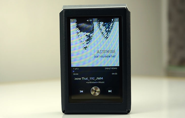
Since then the Opus#1 (and the flagship Opus#2 for that matter) have all been upgraded to Android 5.1 Lollipop with more Android features and a better UI design that now comes as standard with the Opus#3. The Bit also continues to expand on their customized UI with fairly frequent firmware releases for bug fixing and additional features.
More than that the Opus#3 inclusion of WiFi and BT modules means The Bit have been able to dramatically expand the ability of the OS to take advantage of core Android functions such as OTA, streaming and BT connectivity. A connected DAP these days is a big value add.
Walled Android
It is still however not the full blown Android experience such as you would find on the DX200 and the latest FiiO units but it is more advanced than the Luxury & Precision competitors. Navigation is quite linear though the addition of a pull-down menu from Android 5.1 is a useful and familiar navigation tool.
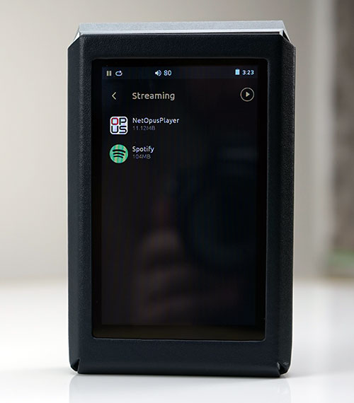
Apart from that it still has a drill down and up type feel with only a fully blown media management and settings feature activated. Apps are not on the home page, you have to dig into them via the settings menu. Not all apps are guaranteed to work apart from the two that are pre-loaded, Spotify and NetOpusPlayer.
This reminds me of how the X7 launched with a white list of apps before FiiO caved in and let us load whatever we liked. Currently, this is more like the Cayin i5 with that walled in feel though the i5 feels slightly more open-ended on its home screen.
Speed
The Bit have elected to retain the original CPU though from the Opus#1, which is an ARM Cortex-A9 1.4GHz, Quad-Core & DDR3 1GB. I honestly cannot detect any difference in boot times between both the Opus#1 and Opus#3 using 5.1 and navigation is just as fast throughout.
The boot times of 5.1 compared to 4.4 are just marginally slower by 1-2 seconds but nothing terribly noticeable. Previously it was somewhere around 15-18 seconds, now its about 18-20 seconds. Similar 5.1 devices such as the FiiO X5iii boot up also around 20 seconds as does the upgraded X7 (using 5.1).
Unlike the X5iii there is no annoying lag in play/pause functionality during playback on the Opus#3. I think that is an important point to make out. If you are going to gimp your OS make sure the execution and performance are flawless. In this respect, I believe the Opus#3 has succeeded.
Media Management
Scanning
The Opus#3, as before with the Opus#1, will automatically scan and create a media DB using metadata upon loading your memory card or dragging and dropping the files.
A single 24BIT/kHz album of 860Mb in size was instantly picked up and displayed in the media library as soon as I disconnected so I have no issues with the speed of the Opus#3 in terms of scanning files. You do have the option of re-scanning manually through the DB Initialize menu option in the settings section though I have not seen dropped files or bad tag reading to date.
Media Navigation
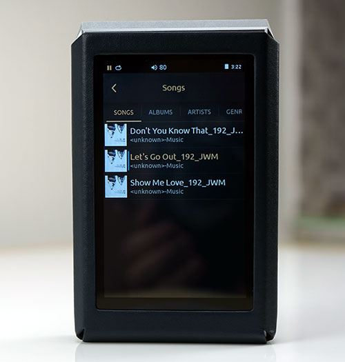
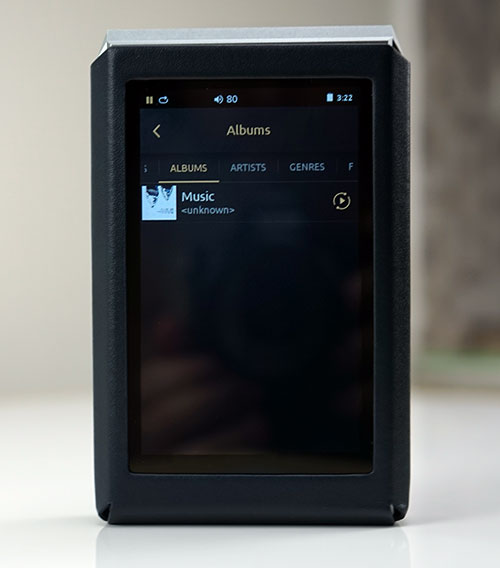
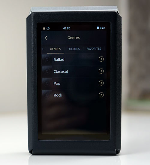
Media Management can be accessed directly from the playback menu and it follows traditional lines of separation with songs, albums, artists, genres, folders and favorites. There has only been a slight cosmetic change from the original 4.4 Opus#1 version with the category dividers moving from the bottom to the top. You can navigate from category to category by simply sliding your finger left or right. Two additions have also been added with folders and playlists but this is now a standard feature in the Opus#1 since both DAPs have the same OS.
Categories
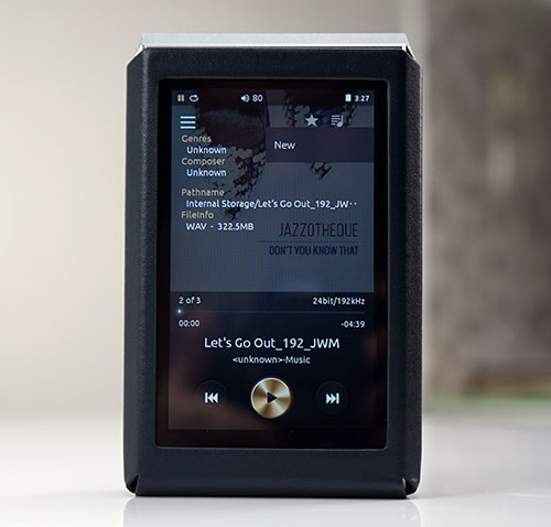
You can elect to navigate via the tagging system in the DB via Songs, Albums, Artists, and Genres or you can choose to drill down via the folder structure if you feel your file and folder naming system is up to par. Meta Tagging is accurate for me though some DSD files were missing album art otherwise I had no issues drilling down via artist or album and finding the right information. During playback, you can click on the main screen and it will bring up both the file path name and file info as well.
That Genre Issue Again
The OS still follows the frustratingly familiar lack of organized drill downs in the tagging system that I have seen on quite a few proprietary menu systems. This is a common feature with some basic systems such as those on the Cayin and Shanling DAP’s and this is Android so I know it’s possible.
For example, clicking on Genre gives you a breakdown of your different genres, but once you click on genre you get one big list of songs. It needs to be divided again by artist, album, and then song. If you have tons of songs in one genre it makes the genre navigation option useless.
Settings
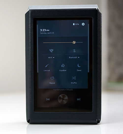
There are two types of settings control on the Opus#3. There are the quick access settings which are accessible with the drop-down menu from the top of the screen and the core settings accessible from the cogwheel icon in the top right-hand corner of the drop-down menu.
Drop Down
The drop-down menu is more of a quick on the go setting type feature in a similar fashion to the SOC software you get on HibyMusic OS systems though the options differ slightly. From here you can choose mostly on or off 7 functions including WiFi, Bluetooth, line out, the equalizer, sleep, repeat or shuffle tracks.
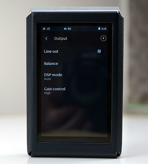
The drop-down menu does not have any gain functionality, something which the Opus#3 is missing and could have been quite useful. Instead, the gain is controlled from the core settings menu. You can go further into WiFi and BT from the drop-down menu to allow you to choose which network or device to pair with before activating the link.
Core Settings
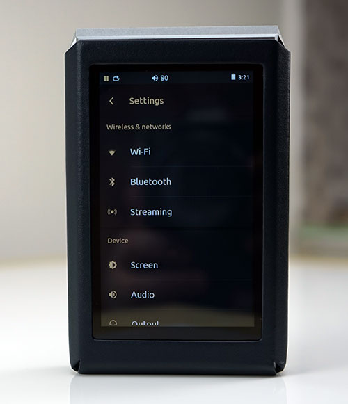
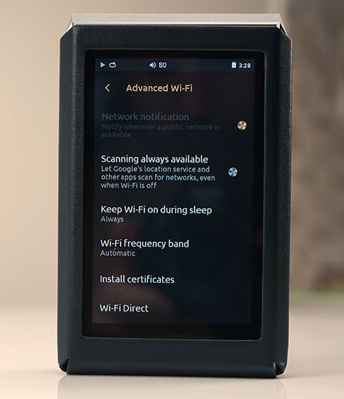
Selecting the cog wheel icon in the top right-hand corner of the drop down menu brings you to the core settings options of the Opus#3. They cover a mix of audio and operational related features including streaming and apps management.
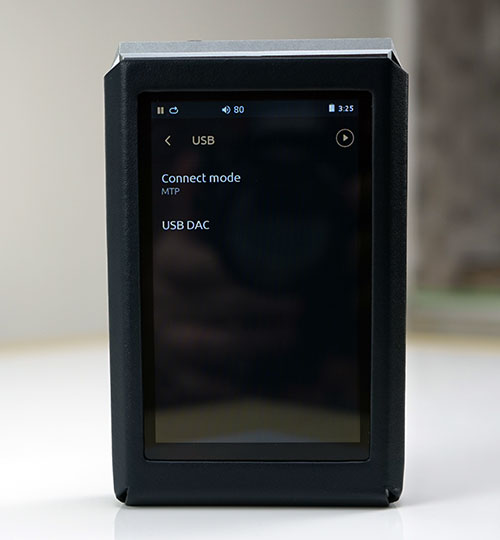
From here you can select your wireless networks, pair via Bluetooth, determine how the Opus#3 communicates with your PC (MTP, charging, USB DAC) as well as control things such as screen brightness and sleep timer to maximize your power and performance.
Equalizer
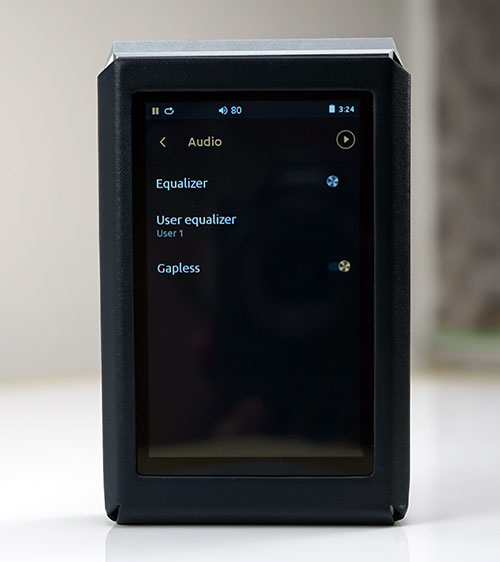
You can also turn on or off the Equalizer within core settings as well as the drop down menu and setup which user equalizer setting you want as your default setting. The Equalizer is a pretty good 10 band equalizer but sadly there are no presets so you will have to make your own. You do however get 5 user customization stored slots compared to 3 in the old Opus#1 OS. You can also elect to turn gapless playback on or off under audio settings.
OTA
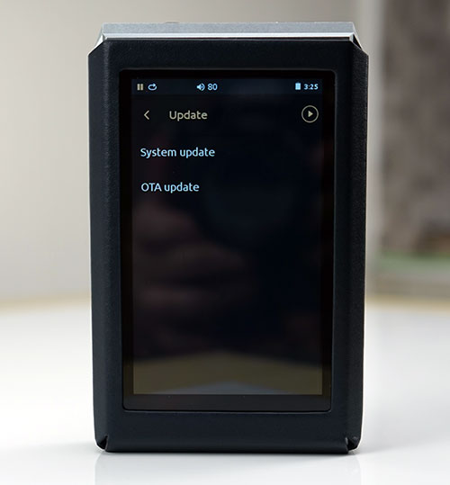
You can also update the Opus#3 from the core settings menu and unlike the Opus#1 you can now update it via OTA or manual with the WiFi switched on. Going from the out of the box 1.0 FW to V1.00.01 using OTA was reasonably quick and painless though the quality of your internet connection will play a role in that.
Streaming
The streaming option is likely to be the section most of us will pop into every day in the core settings menu. I do wish there was a shortcut from the drop down menu, perhaps that would be something to see in future updates.
Spotify & DLNA
Streaming is really the apps drawer in list format. Out of the box, you have two applications, Spotify and the local media server called NetOpusPlayer which doubles up as a media server for files stored on the Opus#3 as well as tap into any existing DLNA networks with file servers such as oShare.
Hooking up and connecting to oShare from my own PC was a breeze though it does take a bit of time for the library to generate on the Opus#3 due to the sheer size. Small libraries will load much faster. NetOpusPlayer though is a walled app so you cannot integrate any remote media libraries into the main media manager. You must access all files including playback within the app itself.
Connecting to Spotify was also pretty straightforward on the WiFi connection, even signing in using Facebook credentials proved no obstacle. Once you are signed in you will not be prompted to sign in again unless you log out of the app even if WiFi is turned off.
3rd Party Apps
Opus#3 does not come with Google Play but you can side load apps though The Bit will not guarantee performance such as you would expect, say, on a vanilla Android smartphone. Side loading is not intuitive but neither is it difficult to do.
Simply go to the streaming section in core settings and long press OpusNetPlayer until you see a plus sign in the top right corner. By pressing this you are taken to the internal storage download folder. If you have apk files ready simply transfer them there and start the installation process.
Bluetooth
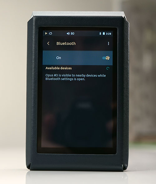
Bluetooth has been added to the Opus#3 which brings it up to speed with most modern DAPs but surprisingly no aptX, just 4.0 (A2DP, AVRCP). That is a shame and a missed opportunity given the budget N3 from Cayin offers this. However hope springs eternal given FiiO originally launched the X7 without aptX but with subsequent upgrades post Lollipop, we now have BT aptX.
BT on the Opus#3 is also lacking any bi-directional capability so its primary purpose is to transmit outwards to something like a BT capable headphone. Using the ADV Evo X BT earphones the pairing process was simple enough and audible quality was ok from up to 10 feet with perhaps one wall but not two walls in the way. If your car has a BT option on its head unit the Opus#3 will also pair to that for audio playback via your car speaker system.
Click on page 3 below for Sound, Matching & Comparisons

