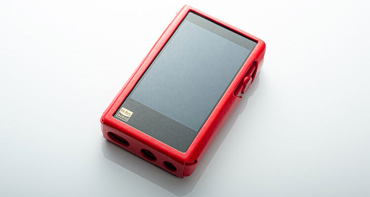
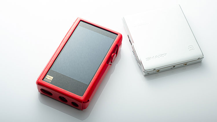
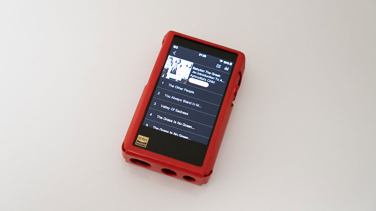
The Shanling M2x is a revised edition of the original M2s pocket digital media player featuring Wifi, TIDAL, and Touch controls to name but a few enhancements. It is priced at $219.
Disclaimer: The Shanling M2x sent to us is a sample in exchange for our honest opinion. We thank the team at Shanling for giving us this opportunity.
To read more about Shanling products we have reviewed on Headfonics click here.
Note, this 2-page review follows our new scoring guidelines for 2021 which you can read up on here.
Being almost as new to Shanling as I am to Headfonics itself I am hella surprised by the M2X and in the most excellent of ways. It’s almost as if Shanling trawl various articles of mine, gathering up major critiques, and applying each to make a near-perfect DAP.
Sure, I don’t understand the branding but then again, I’m not Chinese. What I do understand is ergonomic design, clean UIs, hardware controls, sound quality, ‘yadda yadda yadda’. And in the M2X, Shanling nails most of that.
Technology
The M2X’s got a single DACs, in AK4490EN flavor. It does LDAC, balanced output, and has a beautiful and beautifully contrasty screen.
It is as well finished as any hi-end DAP out there, but in some ways, easier to use. Nothing flexes, and little to nothing feels out of place. Naturally, it supports just about every file type that exists and even does a fair but not perfect job of gapless playback.
Build Quality
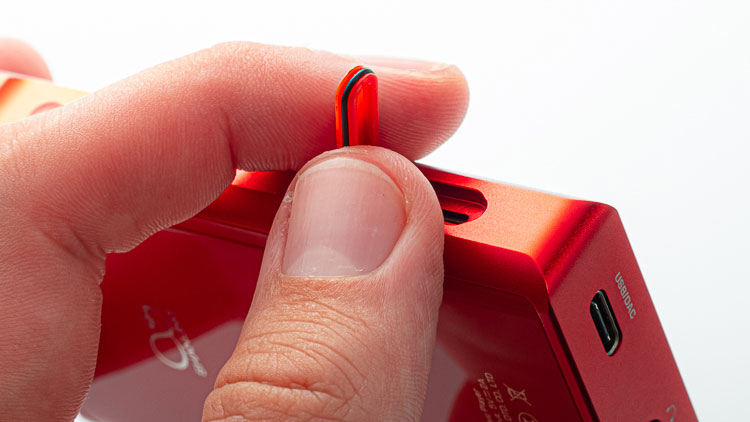
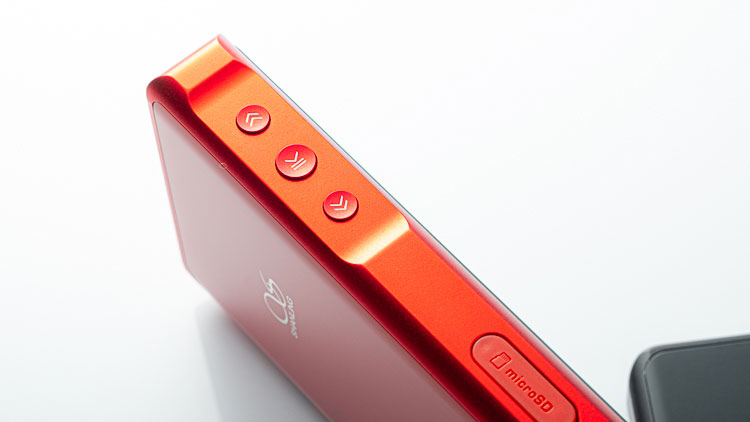
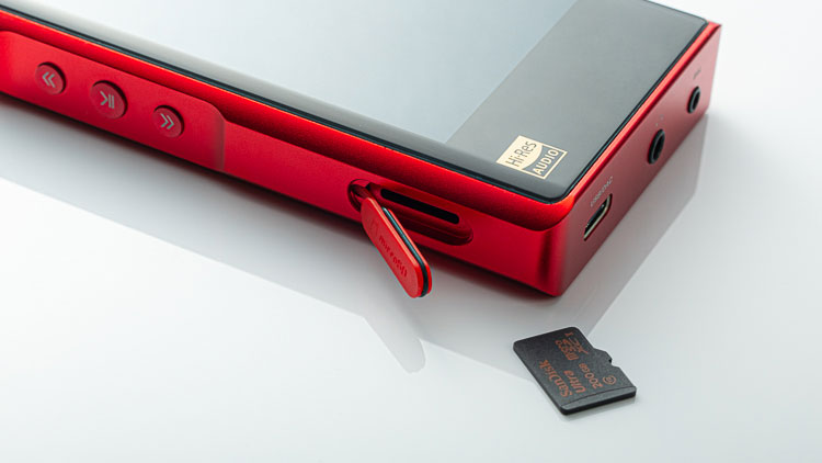
The M2X is as well made as anything I’ve tried. Its glass is well fastened, its buttons nicely laid, and its edges and seams are Lexus-precise. Even the thing I really dislike – the weather-sealed MicroSD card door – is well aligned. But, unless you’ve got nine-inch nails or a paper clip, it is also impossible to open.
Part of that is because it is so small and chintzy. Sony did the same thing in the ZX300 but made it easy for a regular man to open. Shanling‘s card flap is a poor design that will wrack up scars from those users that have to resort to paper clips and knives to prise it open. It should never have made it past the most rudimentary discover/design phase.
Everything else, from screen placement to glass installation and shape and curvature of corners, is excellent.
Screen
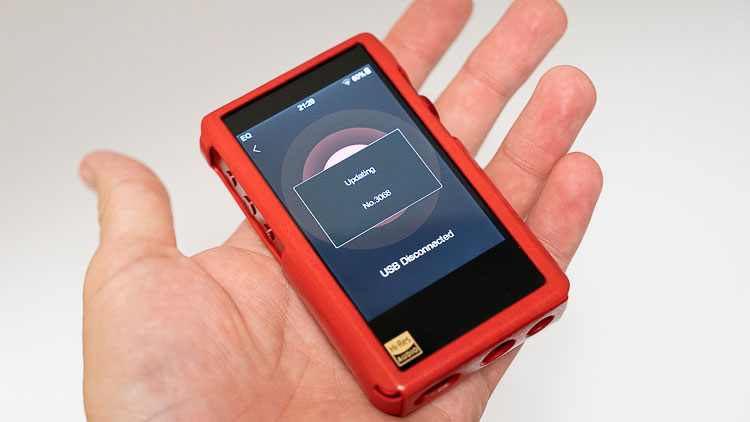
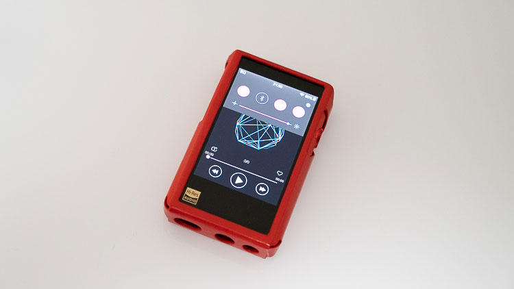
At its price point, the M2X’s screen is glorious. Colors are rich, vibrant, and view angles are good. Resolution of 320×480 is good enough to show album artwork with decent detail. Next to a Cowon Plenue D2, or Onkyo DPS1, it is A+.
It also takes up enough real estate and is wide enough that touch-based gestures aren’t easily confused. This stands in direct contrast to FiiO’s M6, whose gestures are hard to repeat because the screen is so cramped.
Controls
Physical
The M2X arrays things nigh on perfect. Pointing down are track forward and play functions. Reverse points up. Volume ramps higher with a twist up. With ordered lists and software-driven hardware design, such inconsistencies may be inevitable. It’s annoying, but it’s also now par for the course.
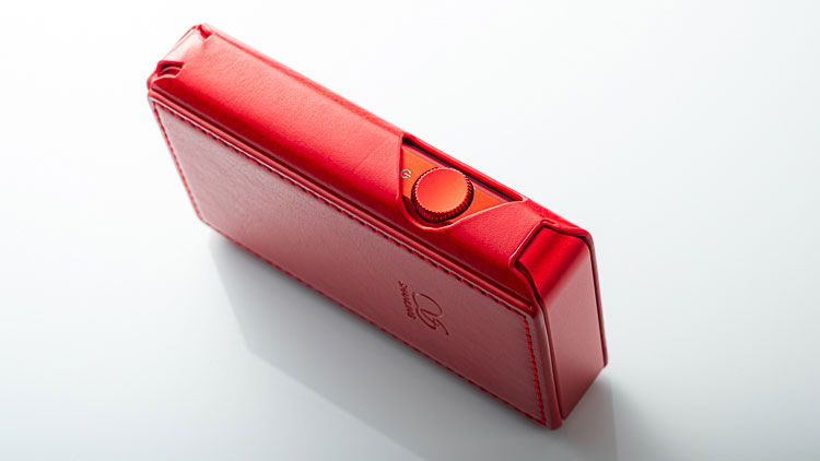
The volume wheel doubles as an ON/OFF switch. It sits on the same axis as the play/pause button, but thankfully, it never gets in the way. I’ve never accidentally pressed it whilst using the tracking buttons. This is because the thumb naturally falls higher up on the body. Contrast this to the iPhone 6, whose long body forces the thumb to also nudge the ON/OFF button when engaging volume. Yes, the M2X is more thoughtfully designed than a Cook-era Apple iPhone.
Better yet, the volume wheel returns interactive graphical feedback only at the top of the screen, and can’t easily be accidentally commandeered by a swipe. Yes, you can control volume via the software, but it first requires you to thumb the volume scale before the M2X changes to a volume screen. Eat your heart out, Astell & Kern.
Output Arrays
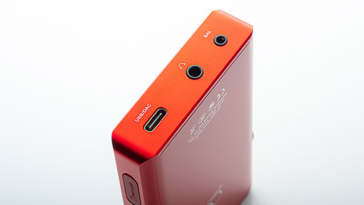
A miracle of all miracles, each output is arrayed along the bottom side. Why is this awesome? Well, you can charge the M2X and listen to it right from in the pocket and still have things ready to rock and roll when you pull out of the pocket. No need to flip it around, catch cables on nearby things, or unbalance your audio system.
The only hitch is when you want to charge it or use the M2X as a USB DAC, you end up making two loops rather connecting the M2X between earphones and a cable in a single line. That said, the M2X is a DAP first, USB DAC second. It works perfectly well as a DAC, but it’s a far better DAC and Shangling have put in the extra work to ensure that as a DAP it feels great in both the hand and the pocket
GUI/touch
While the M2X’s touch targets aren’t large, they aren’t also jammed up against one another. As such, the touch UI is generally easy to get used to, even if your fingers are toe-fat. And, unlike the Plenue D2, text and graphical elements don’t shear when gestures pull up or down on lists.
Unfortunately, it gets a bit jittery when scrolling, catching here and there and sometimes skipping albums, songs, and more. It’s a big improvement over the sluggish, heavy D2 and DPS1 interfaces, but it’s nowhere near as natural as an iPhone or iPod touch.
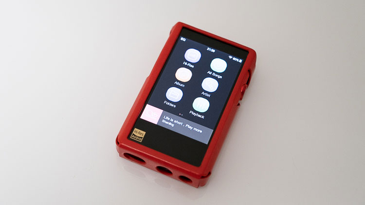
Tucked away are shortcuts for Hi-Res music, Tidal, Recent Songs, All Songs, Album, Artist, My Favourites, Folders, Playback, Composer, Playlist, Frequent, Recently Added, and System, all arranged on pages.
If you swipe right a few times and you’ll reveal an add/remove item panel to tidy or complicate your home screen to your liking. Swipe up from the bottom to return to the home screen. Swipe down from the top to engage wireless, brightness, system preferences, lock, and gain settings. It’s a simple UI to get used to and is nicely arranged.
Navigation
The playback screen sports a large play/pause button in the bottom middle and to either side, tracking forward and back. Playback mode is a small button above the scribbling slider. That slider, which sits above the trackback button works well enough but is too close to the tracking and play/pause buttons, making it a bit too easy to accidentally engage playback controls. Its feedback is also laggy.
Storage
I’ve been using 200GB Sandisk cards with the M2X. Each works flawlessly. Shanling says on the package that cards of up to 512GB but I’m assured that cards up to 2TB will do the trick. The M2X scans relatively fast, cataloging 150GB of music in a handful of minutes
Battery Life
Officially, the M2X is good for up to 10 hours. I get about that when playing FLAC-level files. 10 hours is okay but let’s be honest: it’s far and away from being top of the game. But neither is the DP-S1’s 15-20 hours. Even the Plenue D2’s 35-50 hours is a long way from the Plenue D’s 50-80 hours. And, my MD units generally get 15-30 hours, lossy or lossless.
So, for a single-DAC DAP as thick and chunky as the M2X is, up to 10 hours is okay.
Accessories and Packaging
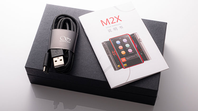
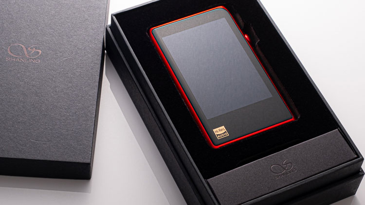
There’s not a lot of stuff in the M2X box, but what’s there is logically and clearly laid out. The high-density protective foam is perfectly cut and nicely lifts out to reveal literature, and sports finger-divots or pull tapes which help to lift out the DAP or cable.
There’s also a USB-C cable tucked away in there. So, that’s M2X, case, literature, and nothing else. It’s almost all you’ll need. If you don’t invest in the pleather case Shanling makes for it, use an iPod sock. The M2X is pretty; there’s no need to scar it up.
Wireless
It’s kind of a shame that the M2X is limited to Bluetooth 4,2. Apart from that it does Wi-Fi and is compatible with aptX and LDAC BT codecs. Connection quality to Bluetooth devices like AirPods is decent but several years behind a good smartphone. I get up to 11 meters distance with AirPods, which, by way of comparison to an iPhone SE (which gets up to 30 meters line of sight) is poor, but it works.
This is better than some DAPs from the last few years but isn’t close to cutting edge or seamless. I’ve also found that initial and subsequent connections aren’t as speedy or reliable through the M2X as they are through a smartphone. I’m not sure if Bluetooth 5.0 would help. Connection quality is probably limited by the interaction between and quality of the M2X’s antenna and metal case installation.
Evidently, you can do Tidal with it, but as I don’t subscribe, I’ll leave that here. Suffice it to say that the M2X wireless experience is good but not great.
Software
UI
Certainly, in comparison with the Cowon Plenue D2 and Onkyo DP-S1, the M2X is a dream. Scrolling is good. Getting back to the home screen, settings, playback screen, and sound adjustment screens is a breeze.
Favouriting a file can be done through the playback screen. Delete, EQ, and playlist functionalities are just a click away. Want to change play mode? Just click the loop or the file drop-down list icon above left of the elapsed playback meter on the bottom left. Easy peasy.
Okay, some touch targets are small. The worst offender is the song tracking slider. I can’t use it with my thumb, so I have to change my grip and holding hand to pinky-finger nudge the play position within a song forward or back. Of course, even smartphones have trouble here, though not as much. If par for the course includes such missteps, the M2X easily surpasses par for a DAP and is one of the easiest to use I’ve ever tried.
Icons
I dislike the icons on the home screen. Why is the artist a microphone? Why do all songs icons look so much like a note icon inside an archery target? Or is it a rewind icon? The good news is that you can customize the home screen, removing or adding functionality and streamlining the player. Always, the currently playing screen floats at the bottom of the home screen, and if you really want to get jiggy with sound, you can update channel balance, low pass filter shape and strength, EQ, gain, and more.
GUI looks don’t favor the M2X but general quality and reliability of interface do. Shanling has done much of the Lord’s work. Much more needs to be done. Whatever the case, the M2X is clearly superior to the DP-S1 and more surprisingly, the brand new Plenue D2, both of which are slow as molasses and to varying degrees, sport abstruse software.
Playback Performance
The Shanling M2X plays back loads of different files and natively native decodes DSD. When it nails gapless, it nails it. But even when gapless is set, intermittent or unexpected gaps really bugger up live albums, messing up certain studio performances, and whatever it is that Tiesto did with In Search of Sunrise. I’ve noticed that most gaps show up most often in compressed file albums.
Click on Page 2 below for Sound Impressions & Comparisons

